Have you ever looked at logos and wondered what their meanings were or what inspired the designer? Here are 15 logos that you see almost every day and what they represent.
#1. Toyota
The three ellipses seen in the logo for Toyota represent three hearts: the heart of the customer, the heart of the product, and the heart of progress in the field of technology
#2. McDonald’s
Yes, the “M” for McDonald’s and there really isn’t another meaning. In the 60′s, McDonald’s wanted to change the logo but their design consultant and psychologist Louis Cheskin insisted that they left the golden arches. According to BBC, he said customers will unconsciously recognize the logo as “symbolism of a pair of nourishing breasts.” Whether this is true or not, their logo is one of the most recognizable in the world.
#3. Mobil
The importance of this logo is in its colors. The red is said to represent strength and the blue represents faithfulness and security that the company provides.
#4. Pepsi
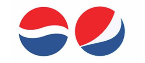
Pepsi’s old logo is the one on the left. The new logo on the right cost Pepsi $1 million. They hired Arnell Associates to come up with it. As a result, Pepsi had to spend millions more to rebrand everything. Then Arnell’s 27 page document was leaked and it was entitled, “Breathtaking Design Strategy.” It proposes that the new logo is some sort of Da Vinci Code. The logo draws on Feng Shui, the Renaissance, the earth’s Geodynamo, the theory of relativity, and much more. For more info on this, read the Gawker’s article.
#5. BMW
BMW has a history in aviation and its logo stays true to its roots. The blue and white represent a propeller in motion with the sky peeking through. In fact, BMW had a role in World War II as a creator of aircraft engines for the German military.
#6. Apple
The Apple logo represents the forbidden fruit from the “Tree of Knowledge” in the Biblical creation story of Adam and Eve.
#7. FedEx
This logo is so creative. If you look closely you will see the arrow between the letter ‘E’ and ‘X’, which represents the company’s forward thinking ways and outlook towards the future.
#8. Mercedes-Benz
The Mercedes-Benz logo is the most confident of all. The tri-star represents the company’s dominance in quality and style over all things land, sea and air.
#9. Google
The Google logo has four primary colors in a row then it’s broken by a secondary color. This was entirely intentional. Google wanted to show that they don’t play by the rules and are also playful without making the symbol bulky. To do that, they just used simple letters and colors.
#10. Adidas
The Adidas logo looks like a mountain to represent the obstacles that people need to overcome. Originally the logo was just three stripes and didn’t stand for anything. So they kept the three stripes and just made them slanted to resemble a mountain.
#11. NBC
Ever wonder why the peacock has so many colors? It’s because during the 50′s, NBC’s owner was RCA and they had just begun to manufacture color televisions. RCA wanted people who were watching black-and-white televisions to know what they were missing, so they created a colorful logo.
#12. Audi
Plain and simple, right? Well, no. Each of these hoops represent the 4 founding companies of the Auto-Union Consortium way back in 1932: like DKW, Horch, Wanderer and Audi.
#13. IBM
IBM’s logo has a hidden message for the whole world. The white lines passing through give the appearance of the equal sign in the lower right corner, representing equality.
#14. Volkswagen
The ‘V’ stands for “volks” which means people in German and and the ‘W’ stands for “wagen” which means car. It’s the car for the people.
#15. Amazon
You may have thought the arrow looks like a smiley face, meaning Amazon’s main mission is to make their customers happy. But notice the arrow is pointing from the a to the z. This represents the fact that Amazon has a large variety of items for sale, from A to Z.


