The parallax effect in web design is something that has gained popularity over the past couple of years. When used properly, it can result in a rich and engaging user experience with seamless navigation. When used poorly, it can result in just a page with a lot of elements moving around and a terrible UX. If you’re considering using a parallax effect in your next web design project, we’ve gathered some great examples here to inspire you.
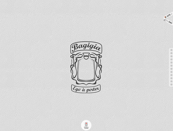
Bagigia
Scroll down to explore the website and enjoy a 360 view of the products.
Whiteboard
Here the concept is the same, fixed images with texts and content moving, creating a nice and smooth effect.
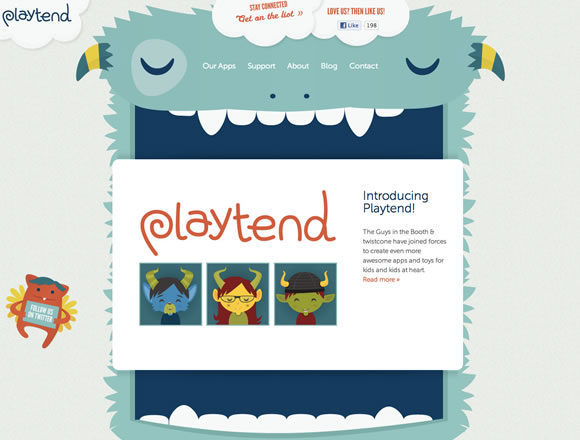
Playtend
Playtend choose a fun concept and executed it pretty well. Scroll down and the monster will “eat the content.”
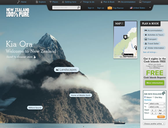
New Zealand
Scroll down to explore things to do in New Zealand while you see more beautiful background images.
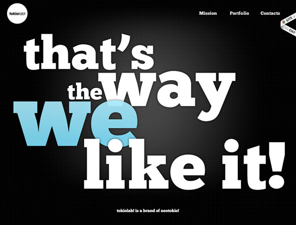
TokioLab
TokioLab uses a lot of typography to help you navigate their website. Scroll down to explore their mission and portfolio while you enjoy a lot of moving text.
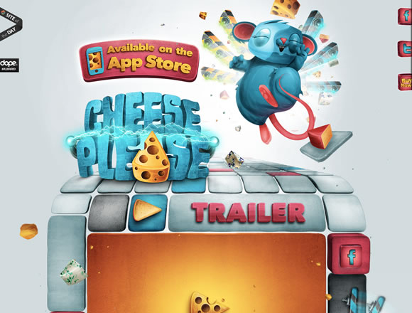
Cheese Please
Cheese Please is a game so of course we can expect a lot of colors and fun elements on their website. Even with all the colors and elements moving they accomplished a nice and fun effect.
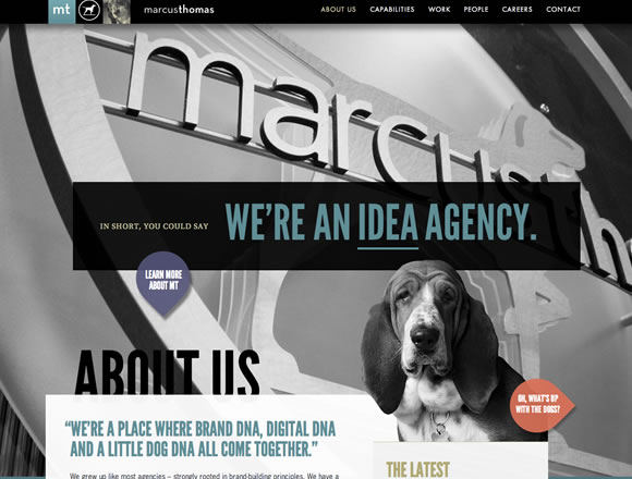
Marcus Thomas
Scroll down to explore the website and see texts and images nicely floating around.
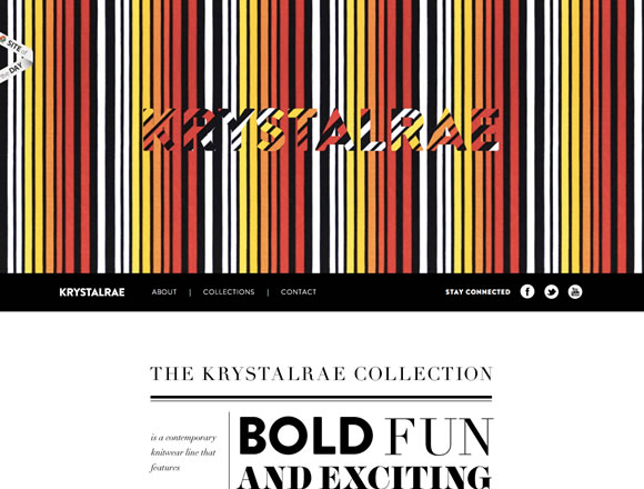
Krystalrae
Once again we see an example of fixed background images (textures in this case) with content moving and creating a nice effect. Scroll all the way to the bottom of the page to change the model’s outfit.
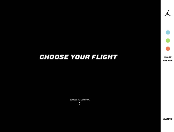
Air Jordan 2012
Scroll down to choose your flight mode while you enjoy planes, shoes and texts floating around.
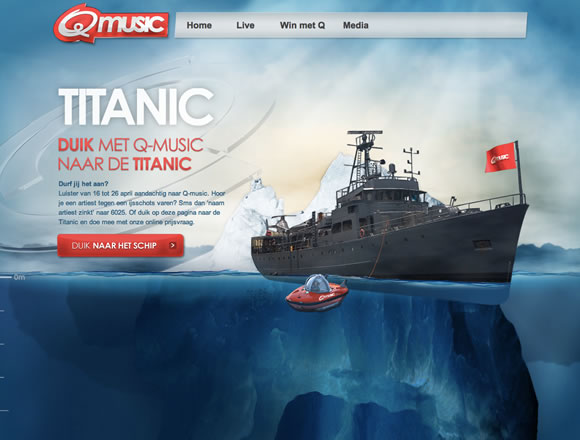
Q music Titanic
Scroll all the way down to check some Titanic facts and to find the ship in the bottom of the ocean.
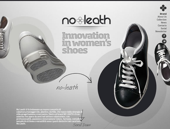
no leath
Scroll down to see the different shoes they offer while a lot of colorful images float around.
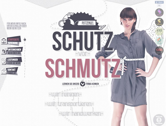
Putzengel
Beautiful colors, type and textures will move around while you navigate their products and services.
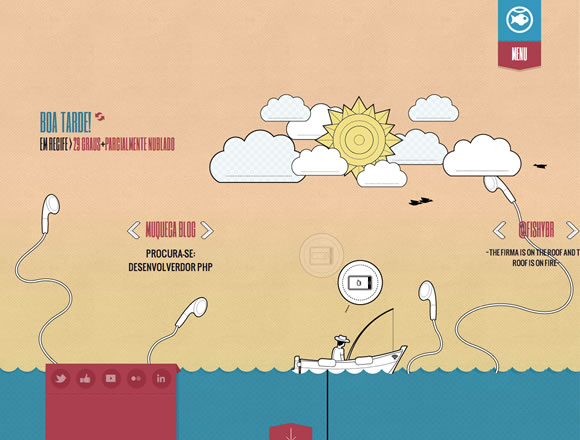
Fishy
A fun and creative approach to parallax applied to a creative agency website.
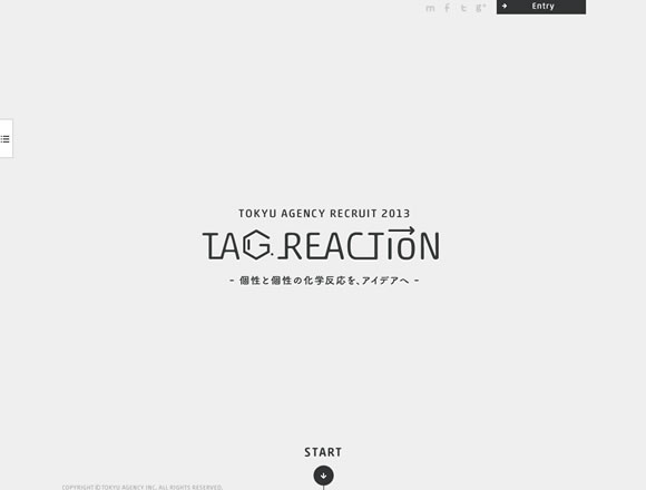
Tokyu Agency Recruit 2013
Press start and they will take you down the road so you can start scrolling to check out if you have what they need to apply for the job.


