After navigating through the wilderness of search results, a unique visitor has landed on your page, and you’ve got one shot to make things work.
1. MyLakeMap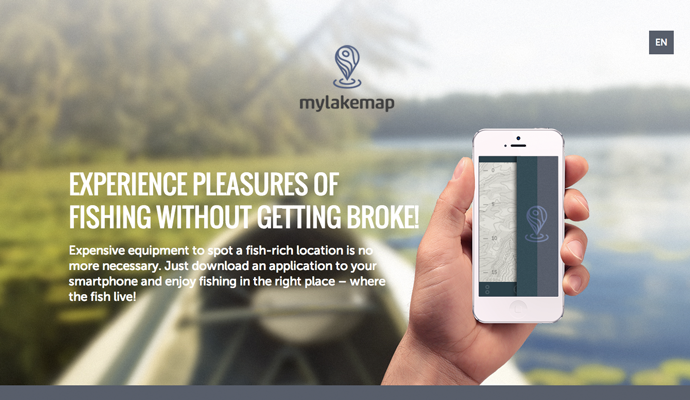
Featuring parallax scrolling and big photography, MyLakeMap is a single page site that utilizesclean sections and simple font. The brilliant combination puts this one on our map.
2. Built Things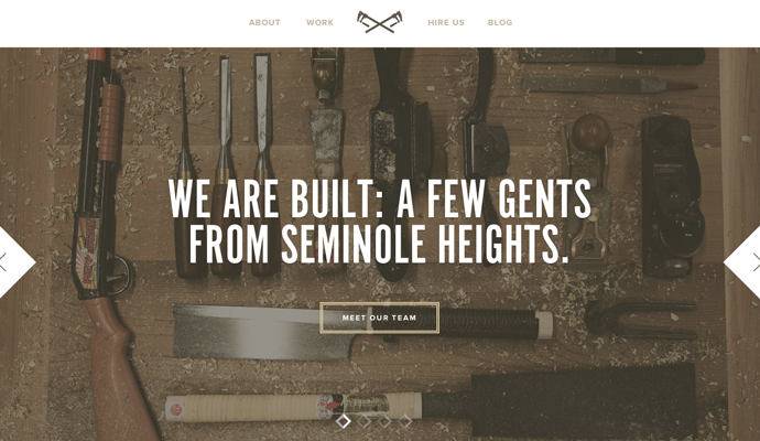
Built Things is a well-built one-pager. Its storyline is executed in a way that makes sense: learn more about the company, what they do, who does it, and how to contact them.
3. Paper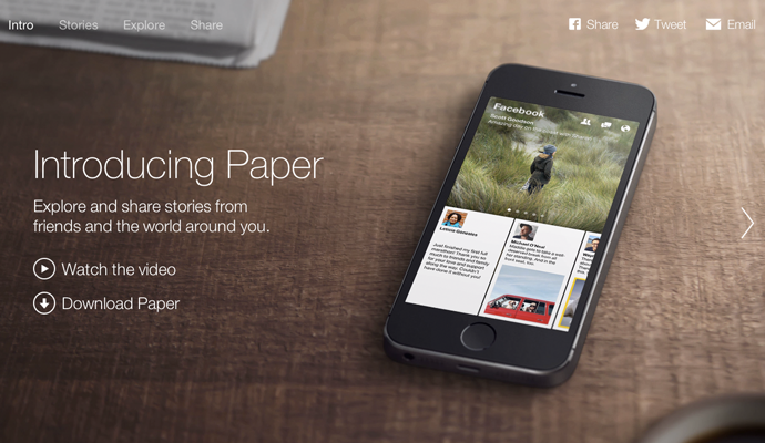
Facebook’s Paper app changes things up with a horizontal one page layout. You can see our take on the Paper launch in a recent DT-tv clip.
4. Crated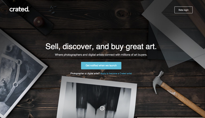
Crated keeps its launch page simple and effective with three boldly defined sections.
This single page site adds a touch of flair with captions that appear when moving your cursor over the images.
6. Emory Bubble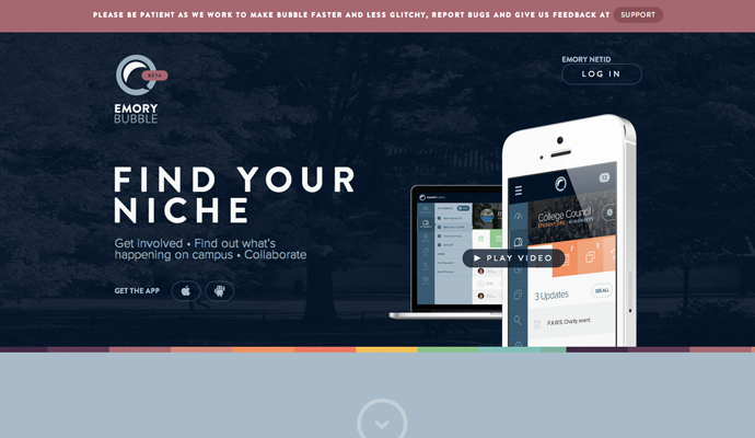
As you move down the page, information glides in from each side, which really spices up the simple scroll down.
7. Treehouse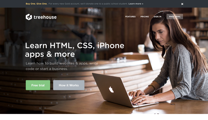
Treehouse alternates sections of descriptions and graphics for a visually balanced one page design.
8. Plentific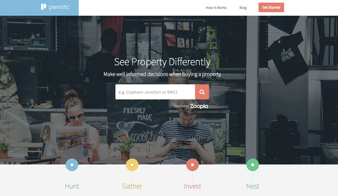
The testimonial section at the bottom of the page is a winner. When you mouse over each user story, the image is magnified just a little bit, which really draws the visitor in.
9. Oyster
Oyster maintains a fresh and readable page design, even with an abundance of CTAs, screenshots, and examples of the product, making the single page layout work.
10. Typetalk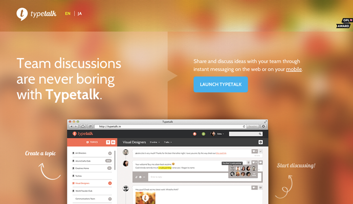
Though simple, this responsive one page design’s bright colors, thorough product description, and y-axis effects keep users informed and engaged.
11. Trippeo
Showcasing the product with fun animation, bold colors, and clean design make this site a standout.
12. Mooncamp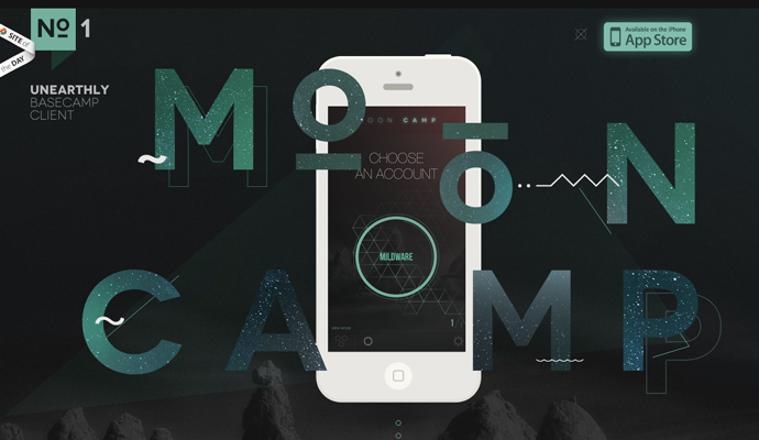
Mooncamp’s site features great images, a cool green-and-dark grey color scheme, and smooth animation. Plus, there’s a unique follows-your-mouse iPhone graphic at the top of the page andsticky navigation so you won’t get lost.
13. Once A Unicorn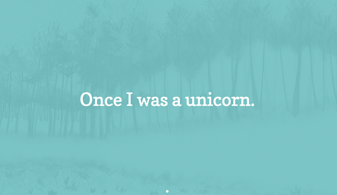
Perhaps one of the nicest aspects of singlepage design is its ability to smoothly tell a story. Once A Unicorn masterfully keeps you scrolling and learning more.
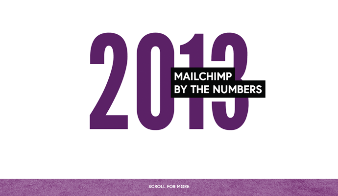
This single page heavy-hitter is brilliantly executed with layers along the z-axis. Images are tinted the colors of the rainbow, complete with quick and interesting stats that add up as you scroll down. Who said reports can’t be awesome?
15. Mixio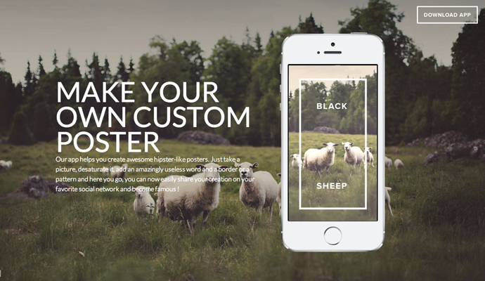
Big pictures, parallax scrolling, and an interactive iPhone graphic that allows you to click through pictures makes this one worthy to be called “inspiration.”


