Responsive web design term is related to the concept of developing a website design in a manner that helps the lay out to get changed according to the user’s computer screen resolution. More precisely, the concept allows for an advanced 4 column layout 1292 pixels wide, on a 1025 pixel width screen, that auto-simplifies into 2 columns. Also, it suitably fixes on the smartphone and computer tablet screen. This particular designing technique we call “responsive design”.
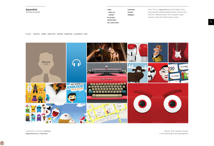
A portfolio theme with five unique pre-set layouts that support images and videos from Vimeo and Youtube.
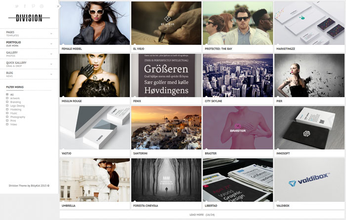
A full width theme that includes with a drag and drop page builder for creating custom layouts, that can work solely with only images or with both images and text.
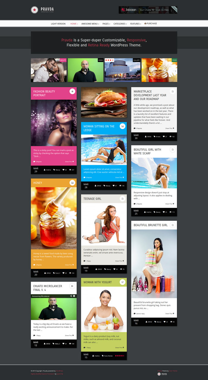
A Highly customisable theme that can be used solely as a blog or to show off photos and images in a portfolio.
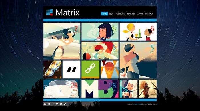
A tile based theme influenced by the Windows 8 interface. Each tile can be customized in different ways including animation and colours.
![]()
An excellent design for a photo showcase with social sharing option on image hover and some lovely animation effects on loading a page.
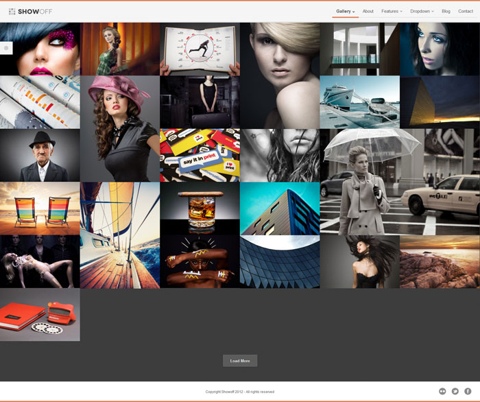
A full width tiled theme that works fantastically for displaying photography, video or graphics in a full width display.
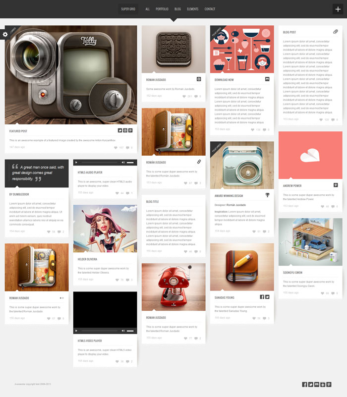
A Pinterest styled theme ideal for a showcase or portfolio and retina ready for i-devices.
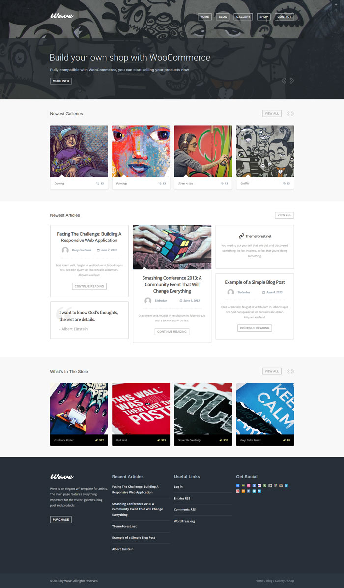
A clean design with several different layout options for artists and other creatives to show off their work, or simply publish a regular text post.
![]()
A full screen multipurpose theme for a gallery or blog with 9 templates for different layouts and styles.
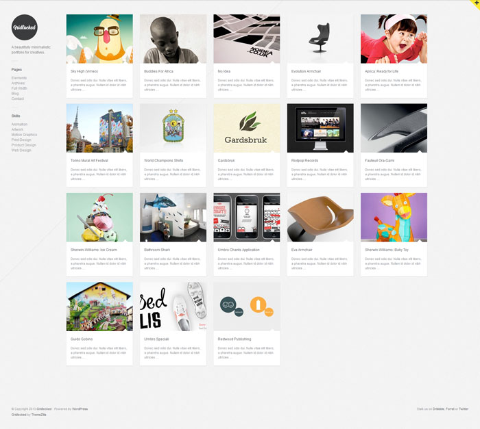
A minimalistic theme with animated shuffle effect when resizing the page, works as a creative showcase or a Tumblr style blog.
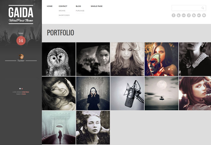
An ideal theme for a photo portfolio, including two different image layouts and a widget for showing off a Flickr gallery.
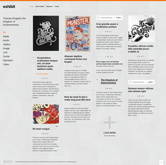
A theme with plenty of built in customisation options suitable for any content, whether video, image or text.
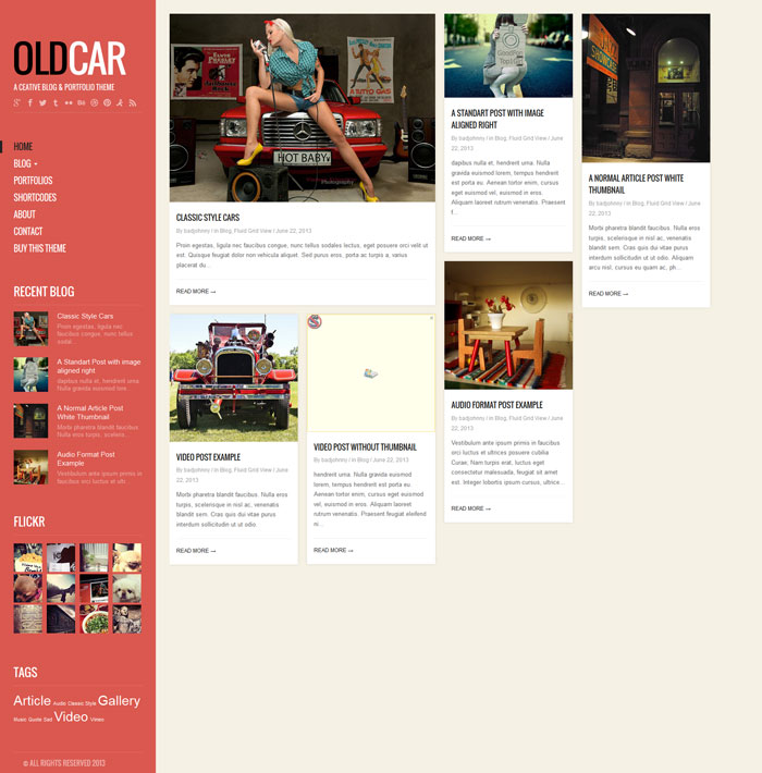
A colourful theme suitable for a personal blog or portfolio. Built in a Tumblr like style with a customizable home page through use of shortcodes.
![]()
A full width theme that works perfectly on both desktop and mobile views. The theme is well suited for a photography or creative business.

