Today, we are finding new ways to reinvent the process of scrolling with gestures, parallax scrolling features and more. We’re creating excitement and telling stories. We’re creating great user experiences and m
1. Alex Flueras Photography
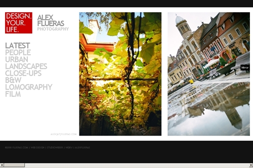
This art gallery style website features clean lines and lots of negative space. The simple color scheme makes it very easy on the eyes.
2. Bartle Bogle Hegarty
Keep your eye on the sheep, it leads you home. Aside from the fact that this site is horizontal, it features spectacular transitional animation well worth the loading time.

3. Carrot Creative
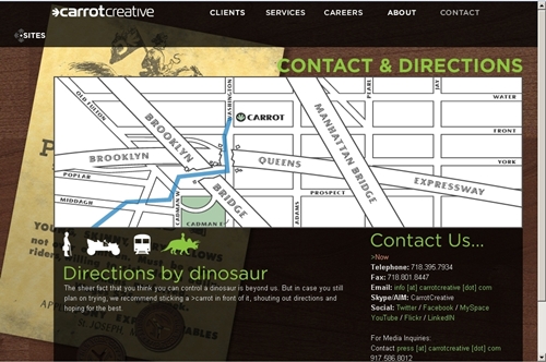
Carrot Creative features smooth transition and an understated humor. Take a few minutes to explore this site for hidden photos of robots and directions by dinosaur. Very creative.
4.Charlie Gentle
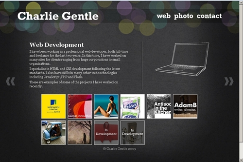
If you like bokeh, you’ll love the way that this site makes it multi-dimensional. The site is simple, but beautiful.
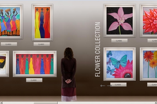
5. Candice Holloway
Another art gallery, this time with framed images and a smoothing background color. It’s straight forward and no frills, but it makes its point effortlessly.
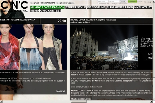
6. C’N’C Costume National
For those of you (ahem, including this writer) who think that blogs should not be horizontal, this site seeks to prove us wrong. Admittedly, this style is not for everyone, but it does have an urban vibrancy that makes you want to scroll through.
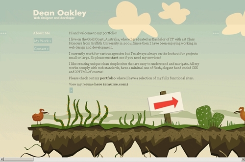
7. Dean Oakley
What list would be complete without this entry? Dean Oakley is practically synonymous with horizontal scrolling.
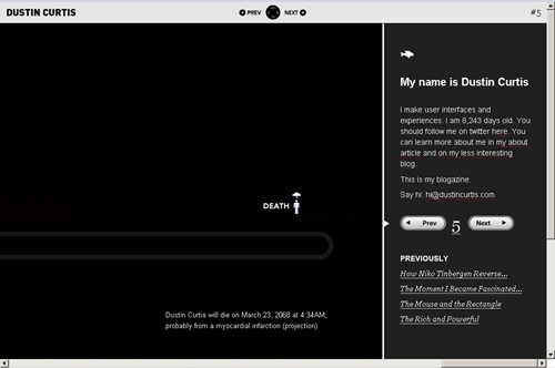
8. Dustin Curtis
Slightly morbid, but none the less compelling, Dustin Curtis’ horizontal website probably reveals a bit more than you ever wanted to know about him.
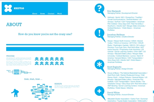
9. Exit 10 Advertising
This is not your average horizontal scrolling site. It takes you in all types of directions. Fortunately for the user, the navigation bar is always on top so that users can easily move through the site.
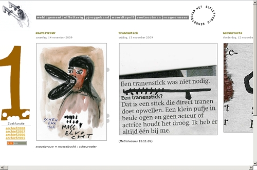
10. Elfletterig
Elfletterig is a Dutch site that features a straight-forward horizontal scroll. The reason this website wins a place on this list is the tag-a-long navigation that keeps you from having to scroll all the way back home.
11. Eolo Perfido Photography
The images will haunt you long after you’ve move on to another website. Horizontal scrolling is the most appropriate way of showing Eolo Perfido’s achingly amazing photographs. The scroll silently narrates you through the range of human ideology.

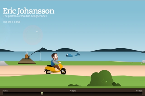
12. Eric Johansson
And for something in a totally different direction, here is Eric Johansson’s cutesy website with its own scroll bar at the bottom of the page. Love the use of lens flare.
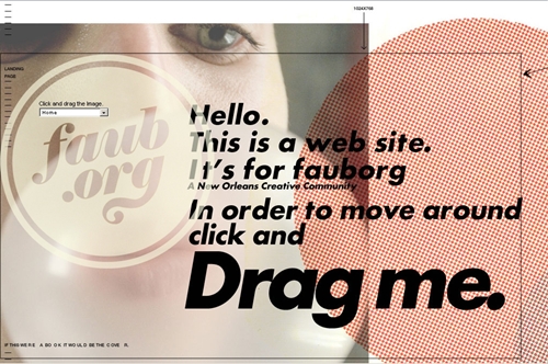
13. Faub
Faub is a different type of website, similar to Exit 10 from the no. 9 spot. What makes Faub stand out is unusual navigation. Probably the least usable website on this list, but also the most extraordinary, users must drag the page in order to view content… what little content there is.
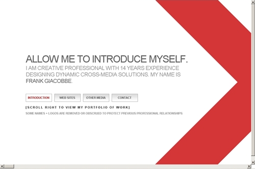
14. Frank Giacobbe
Not only does the whole website scroll, so does the menu bar. It features a huge amount of white space and efficient navigation.
15. Front End Design Conference
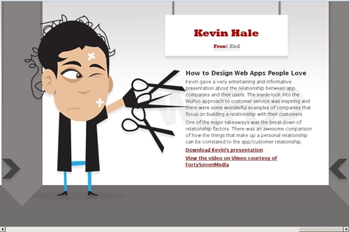
This site features adorable mascots and bold arrows. Although it’s not exactly the most innovative design, the site works, and keeps users moving forward.
