When creating a minimalist site you have to be very careful not to make it too simple cause people might look at it and say it was made in a hurry.
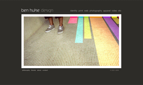
Ben Hulse Design
Dark gray background with white and gray lettering.
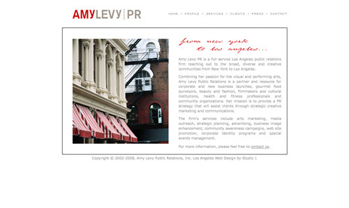
Amy Levy PR
White background with gray and red lettering.
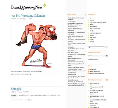
Brand Spanking New
A black and white color scheme with gray, orange, and pale blue accents.
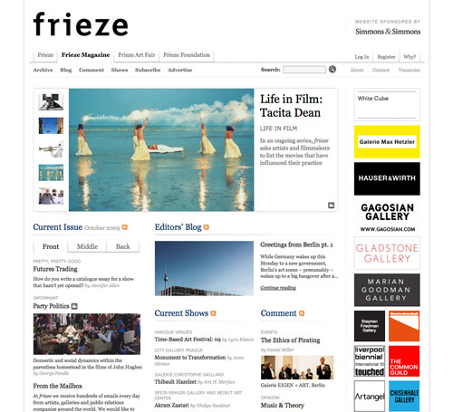
Frieze Magazine
A minimalist grid design.
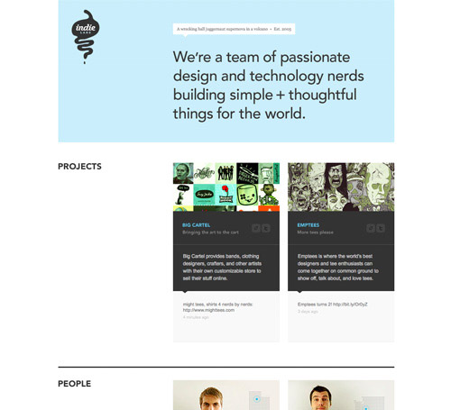
Indie Labs
A dark gray, white and sky blue grid-based design.
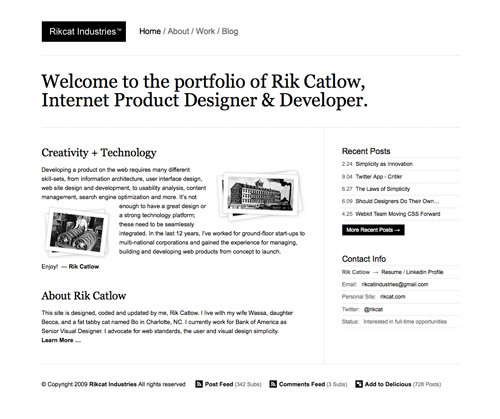
Rikcat Industries
An entirely black and white design.
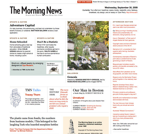
The Morning News
A minimalist magazine-style site.
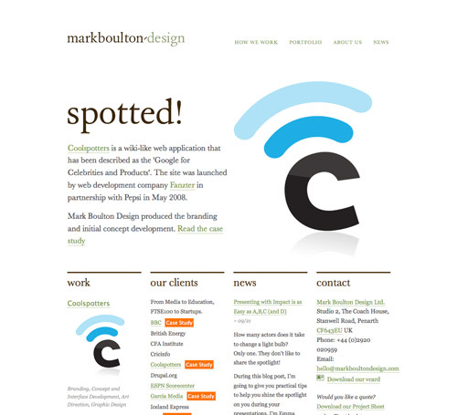
Mark Boulton Design
A mostly black and white site with colored accents.
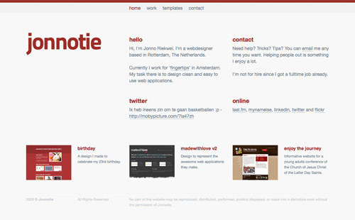
Jonnotie
A gray and maroon design.
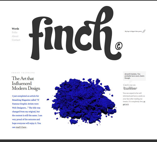
Finch
A mostly black, white and gray design.
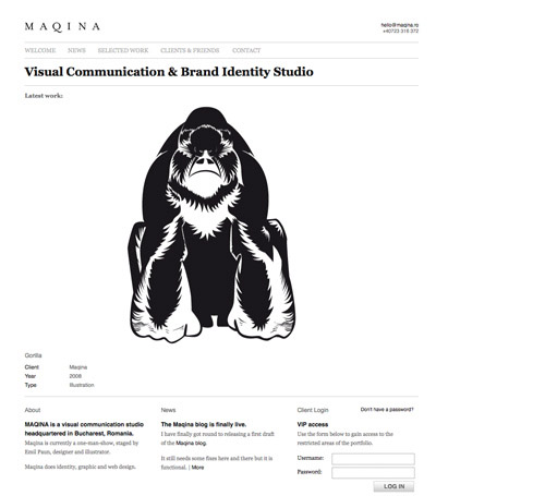
Maqina
A single column portfolio site.
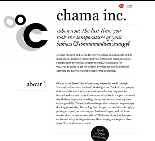
Chama Inc.
A simple black and white design with an emphasis on typography.
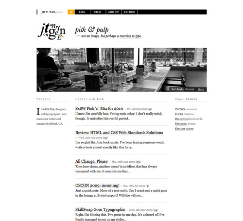
Jon Tan
Another simple black and white design with orange accents and great typography.
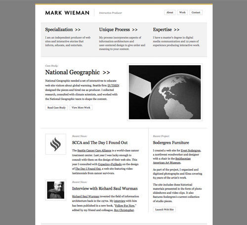
Mark Wieman
Gray and White with mustard-yellow accents.
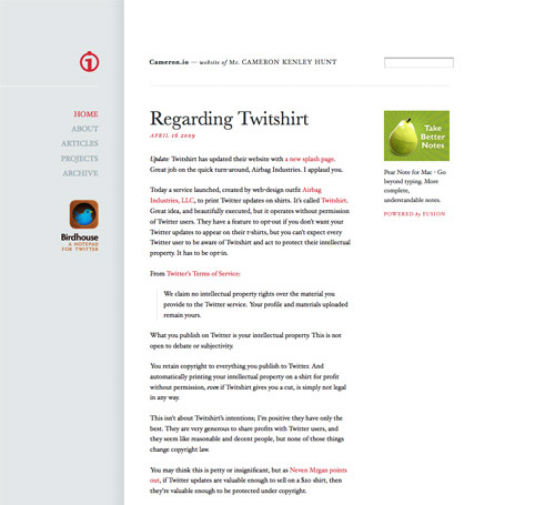
Cameron.io
A simple dove gray and white design with red accents.
