Game sites’ design is not what you have been use to seeing usually in the weekly articles, they are something totally different. Some might say that they are a little bit outdated technologically speaking, considering that they’re not using HTML5 or CSS3, or barely using serious CSS functions.
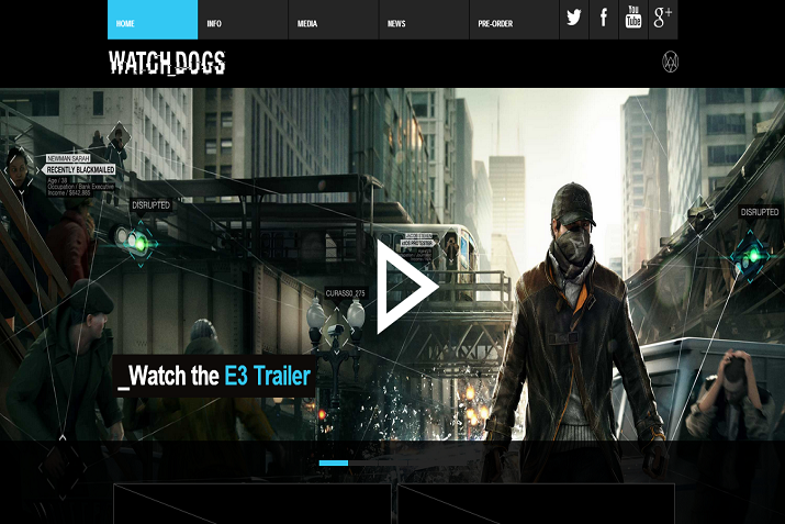
Watch Dogs
Like the game, this site has a futuristic and flat styled experience to it. The Watch Dogs website does well at promoting social elements of the website and game with large, attention grabbing aspects and social widgets to it. It also brings an easy-to-navigate sticky menu to the experience while keeping the flat futuristic style.
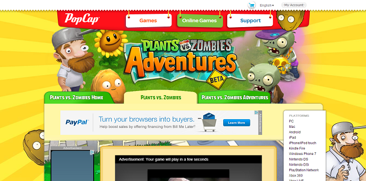
Plants vs Zombies
This website really brings all the information and content you really need on one page; no need to navigate through unnecessary pages! The website also has integrated the actual game on the homepage with links and images linking to full versions to the game.
Saints Row IV
This website is another mix between a video game website and a video game community. It takes advantage of great gradients and transparency with the theme of purple and silver. It also has some great wide content sliders, community profiles which show in-game content and characters, profile customizations and has some pretty well-made graphic elements such as a “Saint’s Row” newspaper, which is created with CSS and JavaScript.

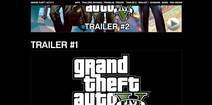
Grand Theft Auto V
Grand Theft Auto Five’s website has a simple design with a unique video game website trait: a one-pager. The website is certainly plain and simple but in a way, unique for a video game website.
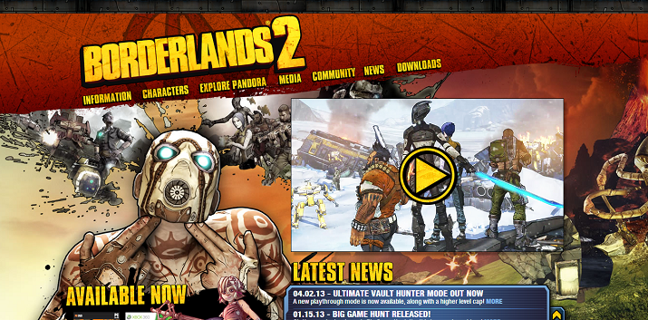
Borderlands: 2
The game itself has kind of a flat or cartoon art to it and the website design was definitely inspired by that look and creativity. One of the neatest features of the Borderlands: 2 website design is the content side animation that displays when you navigate to a different page or post.
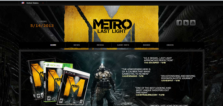
Metro: Last Light
This website gives the user an experience that brings them closer to the game, with a large slider with a customized Metro: Last Light video player theme. While the website is indeed a simple design, it promotes the content and brands it well with the game’s stills and logos while also promoting their email newsletter heavily.
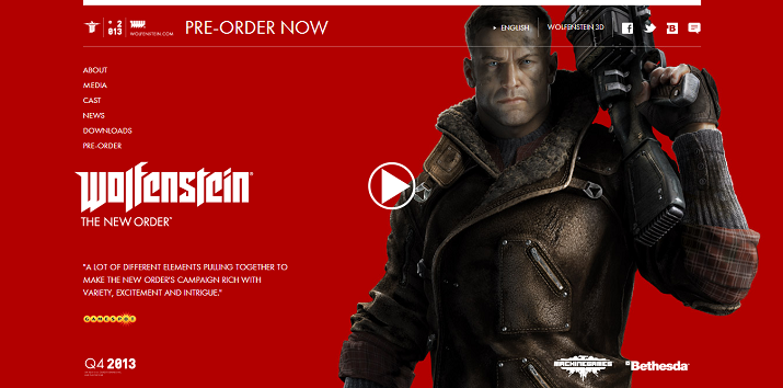
Wolfenstein: The New Order
This website has been designed with creativity in mind with a fade-out featured one-pager. It makes use of some great background images, great looking video popup with stylish next and previous buttons. The social elements really pop-out to the user navigating the page with a sticky navigation bar and the website also has a useful retailer promotion for the pre-orders at the end of the page.
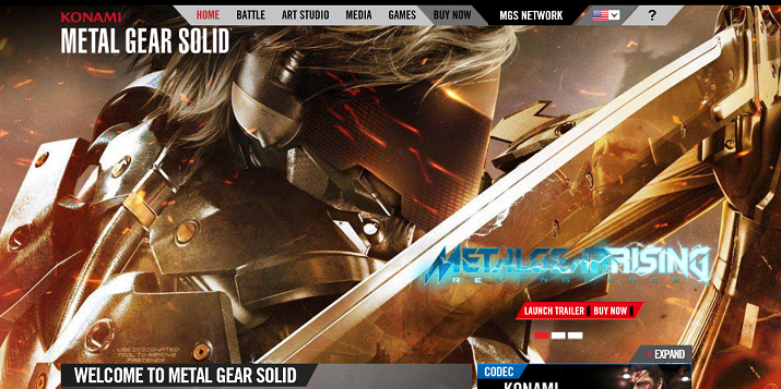
Metal Gear Solid V
One of my favorite video game website designs, Metal Gear Solid V presents you with a sleek and easily navigable menu with an almost full-screen background slider and some small content widgets below it. In this design the background slider is one of the design features that really makes a bold first impression.
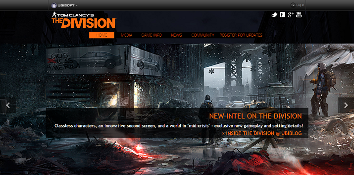
Tom Clancy’s: The Division
Last but not least, we have yet another blur between video game website and community website with Tom Clancy’s: The Division. This website is the perfect example for an upcoming game website that has just been announced, quite frankly because that’s exactly what it is. The website is simple yet themed perfectly for the upcoming video game. It has a large slider perfect for high-resolution pictures, snapshots and videos of the game.
.
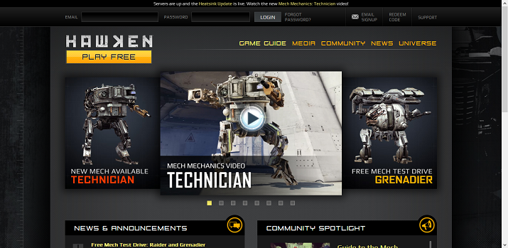
Hawken
Hawken brings a somewhat different approach to video game websites, it blurs a video game site with a community website. This site features an great looking slider, a blog, video portal and community driven pages. Hawken’s website truly brings a unique experience.
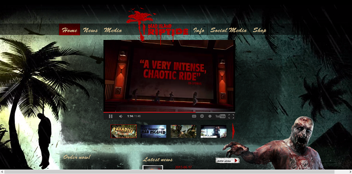
Dead Island: Riptide
This site is simple yet creatively made. Dead Island: Riptide’s website has great “flowing” animation to it, with a few unique features that can be played around with using your cursor. As you navigate through the website you will find that the animation and graphics are really tailored to the user’s viewing experience.
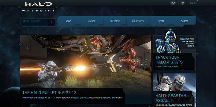
Halo: Waypoint
Halo: Waypoint is the official hub for all the most recent Halo Games. Waypoint brings the creativity and the style of the Halo games right into the website with its design, menu and beautiful fonts. It features a slider with a fresh Halo look and Halo styled video players, which allows for easy and simplified user engagement. This site brings the Halo experience online with leaderboards, game stats, forums and blogs.
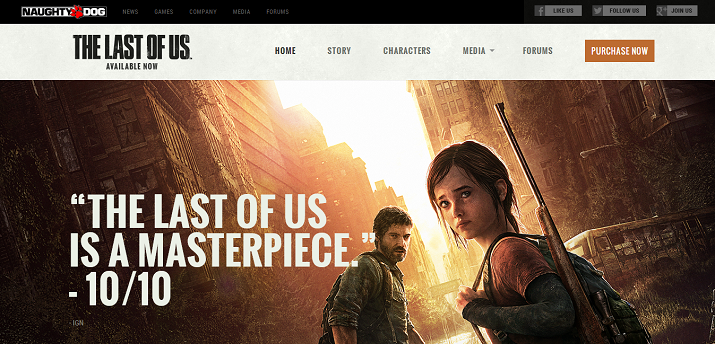
The Last of Us
The Last of Us website is all about the content. As you navigate through the site you will find multiple content widgets that holds links, media, images and slides that take you through video game content like trailers, teasers, game play, articles and more. The Last of Us is a great example of content and experience promoting video game website.
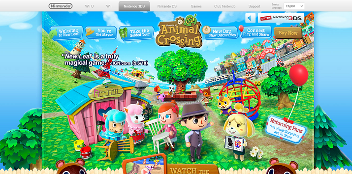
Animal Crossing: New Leaf
This magical life simulation children’s game has a colorful and artistic design with music, animation, guided tours and even has a built-in community website. As you navigate through this website you may just get inspired to create a unique colorful, animated website design of your own.
Final Fantasy: A Realm Unborn
This site has some great graphically rich navigation. It also features great game-themed buttons, artistically CSS-styled images, uniquely placed character images and 3D in-game object viewer. I’m not the Final Fantasy type of guy, but their website design is graphically rich.
