Navigation is, obviously, one of the most important things to get right in website design. Traditionally, menus have been placed at the side or top (or both) of a web page, but these days things are changing. We will never be able to change the importance of good navigation, but it can be taken to higher levels these days, with some navigation menus taking all of thelanding page space.
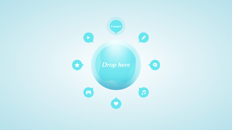
This is definitely a different kind of navigation… to select any of the categories you have to drag and drop it into the center bubble – maybe more novel than unique, but creative for sure!
Van Alen Institute
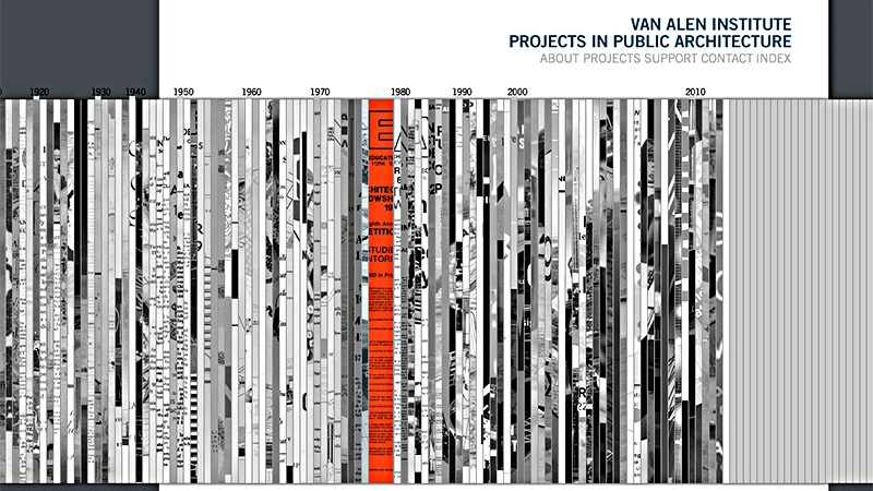
This is a timeline of Van Alen Institute’s projects in public architecture, and there are a lot of them! The slits of paper slide out, but only slightly, on mouseover, so not enough information is revealed to see what the project is, but a decent way to present so much information.
Organic Grid
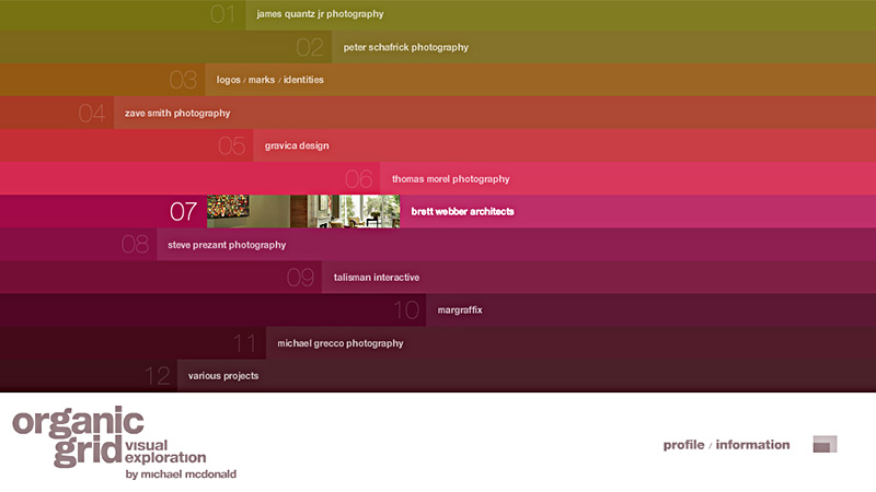
A very colorful home page on which the navigation uses most of the space. Clean, clear and interactive leaves you in no doubt where each link will lead.
On this website the navigation within each category is created in a very unique manner. When clicking each bucket, it zooms a bit, while the area around get blurry. What’s more when you are in the single product view, at the bottom of the page, there appears a reference line with links to other products in this category.
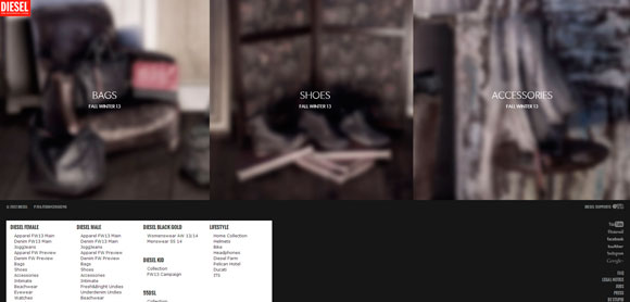
Kurka Wolna is a one page website which is quite huge actually. When the site loads you are explained how to navigate, so you need to use your mouse to drag-and-drop the page. Follow the chicken traces to get to part of the site you want to get to.
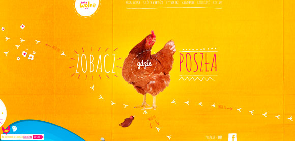
Another great example of a single page website. The navigation bar is on the top of the site, just click the link and corresponding part of the site will open. The site utilizes parallax and bunch of other cool features.
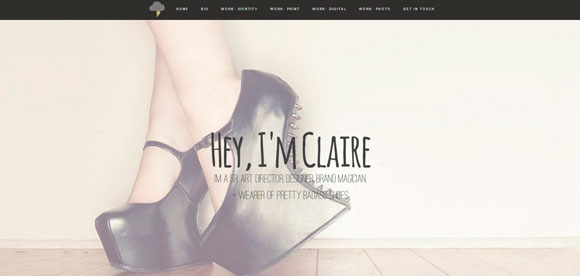
House is really amazing website from the stand point of technological stuffing. Video background on the home page, parallax scrolling, and a single page design.
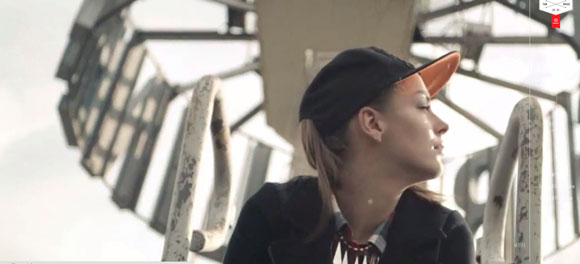
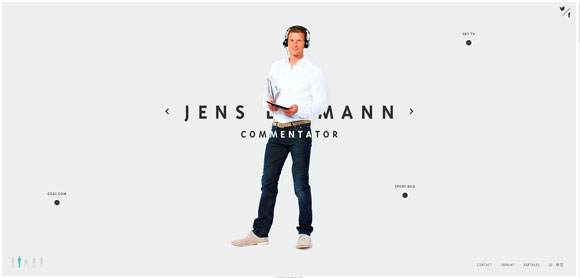
This is a website of an ex German goal-keeper. In his website Jens appears in five roles: coach, commentator, goal keeper, ambassador and speaker. Switch between the figures at the bottom to find more about life and activities of Jens. The Website utilizes an effect of slides; while you scroll these slides replace one another. In the left part of the page you can see the navigation bar showing you which slide are you at right now.
This websites unites information about progressive technical developments; things that will blow your mind. Parallax, full-width videos, animated logos – those are just tiny bits of what you’ll see here.
Toybox
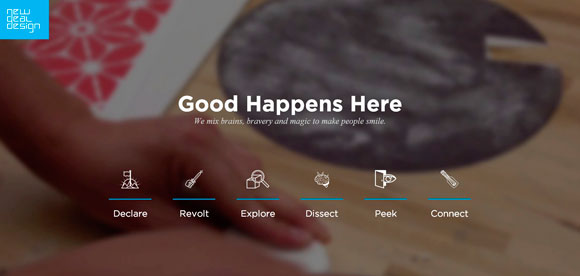
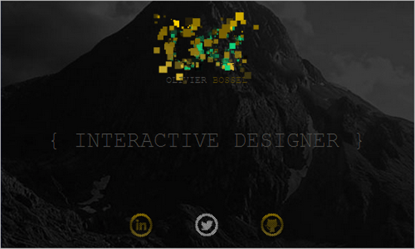
Navigation should always be there when needed, and graciously disappear when the user wants to focus on a particular task. For example, in designing the checkout for an online store, the navigation should always be accessible but also give enough prominence to criticial features of the website, such as the checkout form. The navigation for Toybox does just that.
Olivier Bossel
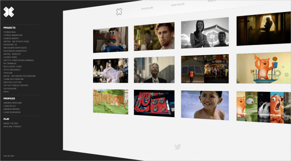
The portfolio of Olivier Bossel, an interactive designer, is interesting. The navigation elements create an effect of exploding pixels as you hover over them. The effect is quite dynamic and contrasts with the otherwise clean design. It works nicely as a visual element because it encourages the user to continue through the website. The consistent visual voice and tone complement the brand’s identity. Just by viewing the website, the user experiences the designer’s work.
Tsto
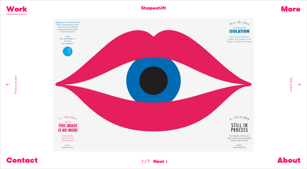
Tsto, a design agency, has a simple yet unorthodox approach to design; its navigation is different from what we’d expect. A navigation element is fixed in each corner of the screen, framing the work being showcased. The visual identity is created with heavy hot-pink letters, along with the descriptive information. The hierarchy is clear, however, with the “Work” tab in the top-left corner, and the “Contact” and “About” tabs at the bottom of the page. In keeping with the style, the title of the work being showcased is in the same heavy pink font.
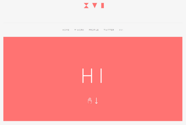
Derek Boateng’s portfolio welcomes the user with a polite “Hi” upon loading, and an arrow directs you to scroll down. The general design is understated; it doesn’t shout at you, but rather gently guides you through the work. As you scroll down from the loading page, the header and navigation shrink back, allowing more space for the portfolio. This is a good example of navigation that is always accessible yet gives center stage to the main content.
Second Story
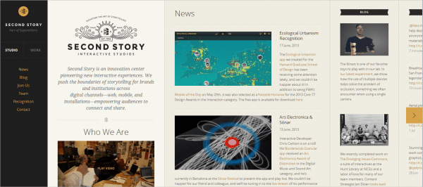
Ah, good ol’ horizontal scrolling! Second Story’s website works like a magazine app on a tablet. It is innovative in that it doesn’t have the feel of a typical Web page and it scrolls horizontally. The content is laid out in columns, and each section scrolls vertically. The navigation is anchored to the left, which helps to establish the rhythm. As you view this portfolio, the navigation minimizes to a bar on the left and reappears when hovered over. You can choose to view the portfolio in thumbnail view or as a slideshow.
Mostly Serious
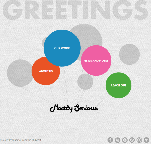
As its name suggests, Mostly Serious has an element of playfulness to it. You are greeted by navigation that is designed as balloons floating around. The friendly animation creates movement on the otherwise static website and sets the tone for the brand. While you can come back to the home page at any stage, a subtle navigation bar appears at the bottom of the page. The website is functional, with a splash of the studio’s fun personality. Actually, it reminds me of funky Flash animations from the good old days (EYE4U, anyone?), but because the website is supposed to be a little playful, it works well in this context.
