Sometimes, brands become so big and familiar that we no longer notice the nuances hidden within their logos. Large, established companies are often thought of as somehow less clever and creative than smaller, edgier startups. But, if you take a look at some of these old, familiar logos, you might discover some symbolism, tricks, and twists that you’ve been overlooking for years. Let’s have a look at twenty logos – ranging from simply “big” brands to ubiquitous companies – that have some hidden cleverness for the observant eye.
Big Ten Conference
The Big Ten Conference of US collegiate teams ran into quite the branding problem. They briefly had eleven teams. (Actually, they have twelve now after Nebraska joined in 2011, and they’ve apparently abandoned any hope of reconciling their total team tally with their brand name.) Negative space provides the opportunity to include all 11 teams.
Goodwill
The “Goodwill” logo strikes a balance between a typographic and an illustrative logo. The “G” forms a friendly smile. Well, half of one at least.
London Symphony Orchestra
This brilliant logo combines the suggestion of a symphony conductor (complete with a baton in his right hand) with the “LSO” acronym.
Milwaukee Brewers
The Milwaukee Brewers combines a traditional baseball glove with the letters “M” and “B”.
Sun Microsystems
Sun Microsystems’ logo seems to spell the word “Sun” in endless circular (clockwise) sequences.
Elettro Domestici
Through clever use of negative space, Elettro Domestici spells out “ED” while simultaneously showing an electric plug.
My Fonts
My Font not only employs an interesting font to represent what they’re all about, they also included a swiping hand, as if to reiterate the possessive nature (Mine!) of their chosen brand.
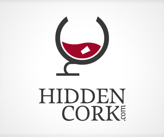
Hidden Cork
Hidden Cork’s logo forms a wine glass with the letters “H” and “C”. And, they hid their own cork through use of negative space.
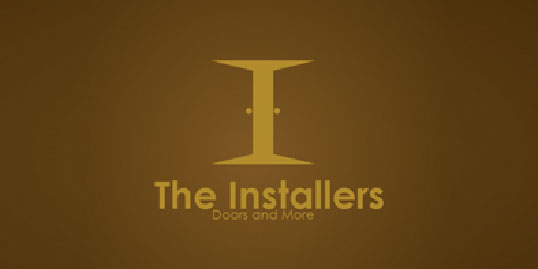
The Installers
The Installers used their own installation of double doors (and a well-lit room behind them) to form a capital “I” through negative space.
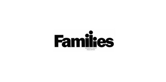
Families
“Families” included a family of their own with an interesting take on typography in the middle of their family-friendly logo.
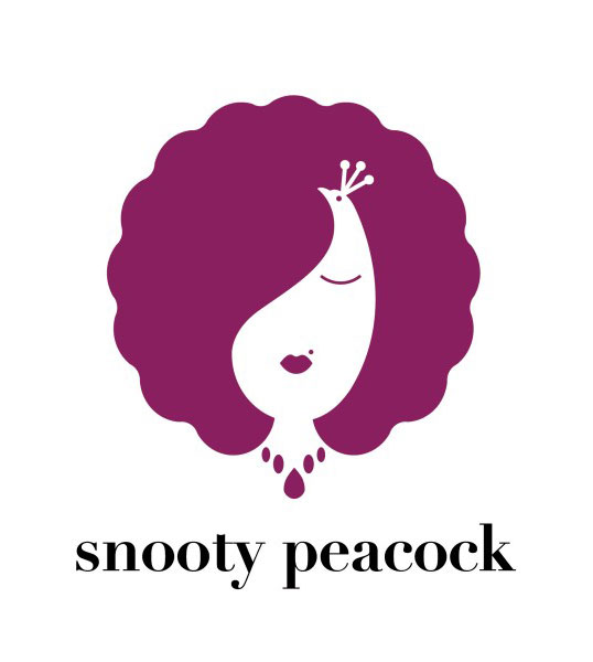
Snooty Peacock
In the tradition of M. C. Escher, Snooty Peacock conflates two completely different images together to form their logo.
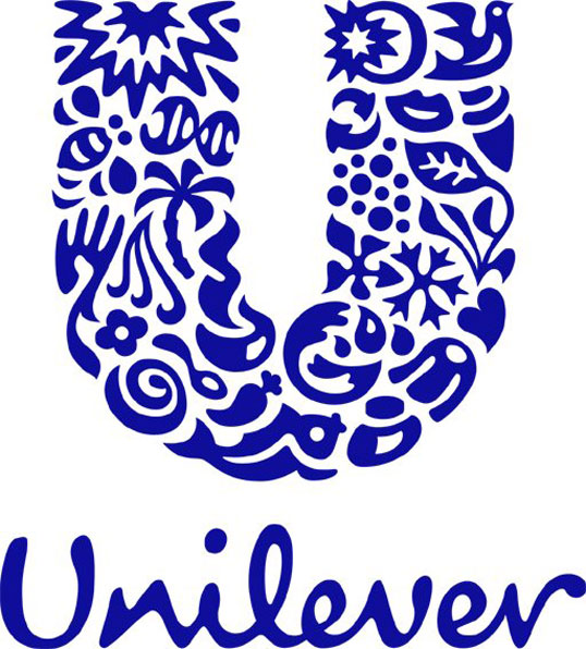
Unilever
Unilever has 24 different facets to their business, and each of them is represented withing the greater “U” of their brand.
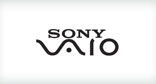
Sony Vaio
Sony Vaio’s logo represents the evolution of analog to digital. The “V” and “A” from a typical analog “wave,” and the “I” and “O” form the essential binary code that forms any digital information.
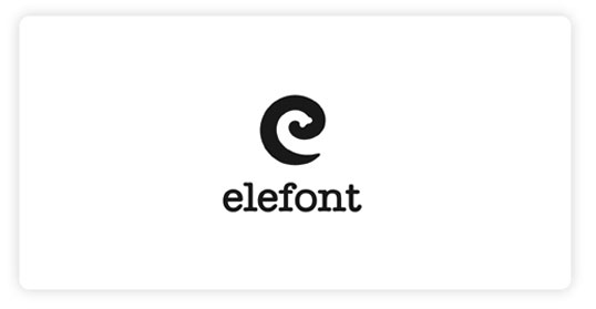
Elefont
Elefont not only chose a remarkable font for their logo, they also found room for a lowercase “e” and an elephant’s trunk.
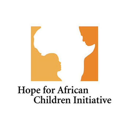
Hope For African Children Initiative
The Hope for African Children Initiative’s brand clearly contains the continent of Africa, but it also includes a child and an adult facing each other within the negative space.

