The web is a wonderful thing, brimming with resources and tutorials for people wanting to learn about the art of logo design. But, sometimes, too much choice can be confusing, so we’ve picked some top online resources that’ll really help you get to grips with it.
V&A by Pentagram (Alan Fletcher)
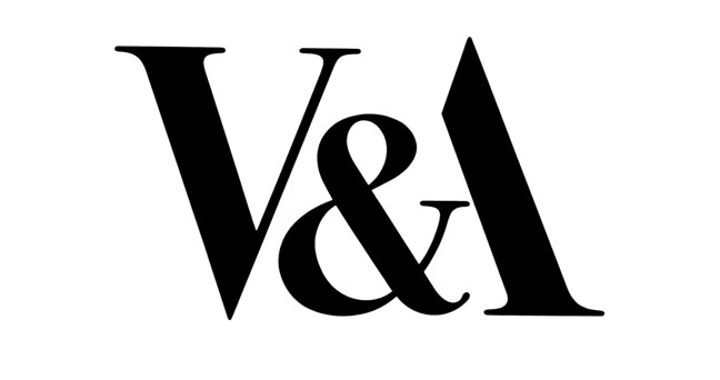
Probably the mark that Pentagram is most renowned for, the late Alan Fletcher’s identity for the V&A Museum, designed in 1988 is breathtakingly simple and brilliant. The V and A mirror each other in form and the ampersand simply creates the crossbar of the A, ridding the need for any further detail on it. Brilliant.
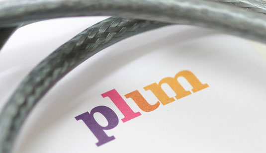
Sometimes just applying a certain shade to a logotype can give it new depth and meaning. The colours 400 used in this logotype for telecoms and media consultancy Plum are very appropriate, as they remind one of different varieties of plums or plums having a varying degree of ripeness. The letterforms, particularly the ‘u’ and ‘m’ link together effortlessly.
Make by Greig Anderson aka Effektive
The power of subtraction – sometimes removing a piece of a letter from the logotype can give the logo new meaning.
Action on Hearing Loss by Hat Trick Design
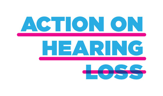
Sometimes simply underlining and striking through letterforms can also convey an enormous amount. In this case, by underlining one section of the logotype and striking through the rest, it highlights the positive, ie. being able to hear and taking action, while the strikethrough eliminates the negative ie.loss of hearing and transforms the logotype into an inspiring call to action.
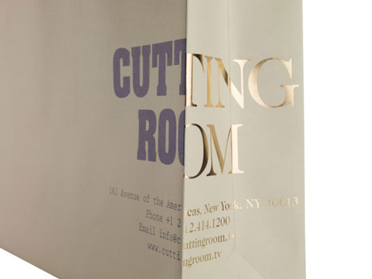
MadeThought captures the essence of The Cutting Room’s editing suite by contrasting two very different typefaces next to each other. The result is an elegant solution that is superbly executed across their website and packaging design. The identity is especially masterfully executed on the carrier bags, having been chosen to make full use of the corner of the bag. Brilliant.
Based in London, MadeThought is a multi-disciplinary agency with a focus on well-crafted and well thought out, considered solutions. They have a diverse body of work that spans brand identity, art direction, packaging and interactive design.
Another recently redesigned logo, again making use of bold capitals, popular Swedish vodka brand Absolut also offers a rare example of punctuation in a modern logo. The full point shows the supreme confidence of the brand; conveying a message along the lines of: ‘This is the brand for you – period.’
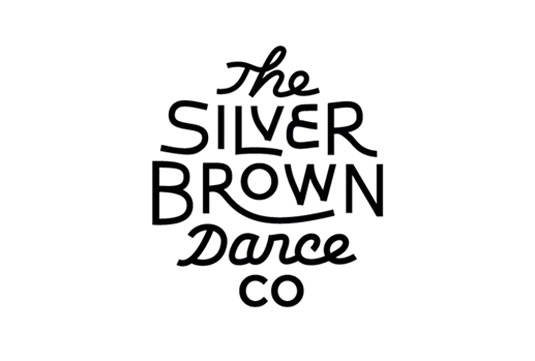
Based in Amsterdam, Mark Sloan is an incredible designer with a sharp eye for typography, which can be seen in his excellent body of identity design. His identity for The Silver Brown Dance Co masterfully mixes script and sans serif type in a way that they work cohesively together as a unit.
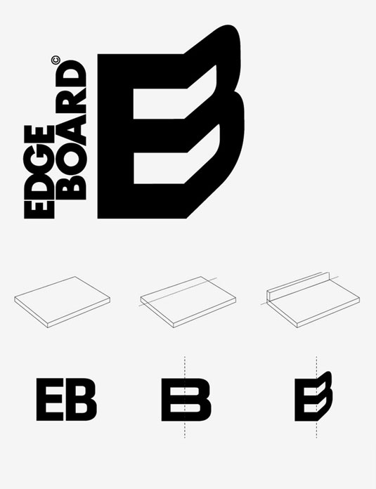
Edge Board is handmade chopping board with a unique feature – an edge you can use to gather and slide chopped food, preventing it from spilling on the floor. Here, the product’s initials happily coincide and demonstrate the Edge Board’s feature in a simple but effective fashion.
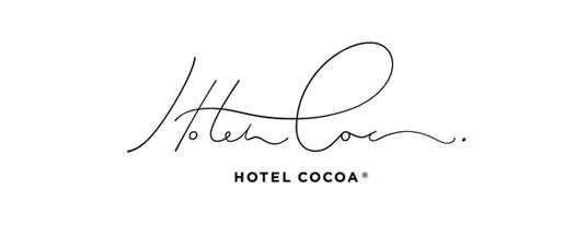
Masterfully combined flowing signature-like typography with an accompanying simple sans serif descriptor. Beautifully executed.
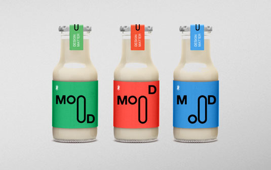
Here Jakarta-based Zaky Arifin has created a fun, organism-like logotype through altering a single letter and has created an imaginative variety of different lock-ups for different collateral.
Chocolate Research Facility by Asylum
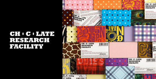
Asylum’s design for chocolate store Chocolate Research Facility makes great use of positive and negative space, through only using the counter spaces of the ‘o’ in the logotype.

Another great example of using the positive and negative shapes of letters in a logotype can be seen in this strong brand identity by Fabian Parra. The encircling ‘B’ could also be used as a stand-alone icon for the brand.
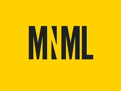
MNML is a publication that informs readers about minimalist architecture and design, aimed at 20-35 year old art lovers. It uses a minimalist design and colour palette to portray the topic, and this logo design by its creator, graphic designer Cassandra Cappello, is a brilliant use of typography and negative space.
CityHint by Deividas Bielskis aka Contrast8
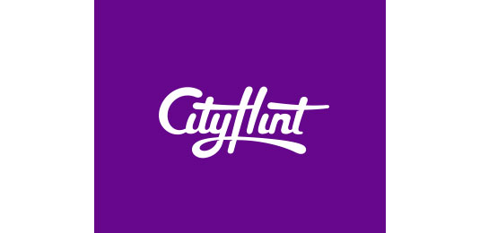
This custom liquid-like identity for CityHint, an easy way to find and book spa and salon appointments, has a beautiful sense of flow and is a great example of letters working interlinking together effectively. In both cases the letter ‘t’ adds detail to other letters in the logotype.
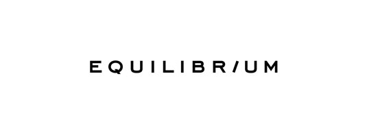
The subtle rotation of a single letter can convey a huge amount. Here just a small shift in direction captures the moment just before equilibrium (a state of rest or balance) is reached.
Trafiq by Kissmiklos aka MIKLÓS KISS
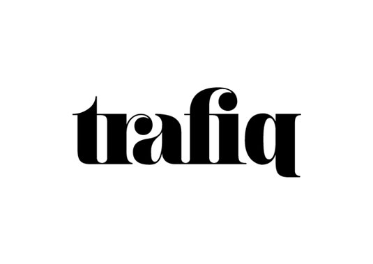
A beautiful use of playful, yet classic ligatures in this logo for a Budapest night club. Here the ‘r’ and ‘f’ in the logotype complete the letter next to them.

