I know everybody and their brother does logo roundups so you’re probably sick of them, but I don’t believe I’ve ever done one and there is a particularly impressive brand of logo design that I wanted to point out.
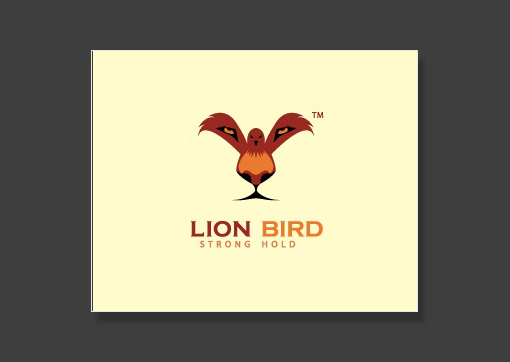
Lion Bird
If you stare straight at the bird’s feet for a second, a stunningly clear lion’s face emerges. Brilliant design!
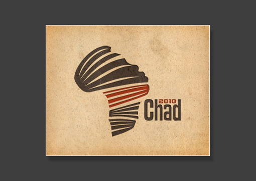
Chad 2010
I love this one. There’s a sort of ribbon theme that makes both a face and the continent of Africa.
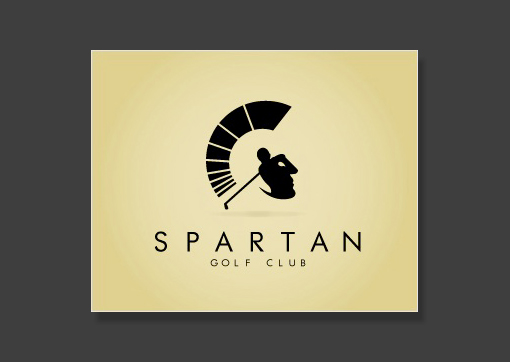
Spartan
Simply beautiful use of negative space. The golfer and his swing double as a soldier’s face.
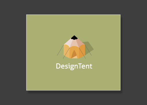
DesignTent
A tent and a pencil.
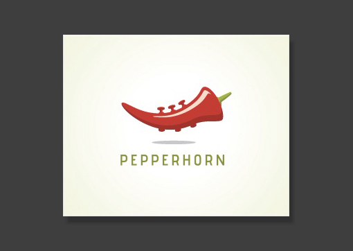
Pepperhorn
A pepper and a horn.
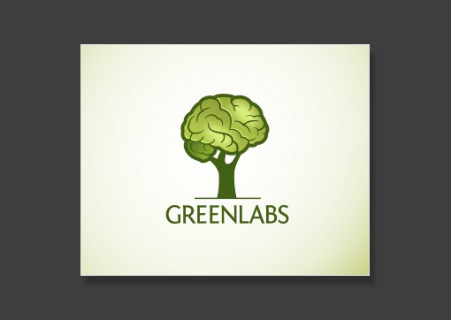
GreenLabs
Green here is symbolized by a tree and labs is represented by the brain. That’s a sharp looking tree brain!
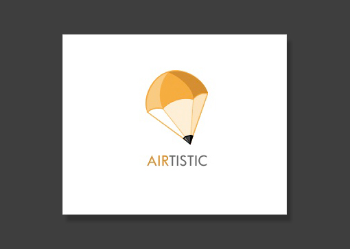
Airtistic
Another pencil idea very similar to the one above. This one is a parachute and a pencil.
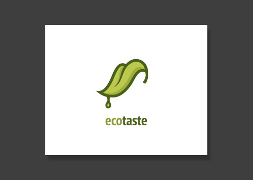
Ecotaste
A tongue and a leaf. A little creepy but a great idea!
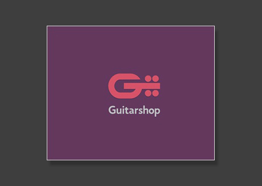
Guitarshop
The letter “G” and a guitar. Simple but effective.
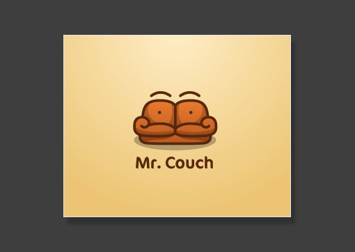
Mr. Couch
This is definitely one of my favorites. The couch has cleverly been crafted to also be a face with a mustache. Excellent work!
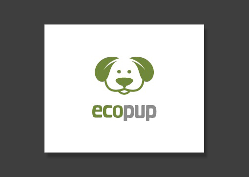
Eco Pup
The dog’s ears are leaves. Sometimes subtle is better.
Mailhouse
The open envelope creates a house shape.
WordRefuge
The open book makes a tent. Not my favorite but it makes for a good visual read.
Australian Pork
This one makes me laugh. Australia has been turned into a pig’s snout!
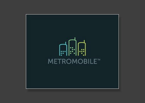
MetroMobile
The city skyline doubles as a row of cell phones.
