Creating personal portfolio website is probably the most challenging task for designers as it should reveal the talent and some special unique style of its author.
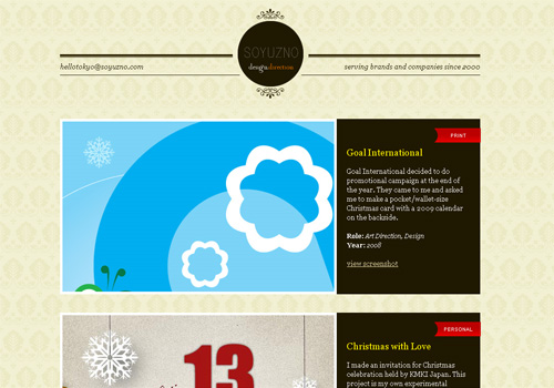
Soyuzno
This portfolio belongs to Tokyo-based designer Soyuzno, so no wonder that Japanese laconism is the foreground theme of the design. Elegant solution, isn’t it?
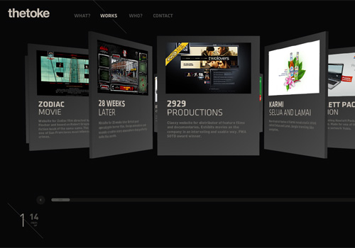
thetoke
Flexible 3D gallery and stylish typography give some unique flavor to this site. You can choose the way of showcase display.
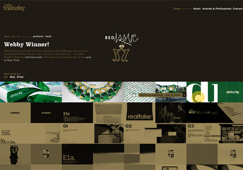
Hello Monday
Hello Monday’s portfolio featured with lovely chocolate color scheme and draggable navigation provides a memorable user interface.
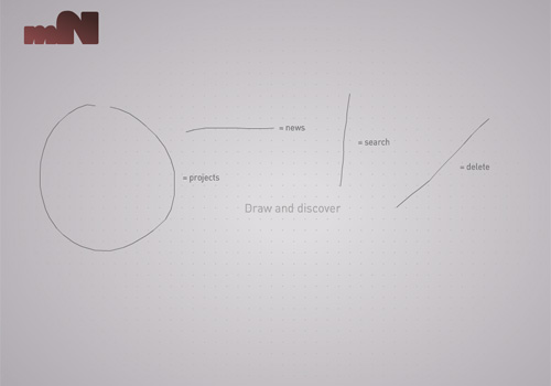
magneticNorth
magneticNorth’s portfolio brings an extraordinary interactive interface to the visitors. Drawing shapes on the page discovers company’s projects.
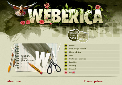
Weberica
Scattered brushes, rich colors, subtle strokes of the paint brush – welcome to artist’s studio! This design is very attractive and tasty.
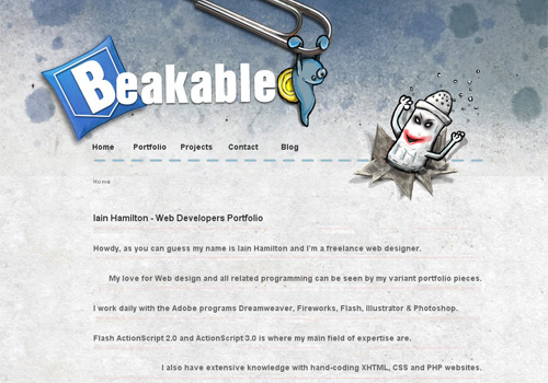
Beakable
Iain Hamilton’s portfolio is interesting and unconventional. Maybe funny characters in the header make up the core feature that singles out this design.
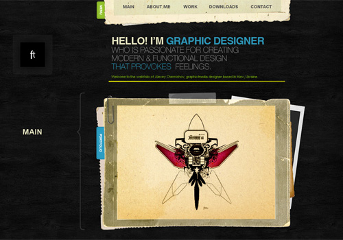
Ft
Background made in imitation of ebony, old paper effect in frames and ascetic typography make the portfolio of Alexey Chernishov look elegant and impressive.
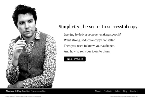
Alastaire Allday
The main theme which runs all through Alastaire Allday’s portfolio is… Alastaire Allday. It makes sense as pure and sincere presentation arouses trust.
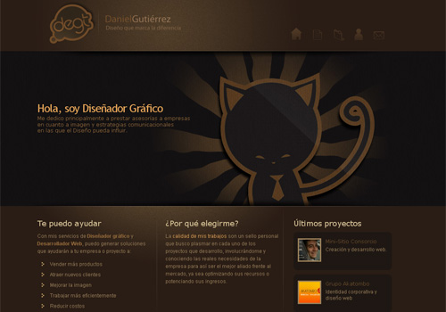
Daniel Gutierrez
Beautiful portfolio design with captivating color scheme, simple but neat grid-based gallery and charming paper kitten in the header.
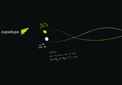
Zupadupa
Romanian web agency Zupadupa offers visitors to take white or green pill to navigate the website. Doesn’t it remind you anything? No matter whether designers are quoting Matrix trilogy or not, this choose-a-pill-thing is something quite creative and interactive.
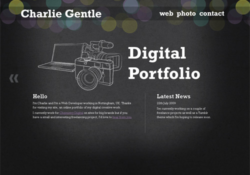
Charlie Gentle
Charlie Gentle implements perfect jQuery style in his portfolio. Nice sketch elements, clean typo and illuminated centered content accentuate the original nature of the design.
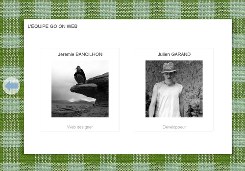
Go On Web
The following portfolio is created using HTML 5. Cloth imitating background that changes its color while you scroll is superb.
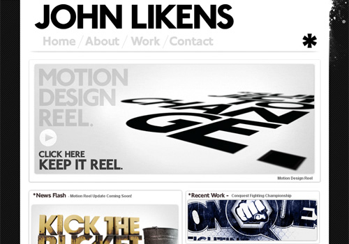
John Likens
Big typo, big showcase grid, big success.
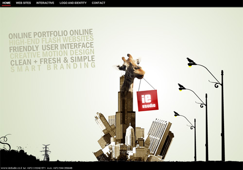
IE Studio
IE Studio created their portfolio with unusual stylish approach. Interesting collage in the center of the home page is a highlight of company’s identity.
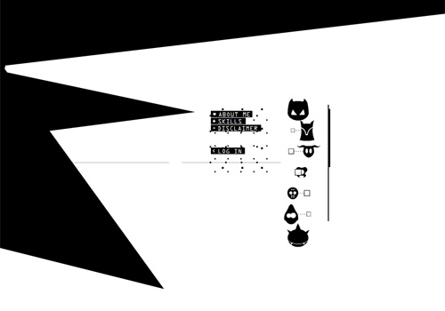
Inside Piet
With this portfolio Belgian Flash developer Piet Dewinjgaert gives you an access to his own brain! it’s difficult to describe what is going on there, so you’d better visit and see it!

