With new technologies like HTML5 and CSS3, it’s becoming possible to create more advanced, interesting and remarkable effects in the browser. While these effects can be gimmicky, when employed in the right way they can result in a remarkable and memorable website.
01. Alquimia WRG
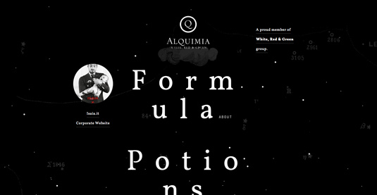
HTML5 canvas is used to animate the initial loading image. Subtle “parallax elements in the homepage are dynamically created and animated to simulate a 3D space environment through mouse movement,” says Andrea Bianchi, creative director at Alquimia.
SUBSCRIPTION OFFER

When such content is loading, a JavaScript animated preloading bar appears at the bottom of the screen, which is a nice touch.
The site achieves its goal, which, as Bianchi says, “was to create an ideal balance between content, usability and user experience”.
02. The Royal British Legion
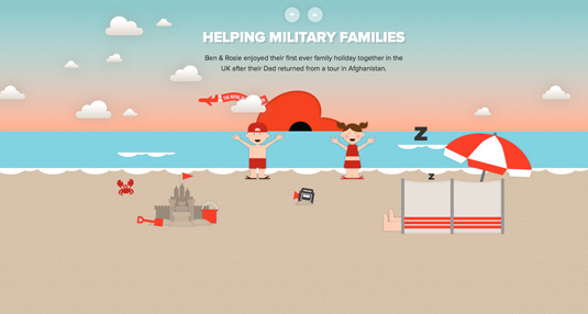
There are lovely parallax-scrolling elements throughout the site that will appeal to children, and the one-page site lends itself so well to youngsters scrolling on tablets, too. Greatrex enjoyed being part of the site, and says, “This project was a lot of fun. The concept really leant itself to us being able to add lots of playful ‘easter eggs’ for the user to explore and discover.”
03. Nintendo Game Boy

With plenty of projects capturing the glory days of Nintendo, the 25th anniversary of one of its most popular consoles seems another fitting tribute. You’ll love this site if you’ve ever had a Game Boy youself.
04. Flat design vs Realism
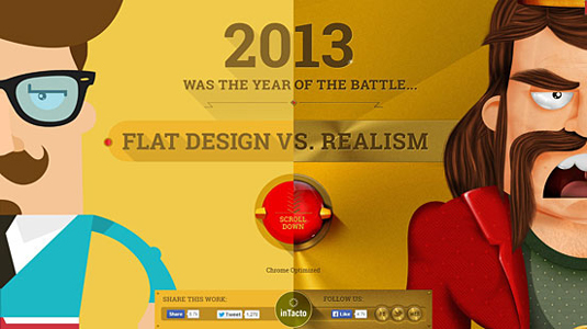
“One of the principal problems was to insert the HTML5 game in the middle of a parallax scroll,” explains inTacto’s creative director Alejandro Lazos. “We wanted everything to be continuous and without jumps while scrolling, so the users could at any time go from start to finish without interruptions. To achieve this we utilized Ajax technology to pass parameters to the url, and the game which loads in a div, is in charge of collecting those parameters and display the corresponding loading screen (flat or realism).”
05. Sony
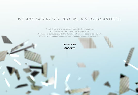
“It was meant as an insult, but we took it as a compliment. Combining artistry and engineering IS an experiment but when artists work with engineers, every day is a chance to be moved.” Scroll for yourself and see what all the fuss is about!
06. Costa Coffee
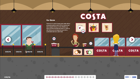
This impressive one paper website, The Costa Experience, is the brainchild of Brighton-based agency Graphite Digital. Having worked previously with Costa Coffee, the team was recently tasked with better communicating its products.
07. Highway One
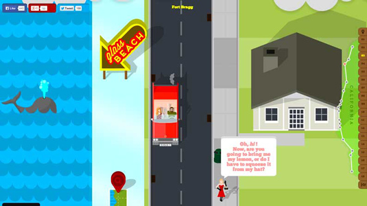
The scrolling journey seats you in a classic Cadillac Eldorado 1959 starting out in the Redwood Highway, which takes you though Fort Bagg, San Francisco, Cambria, Santa Barbra, LA, and San Diego, to name but a few. At first glance the effects look quite simplistic – but as you scroll down you’ll see the site’s got a few quirky tricks up its sleeve to keep things interesting.
08. Make Your Money Matter
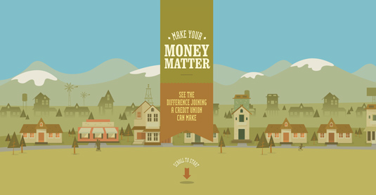
With the aim of teaching the public the benefits of joining a credit union, rather than using a bank, this brilliant site includes everything from how a credit union works, where to find one and apply as well as a calculator showing just how much banks profit from customer’s deposits.
09. The Beast
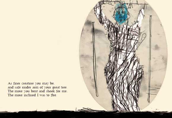
The site makes extensive use of new semantic elements and the data-* attributes used to trigger animations at specific audio cue points (such as scene changes, animation cues and so on) and also assigning control speeds and directions of the moving parallax elements.
10. The Lab

From idea to treatment, users can scroll through two labs and a clinic, each of which is filled with pop-up information buttons. When clicked, new pages open with details on how scientists’ ideas are turned into reality and how this can make a difference for the thousands of people living with the disease.
11. Why Your Brain Craves Infographics
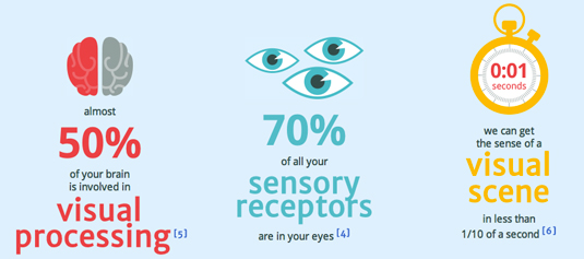
“The parallax scrolling effects were probably the most difficult to achieve,” says Neo Mam’s Danny Ashton. “Our developers looked at the available libraries and described them as a bit ‘wonky’, so they ended up creating their own instead.”
12. 5emegauche
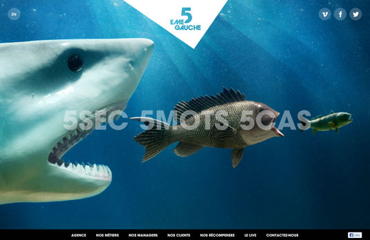
In most circumstances when you scroll, you’re scrolling to a different page. But on this agency’s website, each page has its own scrolling mechanism piece or element that makes everything extremely interesting. It’s a brilliant and fun approach to parallax design and proves that the technique continues to produce inventive results.
13. Atlantis World’s Fair
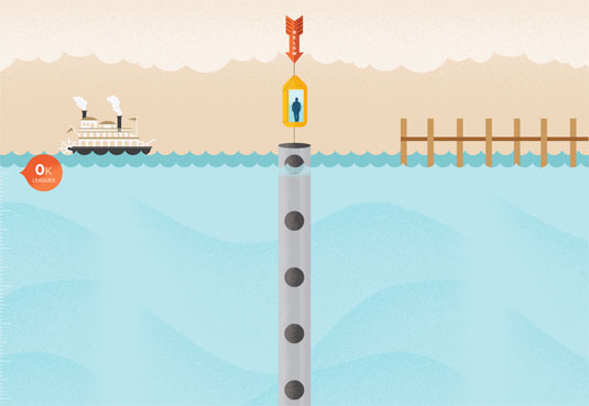
An exercise in demonstrating IE9’s WOFF support, this online infographic designed by Frank Chimero uses some parallax scrolling not as just a way to present information, but as a way to animate information and to tell the story. A fun and interesting approach to interactive information, this is a perfect example of parallax scrolling.
14. Every last drop
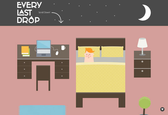
Animation studio Nice & Serious has created this parallax scrolling site to promote the problems of water conversion. Every last drop features a quirky little character, going about his daily tasks, through which the viewer is able to learn more about how water is wasted in our lives, often without us realising it.
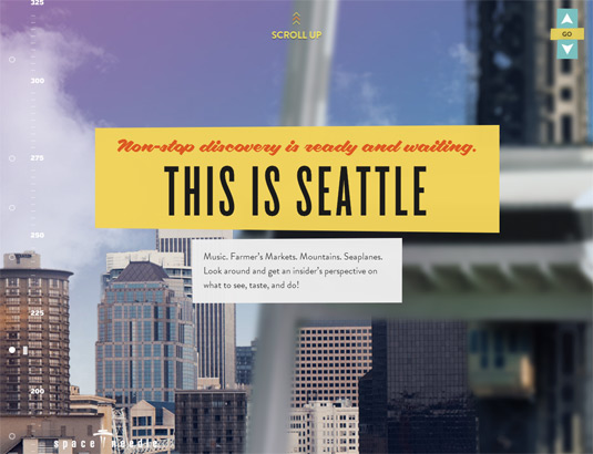
15. Seattle Space Needle
A delightful real-world counterpoint to the Atlantis World’s Fair page, the site for Seattle’s iconic Space Needle starts at the base of the 605-foot tower and invites you to scroll all the way up to the top, taking in views of Seattle and the SkyCity Restaurant along the way. And if 605 feet isn’t quite high enough for you, keep on scrolling and see what you find!


