Brand identity is now becoming more and more of a crucial role for a corporate house. By having a positively received brand identity, people are more likely to work with the company as well as create a buzz and spread positive notions.
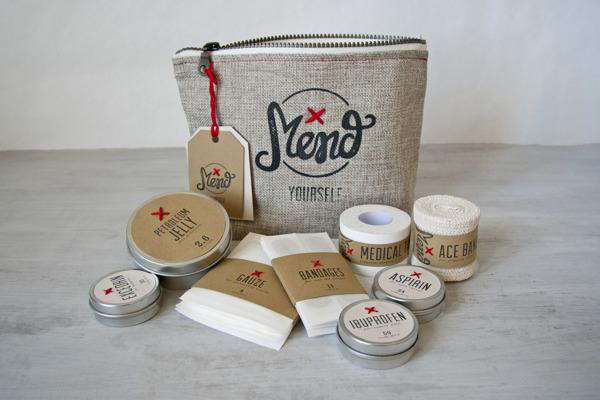
Kate is a designer based in San Francisco who specializes in uniquetypography and branding design. One of her latest projects Mend, is a branding projected for a fictitious company with “survival kits,” aimed at promoting the message “Don’t buy more stuff. Mend what you have.”
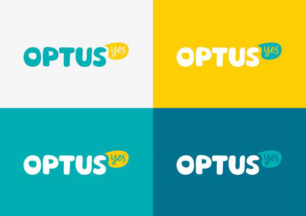
Optus is the second largest telecommunications agency in Australia and recently enlisted a talented group of individuals to rebrand their company with the hope to create more positive awareness for the Optus brand.
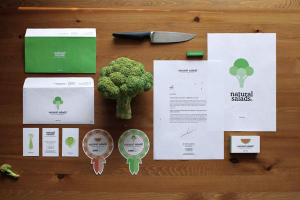
Natural Salads by Jose Álvarez Carratalá
Natural Salads is a company aimed at bringing fresh fruits and vegetables to supermarkets. Jose created an identity design for the company that was meant to express the “natural” aspect of the product, and draws straight from the products (veggies) that the company sells to create the identity for the company.
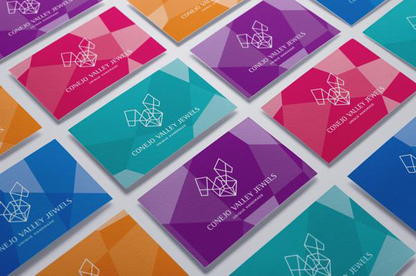
 Conejo Valley Jewelers by Wesley Pinto
Wesley, a designer and brand manager from Brazil, recently created the branding identity for a jewelry store located in Conejo Valley geared at showcasing the brand’s elegance and luxury. In Spanish “Conejo” translates to “Rabbit” and Wesley uses the symbol of a rabbit and of jewels themselves to create a truly unique identity design.
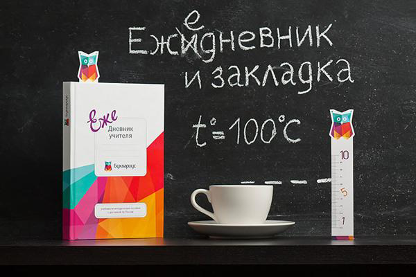
Bukvarius is an organization that offers books and teaching materials to schools throughout Russia. The goal was to create an identity that was fun, fresh, and engaging enough that children could see the objects as an integral part of daily school life.
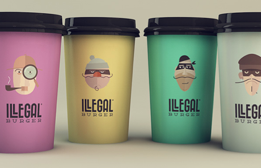
Illegal Burger by Isabela Rodrigues
Isabela Rodrigues is the creative mind behind Sweety Branding Studio, and recently created the branding identity for Illegal Burgers based in Oklahoma and highlights the general theme of ‘crime’ in its design. This might be one of my favorite identity designs as of late, simply because it is so simple, but so genius at the same time.
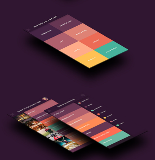
 TriplAgent by Taras Kravtchouk
TriplAgent is a travel app that helps people find the perfect vacation based on their interests. Recently, Taras Kravtchouk a multi-disciplinary designer who created the mobile identity for the travel app. It’s an elegant design, that features a flat user interface and makes it easy for people to find what they are searching for with it’s simplicity.
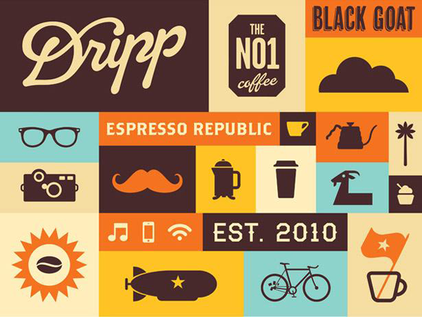
Dripp Coffee by Turner Duckworth
Dripp Coffee, a southern California based coffee shop, features a new unique identity design created by Turner Duckworth. The identity features simple colors and shapes that almost make it appear flat and modern, while incorporating a hand-drawn script logo with the word “Dripp”. The identity is almost a combination of modern and vintage styles. What do you think?
Graham Smith, I’m Just Creative – Brokers Direct
Graham Smith of imjustcreative takes his viewers through his entire brand identity creation process for Brokers Direct in this post. From concept to completion, the post is very detailed and a great insight into the designer’s working mind. A great post for anyone interested in brand identity design.

Jacob Cass, Just Creative – Just Creative
In this post, Jacob Cass of Just Creative takes his readers through one of the hardest jobs in graphic design, personal branding. Any designer will tell you they struggled when putting together their own brand identity, and Jacob proves in this post it’s no easier for even the best of designers.

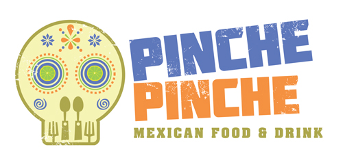
Gareth Coxon, Dot Design – Pinche Pinche
I love Mexican food and found this brand identity design for Mexican restaurant Pinche Pinche by Gareth Coxon of Dot Design very compelling. Demonstrating several different identity ideas, this post demonstrates Gareth’s creativity perfectly, as well as showing the design in both digital and physical form.
David Airey – Digital Luxury Group
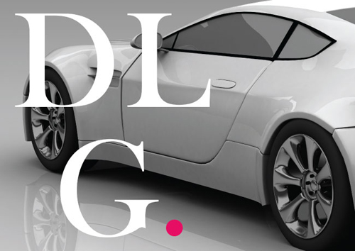
This post is David Airey showing exactly how branding should be done. From the initial pages in the sketchbook to the completed branding presentation, David’s work for the Digital Luxury Group is complete class.
Matt Chase – United States Postal Service
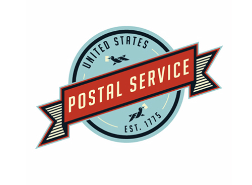
Whilst not strictly a case study into the brand identity process, this is one of my new favourite brand identity explorations. Matt Chase demonstrates perfectly how a branding project should be put together and shows how his fantastic USPS identity can be applied across several brand touch points.


 Optus Rebrand

