This overview features a hand-picked and organized selection of the most useful and popular Smashing Magazine’s articles related to Web Design navigation and published here over all the years.
Yorkdale
Irregular shapes and variable alignment of menu items give this website design a memorable look. The design fits the theme, too.
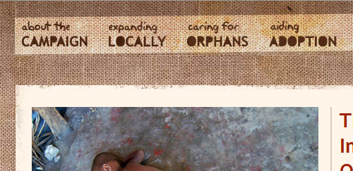
The Crazy Love Campaign
The menu bar of this website is slightly tilted and not perfectly horizontal.
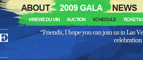
Carnivale du Vin 2009
The navigation menu on the Carnivale du Vin website is shaped like brushstrokes. Hovering over certain items reveals sub-menus, making it look like the artist has swiped a brush across the page.
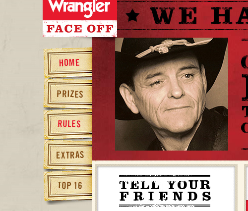
Wrangler Face Off
This website’s vertical primary menu items are designed as tickets that stick out of the side, shuffled up.
HTO
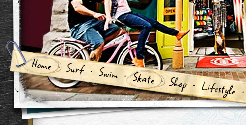
HTO’s navigation bar is a strip of aged paper angled down and clipped to the background photograph.
smriyaz.com
smiriyaz.com shuffles its primary menu items, and the text is written vertically.
Think Up
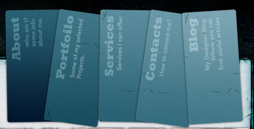
Think Up’s menu items are crumpled post-it notes, and the navigation follows the tabbed navigation user interface design pattern. Hovering over an item changes the color, and clicking on it brings it forward on the z-plane.

f claire baxter
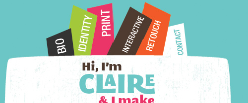
The menu items on this website stick out like bookmarks. The vertically written text and the varied color and size all help the website stand out.
Inner Metro Green
This menu bar has an irregular shape, contributing to the disorganized grunge theme of the website.

Custom Tshirts UK
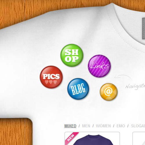
The navigation items on this website are flare buttons pinned to the corner of a t-shirt background.
Pirata London
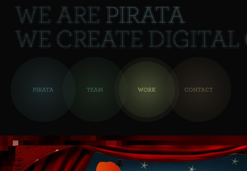
Pirata London has a unique and beautiful navigation menu: overlapping and semi-transparent ellipses. The text is given the CSS 3 text-shadow property for a bit of drop-shadow.
koraykibar.com
The navigation bar of this website is oriented vertically as stacked ellipses, an unconventional structure that uses a single image with <map> elements for the links.

Idea.org
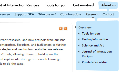
Idea.org’s primary menu has an odd shape: sub-menus seem to drip from their parents.
Paging For Primary Navigation
Some websites have dropped the standard list of primary menu links. You’ll often see magazine-style (or blogazine) websites do this, to give users an interactive experience, similar to flipping through the pages of a magazine or book.
Jack Cheng
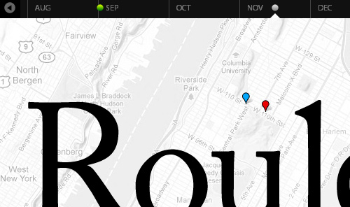
Jack Cheng opts for individually styled blog posts, and his navigation bar is a chronological timeline of posts. Each post appears as a dot, and hovering over one reveals more information in a speech bubble.
gregorywood.co.uk
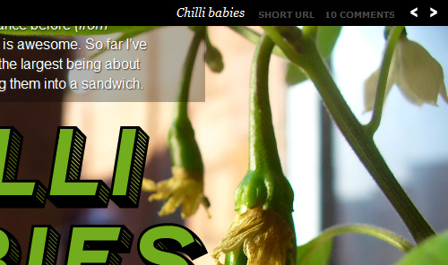
Gregory Wood also custom-styles his blog posts so that you can flip through them using the left and right arrows. To help users get to important pages, he has small icon links for the home, about, RSS and contact pages at the top-left.
The Rich And Powerful
Dustin Curtis’s custom-styled blogazine posts can be navigated using the “Next” and “Previous” controls that are centered in the masthead.

72nd Ave.
This website features custom-styled posts that you can navigate using the “Next” and “Previous” links in the bottom-right.


