Designing a website doesn’t mean you have to create a static experience – it’s not print. With the rise of HTML5 it’s become easier to add things like animation to create a richer user experience. These visual flourishes can often work to create a more interesting, immersive and remarkable experience if done properly. The same is also true of video, which HTML5 makes much easier to implement in a way that’s accessible.
01. mediaBOOM
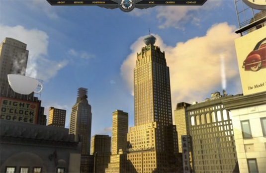
mediaBOOM is an interactive advertising agency that’s taken a unique approach to creating its branding. A background video filmed with a retro Americana style tells the story of their agency set in a fictional world that resembles Manhattan in the 1950s.
02. MyProvence Festival
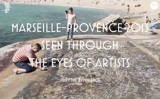
The MyProvence festival site uses background video to show highlights of artists exploring the area. The music and the scenes in the video work together perfectly to set an uplifting mood for the site.
03. Spotify
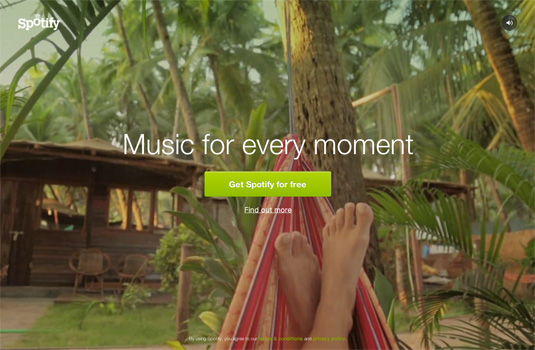
Music streaming app Spotify uses background video to help add emotion to their landing page. The core message behind the site is that Spotify is available to provide music for every moment. The background video, a series of clips which demonstrate emotional attachment in different ways, combines well with the accompanying music to generate a sentimental atmosphere around the brand.
04. Life of Pi
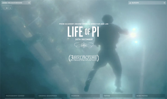
The promotional website for Ang Lee’s Oscar winning movie Life of Pi makes full use of the full browser-sized background by showing beautifully shot excerpts. Each scene, along with the music, helps to turn a minimalist design into something more interesting and inspirational.
05. Telly
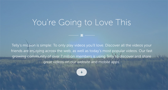
Telly is a startup that finds and shares the most popular viral videos. Its ‘About’ page makes use of a faded, repeating background video, which helps to set the mood beautifully.
06. Fernando Maclen
Fernando Maclen is a talented designer who uses a blurred video background to help show off the way he works. The result is both interesting and memorable, while maintaining the simple, clean design.
07. Windward
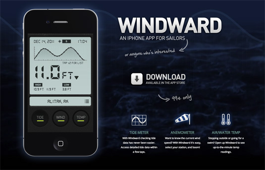
Windward is an iPhone app that’s designed for sailors by displaying data around tides, wind speeds and temperatures. The background video, which shows a reasonably choppy sea, isn’t too distracting and does a good job of setting the mood.
08. Matter
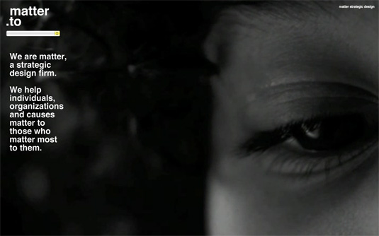
Matter is a strategic design consultancy that use a series of randomly selected videos, each one showing a different person, as the background to its site. This really helps make the site stand out; as it’s so unexpected, the experience becomes remarkable and memorable.
09. Eagleclean

London cleaning company Eagleclean incorporates a very brief bit of video into its site to help add some humour. The landing page initially appears with a very small smudge, which is quickly cleaned away by a gloved hand.
10. Dromoland Castle
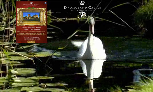
Dromoland Castle is a prestigious hotel and country estate in Ireland. The homepage makes use of a large scale background video to show off the spectacular grounds, golf and nearby wildlife.
11. Y.CO Yachts
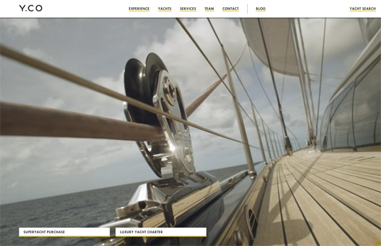
Even if you’re not one of the rare few in the market for a luxury yacht, you’ll still find the Y.CO yacht website interesting. It uses a large-size video to show footage of a family enjoying a holiday on one of their yachts as its backgrounfd. The film is aspirational without being too false or ‘salesy’.
12. Flipboard
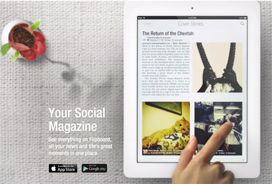
Flipboard is an iPhone and iPad app that merges RSS feeds, Twitter and Facebook accounts into one digital magazine, allowing you to flip between interesting articles with ease. Because its user interface is so important, the website’s homepage background is given over to a video of the app in use. In this case showing you, rather than telling you, how the app works is a stroke of genius .
13. Nike Jordan M6
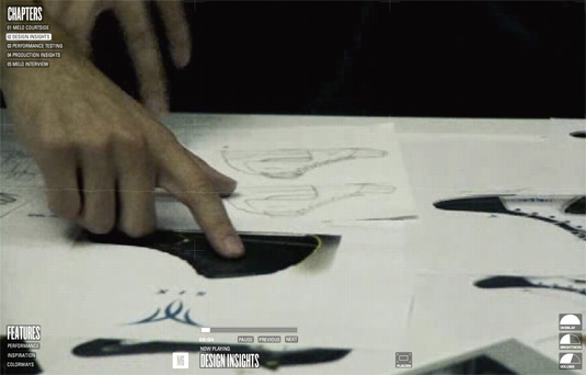
The Nike Jordan M6 website uses background video to tell the story of how the new sneaker design was created. Rather than putting across an overtly sales-based message, Nike simply talks about the reasons for each design choice. For anyone thinking about buying the Jordan M6, it becomes a fascinating insight into how the product came to be.
14. Arcade Fire
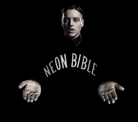
Indie rock band Arcade Fire have often been known for their quirkiness, and they don’t disappoint in this experimental promotional trailer for their Neon Bible album. While the title track plays, the background video is in sync, but it’s also interactive – try clicking on the hands while the video plays.
15. The Cassette
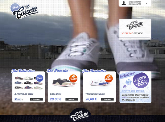
The Cassette is a French online shoe store that uses background video creatively. The background on the homepage is dedicated to showing one of their bestsellers being modelled so you can see what it looks like from all angles.


