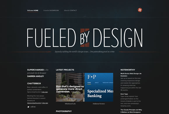
Textures are used everywhere: websites, banners, logos, business cards and so on. One of the biggest advantage is that the designer can save a lot of time using them, instead of creating the graphic from scratch. Also, using textures you can make to your web and graphic design projects a lot more interesting and with more personality.
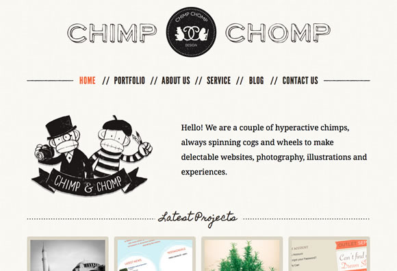
CHIMP CHOMP
Chimp Chomp decided to use a delicate texture to match their simple and clean style.
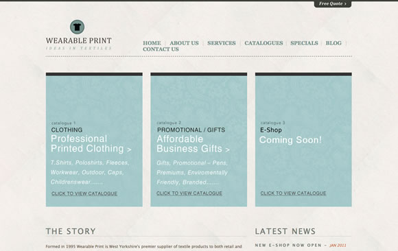
WEARABLE PRINT
Here we have a very subtle texture giving a nice touch to their minimal design.
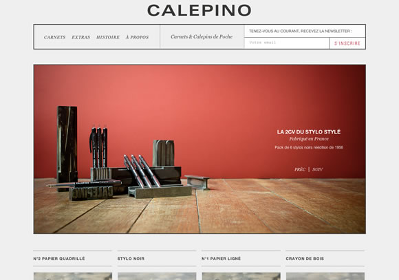
CALEPINO
Calepino gave a nice touch to their layout by using a big main image including wood as texture. The image creates a nice balance to the minimal design.
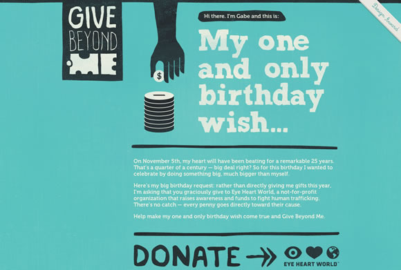
GIVE BEYOND
A layout based on typography and hand-drawn elements complemented with a nice and beautiful texture.
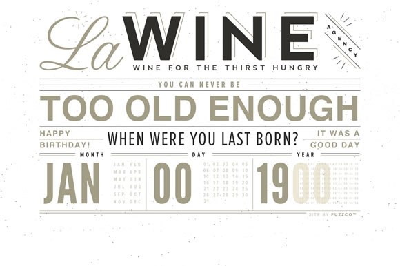
LA WINE
La Wine Agency is using a beautiful and clean texture to match their simple layout, typography based.
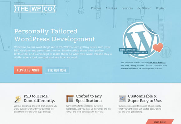
THE WP CO
Here they use different delicate textures in some sections of the page, it really gives the layout a nice touch.
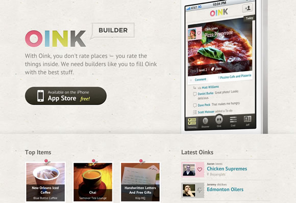
OINK
Oink is another example of a clean website with a subtle texture to spice up the layout.
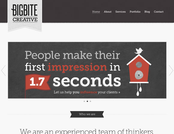
BIG BITE CREATIVE
Big Bite Creative is using a nice layout based on shapes, typography, colors, images and subtle textures. Really nice choice of colors and contrasts.
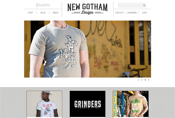
NEW GOTHAM DESIGNS
A minimal layout using texture in a small section of the page, really nice touch.
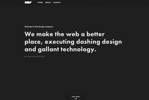
ONE DESIGN COMPANY
A minimalistic black and white design, typography based and textured background.
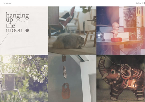
HANGING UP THE MOON
Another beautiful example of a simple layout using a delicate texture to give the page a nice touch.
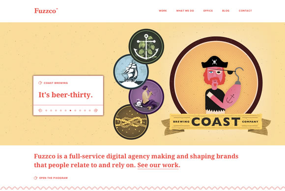
FUZZCO
Fuzzco is using a minimal design that includes texture in the main image and also in the footer. Beautiful combination and result here, really nice choice.
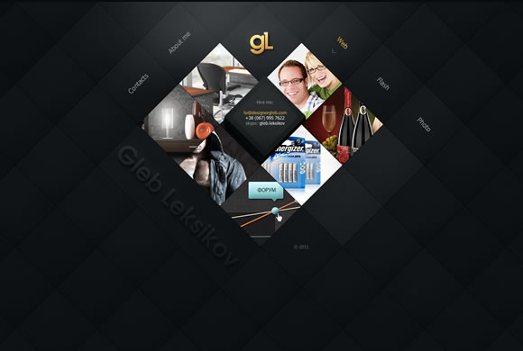
GLEB LEKSIKOV
Another good example of a subtle texture adding personality to a clean layout.
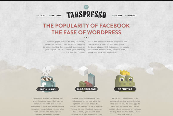
TABSPRESSO
Tabspresso has a few elements on their design and they definitely make a beautiful use of colors and textures.
FUELED BY DESIGN
The texture usage here gives a nice touch to layout and also centers our attention to a focal point, in the middle of the page.
