The latest CSS3 properties have opened a multitude of new doors to web designers and developers. It’s now possible to create animations and interactivity entirely in CSS markup, without going near Flash, Silverlight or After Effects.
01. Solar system
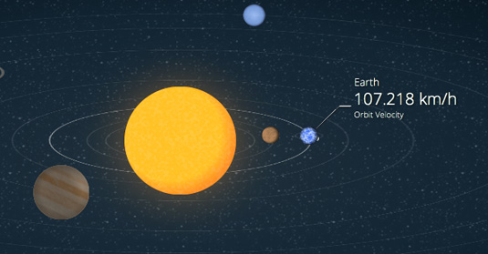
You don’t have to be a web design expert to appreciate this animated model of the solar system, another one of the bestexamples of CSS we’ve found. Created by Julian Garnier, it shows the eight planets orbiting the sun in 3D (yes, you read that right – despite what you got told at school, boffins recently decided that Pluto is no longer officially a planet).
02. 3D page flip
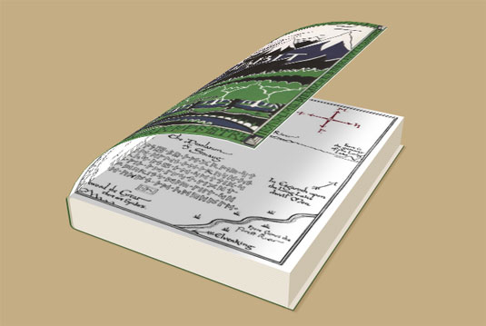
Created by web designer and developer Fabrizio Bianchi, this fantastic 3D bending page flip effect is a CSS-only experiment. Be aware that it’ll only work on browsers that support transform-style: preserve-3D.
03. Periodic table
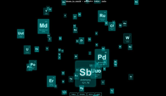
The periodic table of elements is a popular subject for designers to showcase new web technologies, and this latest CSS3 experiment is the most fun yet. Built by Barcelona-based web designer Ricardo Cabello – best known within the community as ‘Mr Doob’ – the demo starts with the animated elements hurtling through space towards each other to form a table.
04. CSS Creatures
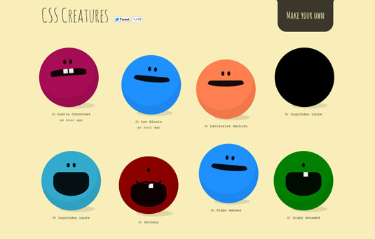
We all know that working in the design industry can sometimes become monotonous. So, take some time out from your busy schedule and have some creative fun with this cute little CSS project from Pittsburgh-based web designer and developerBennett Feely.
05. Bonfire Night safety infographic

With Bonfire Night approaching in the UK, Col Morley and Igor Krestov of Blue Claw decided to put their CSS skills to work creating this fire safety infographic aimed at school-age children.
06. AT-AT Walker from Star Wars
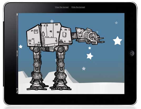
This illustrated animation of AT-AT Walker from The Empire Strikes Back by Anthony Calzadilla is created entirely in CSS3. Click on the ‘view the bones’ link on the iPad and you can see how each part animates and functions. This great piece of work suggests we’re going to see a lot more of CSS3 introduced with online gaming.
07. Chessboard Vacuum
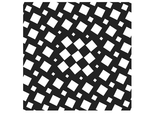
You know those optical illusions you get that appear to be moving, even though they’re static images? This isn’t one of those. It’s a mesmeric piece of CSS by Ana Tudor, in which a sort of chessboard slowly spins and mutates and rebuilds and spins and mutates and oh God we can’t stop looking at it.
08. Futurama Animation
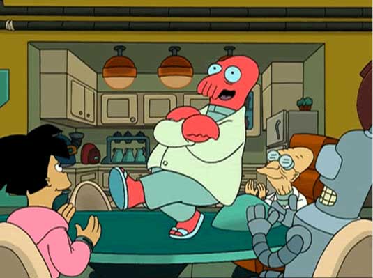
This entertaining CSS3 rollover created by Stu Nicholls enables you to horizontal-run your cursor along the image and watch Zoidberg from the sci-fi cartoon Futurama dance on the table. You can also repeatedly click on the image above and watch each animated state.
09. Responsive cat
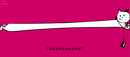
Japanese web designer and interactive director Masayuki Kido, aka Roxik, has created this animated kitty which stretches across the length of the browser window, and resizes accordingly as you reduce the window’s width. Make it narrow enough and the word changes with hilarious consequences. And the fun doesn’t end there – but we don’t want to spoilt it, so go have a play now!
10. Animated Buttons
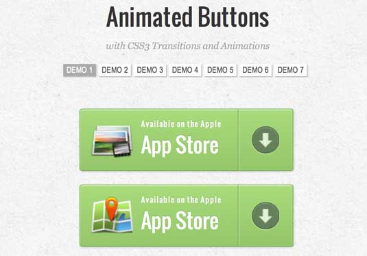
This series of demos, featuring icons by webiconset.com and a symbol font by Just Be Nice, showcase seven beautifully animated link elements with different styles, hover effects and active states. The animation is marvellous, although we’re not to sure from a user perspective about the way the information is hidden until you hover over the link .
11. Original Hover Effects
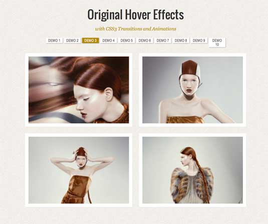
In another great demo series, Alessio Atzeni has created some brilliant CSS transitions. Hover over the thumbnail and the CSS animation reveals further information in a way that makes you go wow. There is a great selection of transitions with 10 different demos to choose from. If you want to integrate this rollover effect on your own site then follow this tutorial.
12. Mad-Manimation
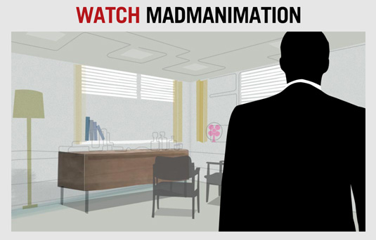
This animated title sequence for the hit TV drama Mad Men showcases what CSS3 animation has to offer in the form of ultra-smooth video. It was made by Anthony Calzadilla, Geri Coady and Andy Clarke, and if you work in web design, you’ll notice a few familiar names and faces. To find out how it was created, see this blog post.
13. Safari Technology Demos
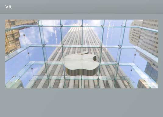
This demo lets you gaze around the Apple Store in 360 degrees – an amazing virtual scene in your web browser which you can navigate without the need for any additional plug-in software. CSS transforms are used to position six images in 3D space to form a cube with the user’s viewpoint inside. As you navigate, the cube is rotated to reflect the new appropriate position.NOTE: Best viewed in Safari.
14. The Man from Hollywood
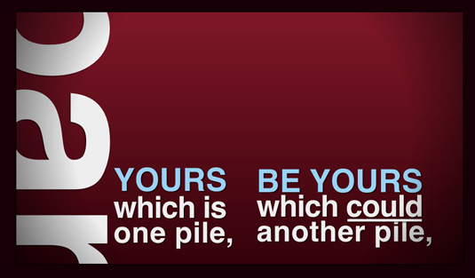
This kinetic type experiment made by Tyler Gaw uses advanced CSS3 selectors and CSS3 transitions, as well as a little JavaScript where necessary. NOTE: This demo only works on the following browsers: Chrome, Safari, and “kinda-sorta on Firefox 4+”.
15. Animated Google Doodle
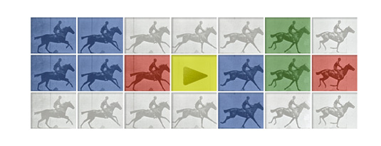
Inspired by Google’s JavaScript-powered Doodle markingEadweard J Muybridge’s 182nd birthday, the guys at CSS Creations set out to achieve a pure CSS alternative using transitions against a background-image sprite. As a result, the CSS3 animation behaves almost exactly as the JavaScript original.


