We bring you some of the best HTML5 examples around and ask the designers who made them just how they achieved their goals. HTML5 is the latest version of HTML – the markup language used to display web pages
01. Frank Chimero
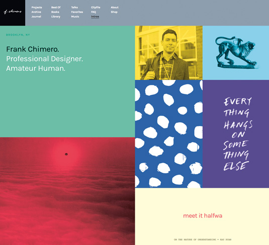
Frank Chimero is a wise man of art and design. He has the ability to blur design thinking with life itself. He’s an amazing and elegant writer who can turn thoughts into words in a way that few others can. His new website, designed and coded by himself, reinforces this. In Chimero’s own words: “This is a personal site, so it’s meant to hold personal things in personal ways.” And this is exactly what it does.
02. Ba Ba Dum
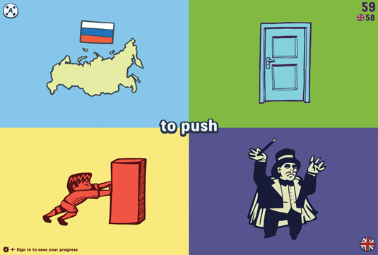
Ba Ba Dum, a ‘play and learn’ site featuring five games that work in nine languages, is visually stunning, with beautiful graphic design, illustration and typography. It uses what look like simple hand-drawn illustrations that have been converted to vector illustrations: perfect for this word quiz.
03. Prospek
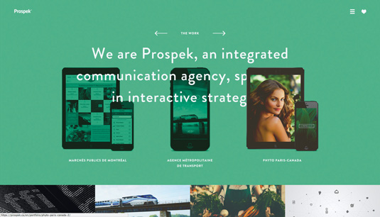
Designing agencies’ websites can be the source of a lot of creative
freedom. Most agencies have similar content: homepage, a portfolio, an about page, team page and contact page, but the fun part is creating a visual identity for the website. Every agency has a different personality, different aspirations, goals and target customers. So, it’s really fun to see how different agencies present themselves on the web.
04. M. Power Yoga Studio
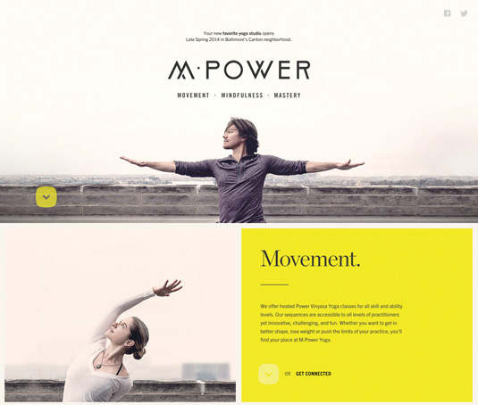
The M.Power Yoga Studio website is a beautifully simple example of single-page design. The site uses bold and emotionally engaging imagery of people practising yoga in an urban setting. The slightly desaturated colour processing of the photos strikes a perfect balance with the soft yet bold colour palette and the simplicity of the page layout.
05. The Music Bed
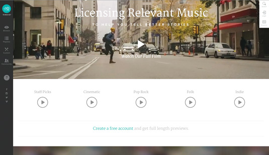
The Music Bed really stands out in terms of how it tells the story of what it does. It’s a music licensing site: if you have a short film and you’d like to put some music to it, you’d come here. I’ve used a few of these sites and normally they’re awful – badly designed, and finding the right music is impossible. The Music Bed is different in a number of ways.
06. Lowdi
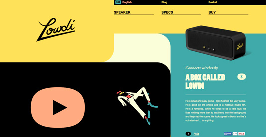
The Lowdi is a small, loud, and stylish speaker that connects to your phone, tablet or other device via Bluetooth. It has a stylish website to go with it, built by Momkai, a digital creative agency based in Amsterdam. Momkai used to specialise in Flash websites but has made the natural move to HTML5 only.
07. Legwork Studio
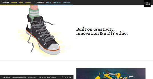
Located in Denver, Legwork Studio’s site makes heavy use of HTML5. As well as taking advantage of some of HTML5’s more semantic elements, the website also leans on the <video> element for a lot of its content.
08. 538
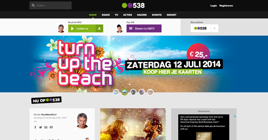
538 is the largest radio station in the Netherlands. Rotterdam-based agency Supersteil created its site. The agency decided to use HTML5 when building the site from scratch. One of the main challenges Supersteil faced was “developing a content-heavy website that offered a user experience that was as rich as possible on multiple platforms”, explains creative partner William Duijzer.
09. Bilekjaeger
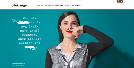
Bilekjaeger is an advertising agency based in Stuttgart, Germany. Its clean-looking new site was built using the latest technologies, of which HTML5 was one. As well as making use of HTML5- specific elements such as <header>, <nav>, <section>, and <footer>, bilekjaeger also chose to make use of the History API.
10. Cafédirect: Drink Better Tea
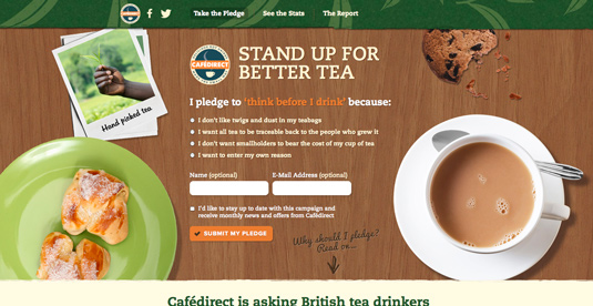
Leicester-based agency Cite was tasked with producing a microsite for Cafédirect, which wanted something “visually engaging to promote its ethical RealiTEA report”, according to Veronica Bagnole, marketing coordinator at Cite.
11. The Mustache Game
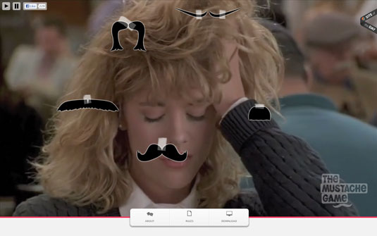
The brainchild of Dan Nelson, Steve Dolan and John Dierks, The Mustache Game is an online version of a popular drinking game. The team built a JavaScript bookmarklet to enable users to play the game with video platforms such as Hulu and YouTube.
12. Yas Marina Circuit
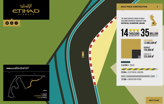
Built by LBi for Etihad Airways, Yas Marina Circuit enables you to race around Abu Dhabi’s famous Yas Marina Formula One Circuit. Guy Jarvie from LBi explains that there’s “an abundance of interesting facts around the Yas Marina Circuit and Abu Dhabi’s motorsport scene. The danger was to either create a ‘too long; didn’t read’ page or skimp on content. HTML5 solved this problem for us as it allowed us share a wealth of information, but present it in manageable slices.”
13. Poker Blind Timer
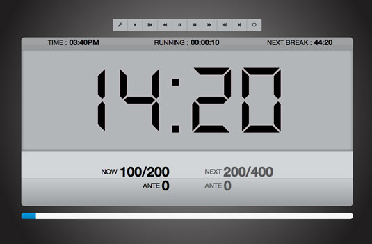
Philippe Pérusse decided to create this free poker clock because he was hosting a poker tournament and wanted to make sure it ran smoothly. The site was built to work on TVs and iPads, and uses HTML5 audio with the media API to play buzzers.
14. Energy Centre
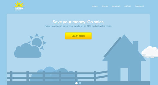
Energy Centre is Ireland’s leading installer of solar panels. The company recently asked Colm Tuite to redesign its website. The site is responsive and was built mobile first using HTML5 and Ruby on Rails. Tuite explains that he develops all his sites with HTML5. “HTML5 elements are much more semantic, which helps code readability if you’re working with a team, and also helps to minimise CSS selectors,” he says.
15. Currys
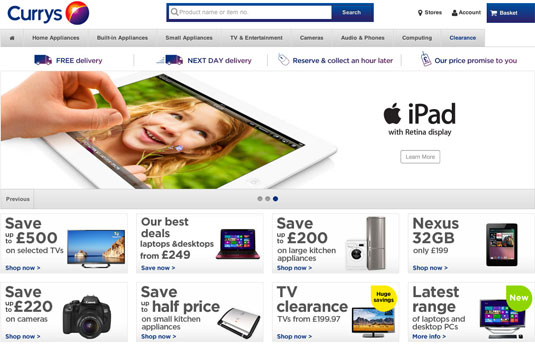
An increasing number of big, consumer-facing sites now use HTML5 under the hood in an unobtrusive way. A great example is the site of the UK’s biggest electrical goods retailer, Currys. Lurking underneath its traditional fridge-flogging design are HTML5 structural elements, ARIA roles and a mechanism for responsive images.


