The internet is full of thousands upon thousands of awe-inspiring design portfolios. To enable you to stand out in this tough market, it’s important to make your online portfolio as impressive as you can.
01. Adhemas Batista
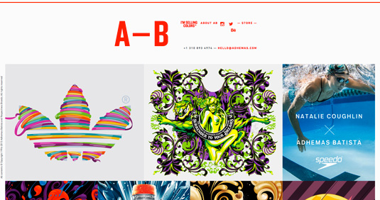
A Brazilian-born graphic designer and artist based in Los Angeles, Adhemas Batista has worked with some of the world’s biggest brands, including Adidas, Coca-Cola and Sony. His awe-inspiring portfolio reflects his passion for exploring vibrant and colorful concepts, all of which pop againt a bright white backdrop.
02. Ryan Scherf
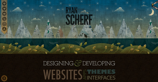
Inbetween web designing, developing, writing, teach and building, Ryan Scherf found the time to create this eye-catching portfolio site. A gorgeous example of a one-page site, simply scroll down past the beautifully illustrated landing page to a number of example websites that he’s worked on, followed by contacts at the bottom. Simple but very effective.
03. Charlotte Tang
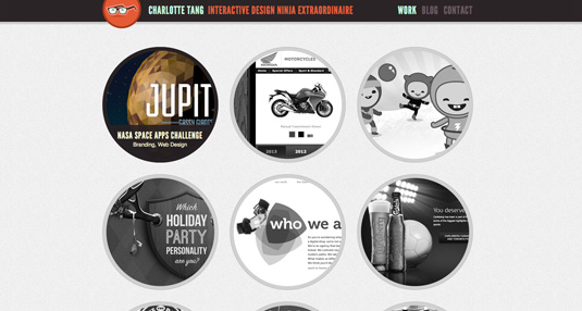
Toronto-based interactive designer Charlotte Tang ‘strives to marry the love of web and graphic design by finding a harmonious balance between functionality and aesthetics’. And is something that she’s clearly applied to her portfolio site.
Users are greeted by little port holes, featuring a black and white taster of her work. Hover over each and they come to life in full colour. Click and it leads to a short description, which is completely overshadowed by a beautifully big image of said work.
04. Robby Leonardi
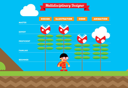
Robby Leonardi is a multidisciplinary designer based in New York City. Specialising in illustration, graphic design, animation, and front-end development, he has worked with the likes of Fox, Speed TV, FX Networks, myNetworkTV, and G4. This incredibly fun interactive design portfolio will have you scrolling for hours.
05. Lizzie Seymour
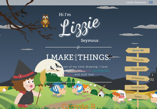
Lizzie Seymour is a designer that loves to dabble in character design, illustration, installation, a bit of coding, and stuff that moves. This adorably crafted portfolio will give you a sense of her brilliant work and her impeccably cute characters.
06. Björn Meier
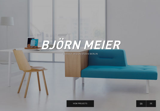
This beautifully minimal, easy to navigate portfolio from Björn Meier is a feast for the eyes. Designed by German based agencyBASICS09, the portfolio went on to become recognised on theAWWWARDS.
07. Jeremy Sallee
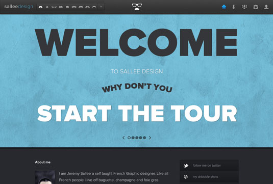
Jeremy Sallee is a self-taught French graphic designer. Creating wonderful icons, Sallee uses a very popular portfolio layout but with a few precision tweaks to make it stand out from the creative crowd. Salle has an impressive array of work on offer that you can navigate using some very cute mini icons.
08. Marc Thomas
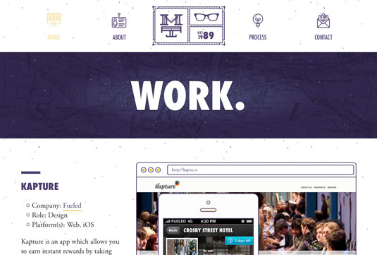
This portfolio from designer Marc Thomas teams a sleek layout with a handful of striking shades. His use of typography is masterful, plus the look and feel of the site stays consistent on mobile screens.
09. Rosie Lee
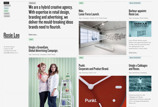
Rosie Lee is a hybrid creative agency, with on and offline expertise in branding, advertising and retail design. We love the unique layout and the use of complementing colours makes it a winner in our eyes.
10. Studio Airport
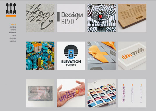
Studio Airport is a design agency based in the Netherlands, with a strong online presence embracing airport graphics, large photographs and strong typography. We love the little animated reordering of contents that takes place in its Projects section when you switch options in the left-hand menu.
11. Paul Currah
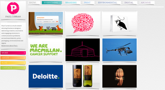
Paul Currah is an award-winning multi-disciplinary graphic designer, delivering creative, innovative and engaging solutions to communication problems across brand identity, print, packaging, environmental, and digital. His portfolio is a clean and simple offering, with each project photo fading in and out, showcasing different aspects of the creation.
12. Teacake
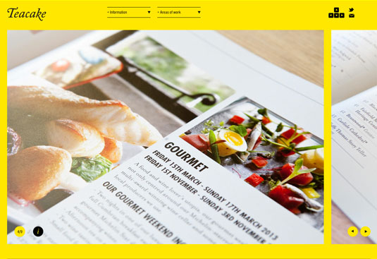
Teacake is a quintessentially British, inventive and conscientious design studio. Its online portfolio instantly catches your attention with its yellow backdrop and large imagery. Navigating through the site you see a strong and diverse portfolio of work. Our only plea would be for the trackpad to allow for horizontal scrolling through the content.
13. Smart!
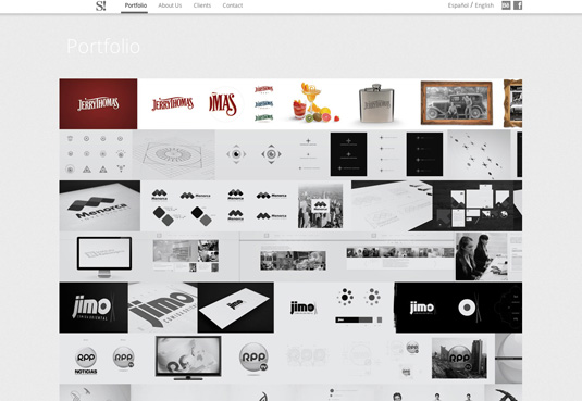
Smart! is a multidisciplinary team of professionals in graphic design, communication and information technology that have two offices in Buenos Aires and Perú.
Their online portfolio has a simple structure, with the grey turning to full colour once you hover over each project. We love that the selected images from each project are presented in a horizontal line.
14. Olly Gibbs
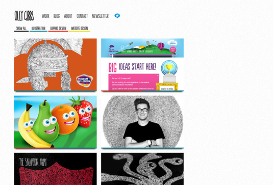
Olly is a London based, multi-disciplined designer and illustrator who has already worked with the likes of Warner Bros, Muse, and The Salvation Army. It’s the attention to detail within his portfolio that really makes it stand out.
The sense of fun immediately showcases Olly’s personality, whilst the typography and lay-out makes it work aestheically. We especially love the ‘About’ section.
15. Pollen
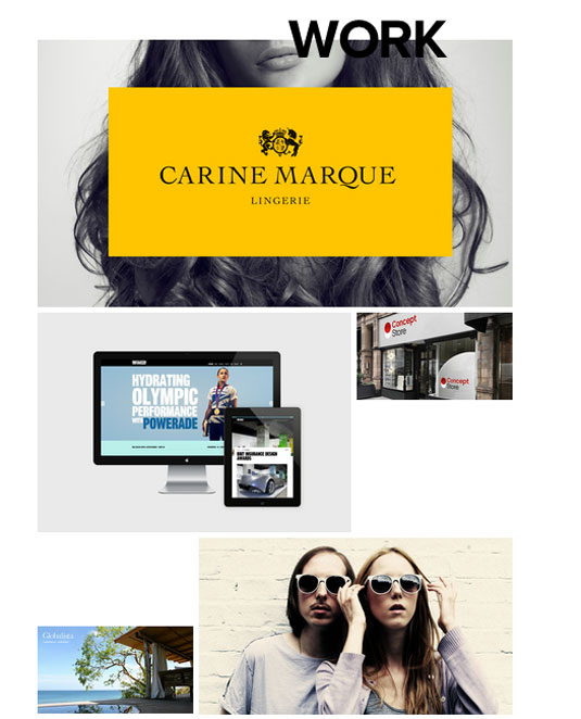
Pollen are strategists and innovators, as much as as they are designers. They have developed a format that allows them to work closely with clients as creative partners, engaging the target audience and driving results. Pollen have a beautiful structured website, comparable to editorial layouts. We’re a big fan of the chunky yet simplistic footer.


