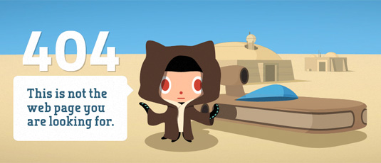
Every internet user will encounter 404 pages whenever a page does not appear because a site has been moved to a new server, or because that page does not exist. A 404 page will also appear when a web address is incorrectly typed or a bad link is clicked and does not lead to the right content.
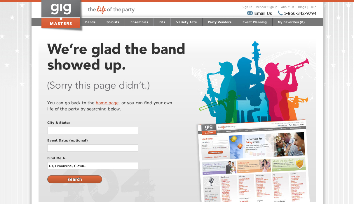
Gig Masters
We will start off with a very practical 404 page. Here, when we stumble upon this error, we are quite aware that we’ve gotten here on accident. The page offers a link for you to return to the homepage or you could complete a search and get the results. It’s very straight-forward and fits into the visual branding of the site.
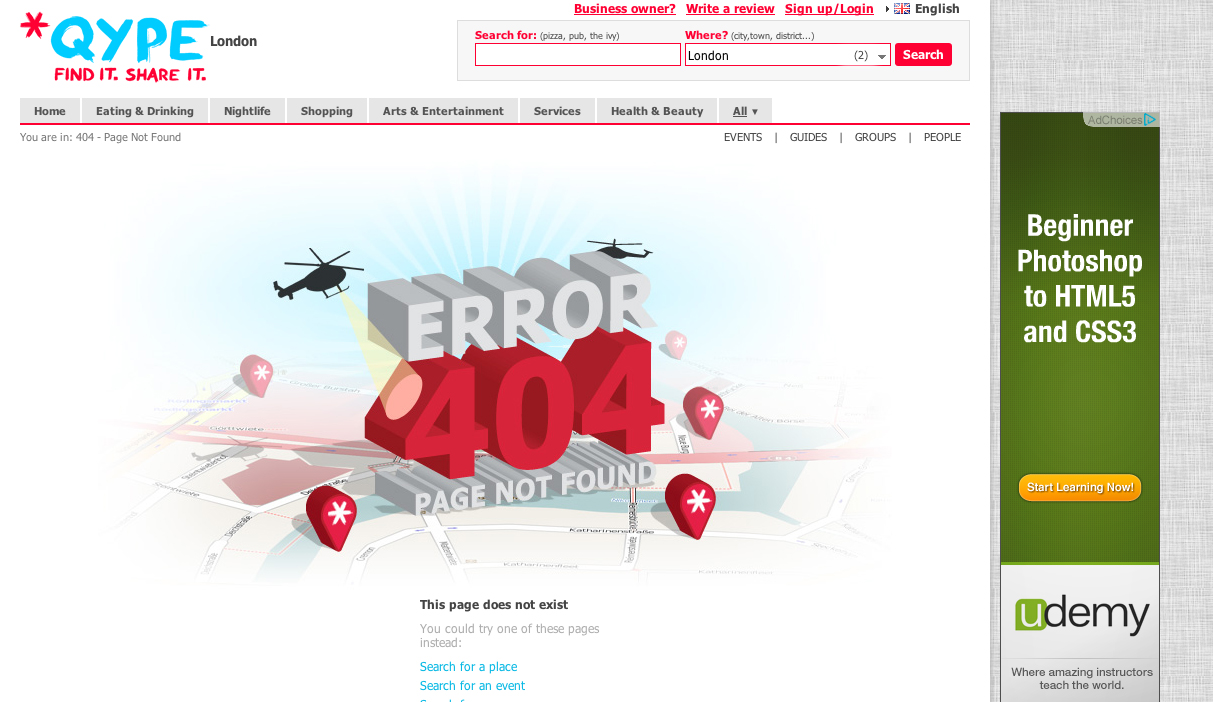
Qype
Qype have created another rather practical use of their 404 page by allowing you to return home or search all the categories the site has. They also offer answers to questions you may have as well. In addition to the practical use, they did add a bit of flair by creating a very beautiful, high quality illustration that refers to their brand’s use.
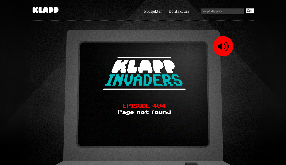
Klapp
Klapp has created a very interesting use for their 404 page. They’ve created an entire game you can play while you determine what you want to do next. It’s a very fun game. It’s actually very addictive. But when the game is over, the game is over and you’re forced to get back on track. Or try to get lost again.
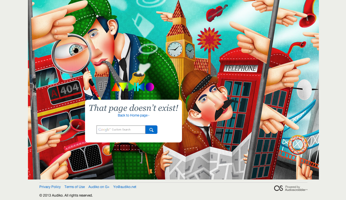
Audiko
Again, this brand has decided they want to couple the most obvious use of returning the viewer to the correct page with creating an amazing illustration for you to view. The difference here is Audiko has created such a focus with this illustration that all you want to do is marvel at it and find your way back later.
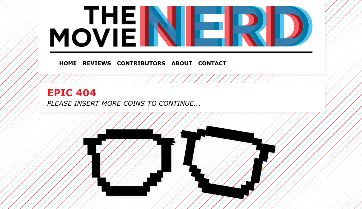
The Movie Nerd
The Movie Nerd has used a clever little iteration of their logo to characterize their 404 page. That’s extremely smart and consistent branding. Because of the very visible navigational bar up top, they didn’t see the need to make sure the viewer needed to be redirected.
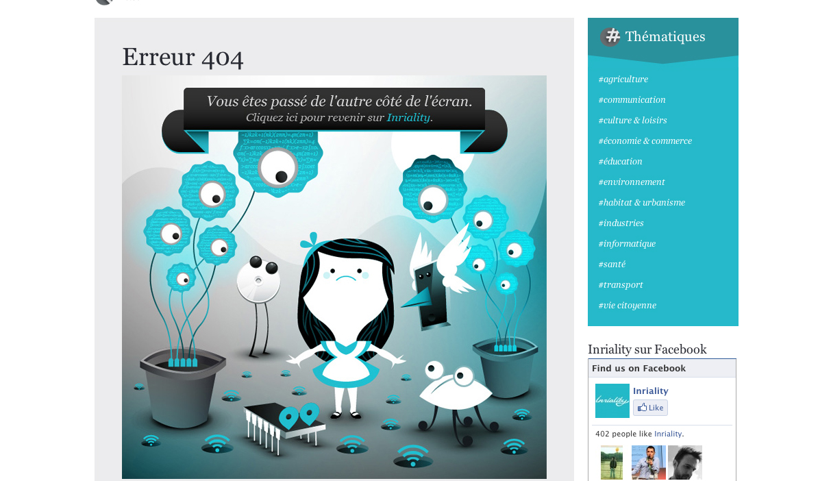
Inriality
Here’s another use of illustrations in 404 pages. While I’m unsure of what it says (due to the language barrier), I can assume it says something to the effect of ‘Click here to return to Inriality.’ Obviously, when you click the picture of the illustration, you’re redirected to the homepage.
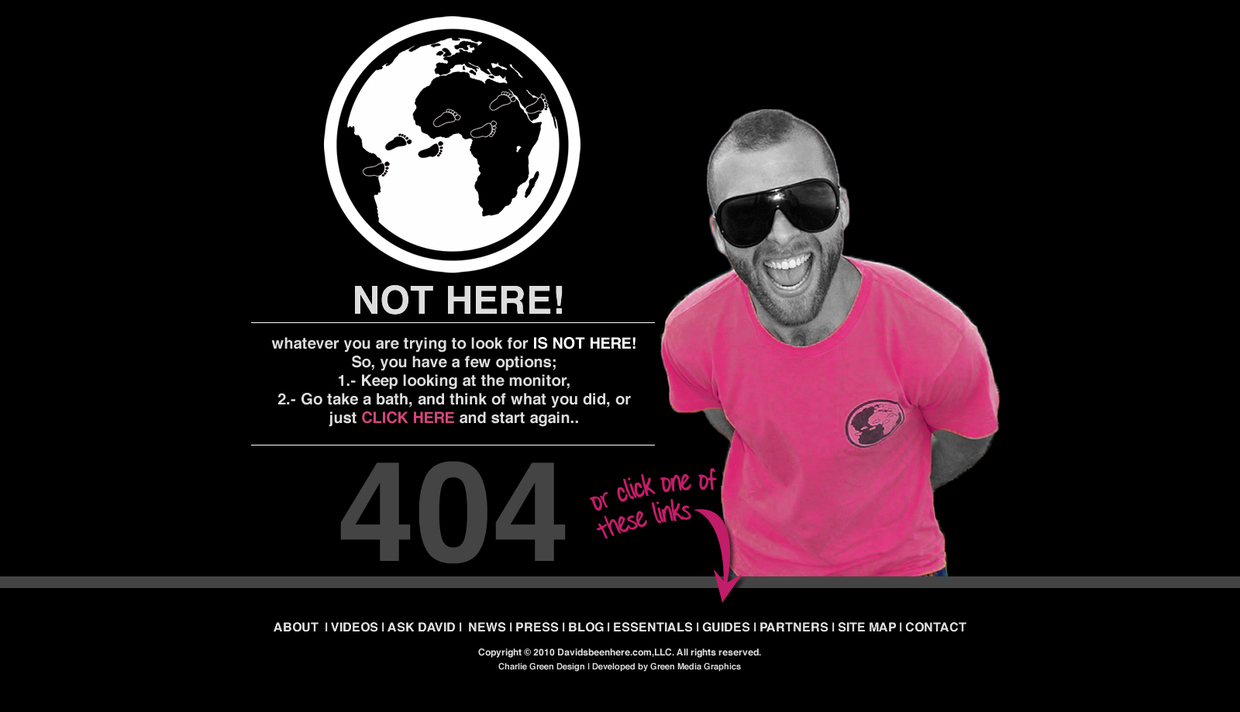
Davidwashere
What I like about this 404 page is it’s simplicity. Not only that, but while it’s straightforward, the brand has decided to let a bit of their personality come out with some of the instructions. It’s a very easy way to approach the 404 page.
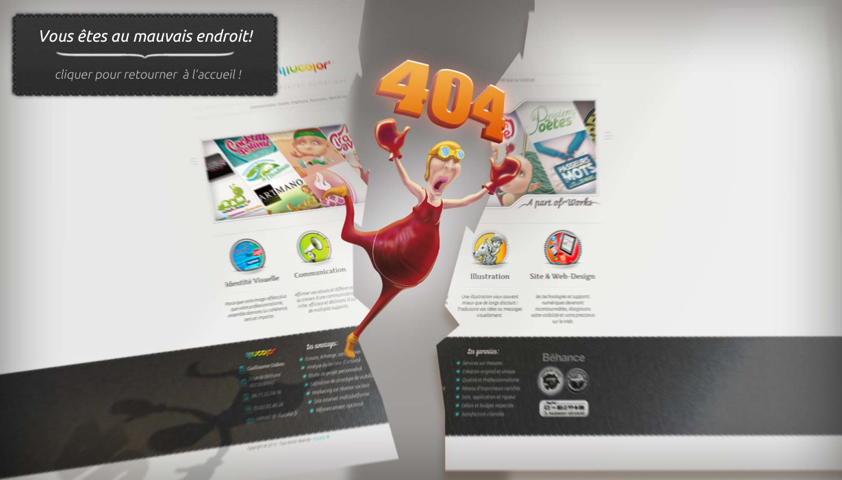
Illucolor
This is another very clever graphic. It seems as if your Internet is broken and you need to get it fixed. Again, I’ll have to assume the graphic says to click somewhere to refer to the home page, but again it’s another attempt at a semi-practical, yet highly visual 404 page.
I love Icons
This 404 page doesn’t have much to do with anything. In fact, if you stumbled upon this page you’d probably be extremely lost. However, that does not change the fact that in it’s simplicity, this is just a beautiful image. And the faint “404″ is a nice touch.

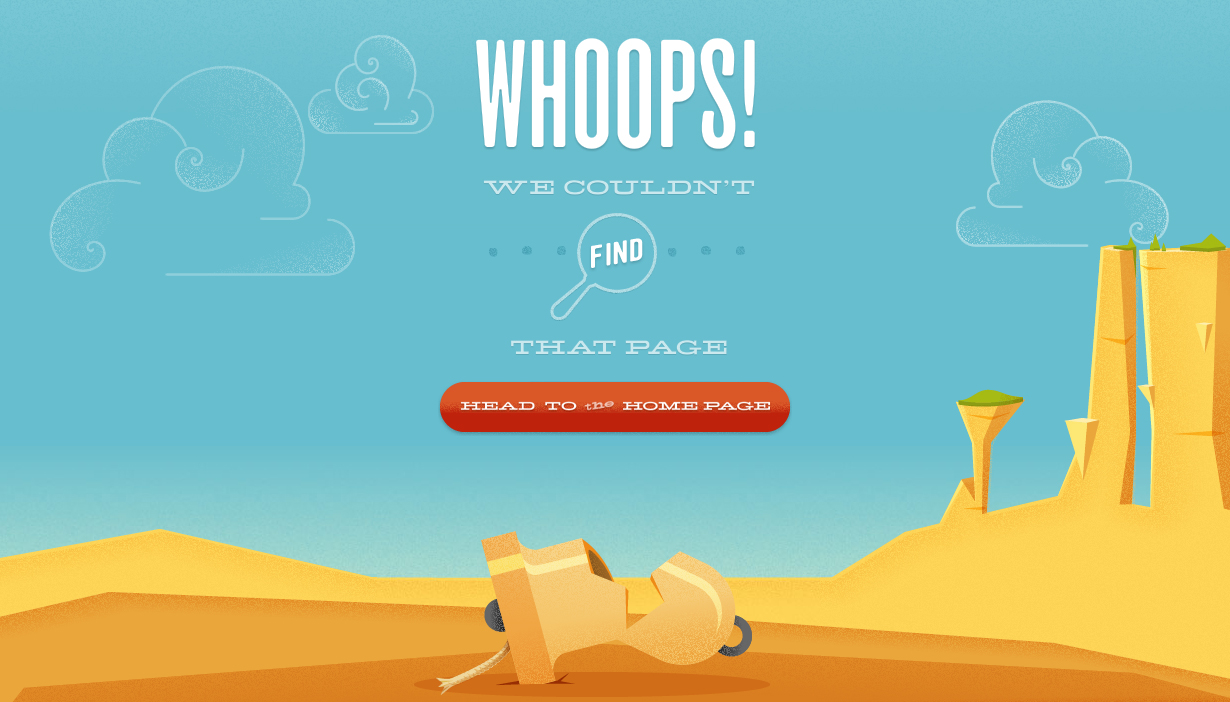
Bellstrike
Another simply beautiful 404 page. The illustration is exceptionally consistent with the visual image throughout the web site. This 404 page lets you know you’ve stumbled upon the wrong page, but you’re still on the right site, which is extremely important.
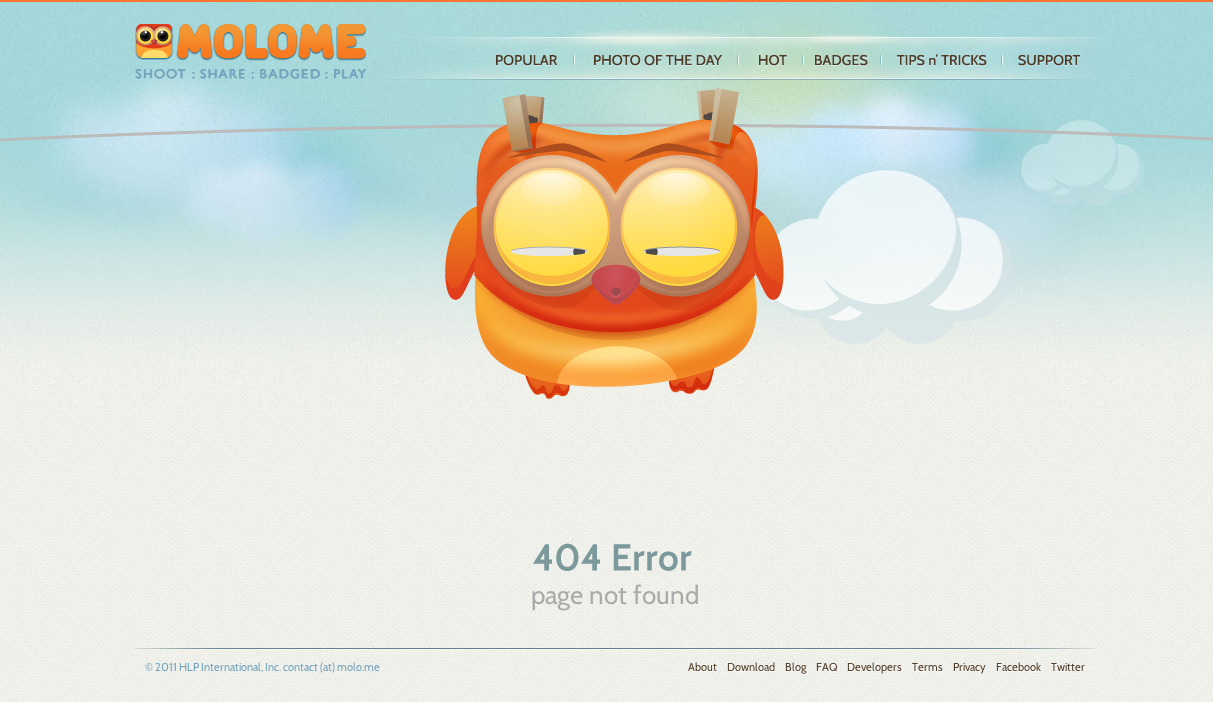
Molome
Well, this 404 page is just plain cute. Molome obviously wanted a chance to show their graphic skills and weren’t too worried about directing the viewer back home. That’s fine though, because again, the navigation is very visible. The 404 page is an extension of the brand.
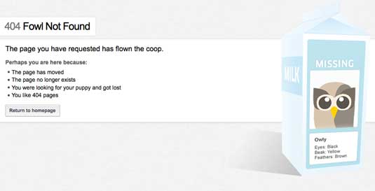
Hootsuite
Hootsuite is proving an essential tool to many who work on the web – not least us at Creative Bloq, where we make good use of the social media management system for brand management. What could be a visually dull functional app is brought to life by the use of the owl mascot, which is at the forefront of this witty 404 page.
iStockphoto
iStockphoto is an online, royalty free, international microstock image provider that’s risen to prominence partly because it understands its users. This cute if slightly gruesome cartoon will put a smile on your face if you ever get stuck while navigating its massive site.

Lego
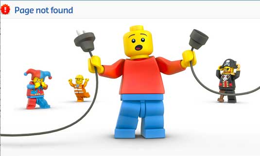
In general, Lego can do no wrong in our eyes, and we love this cute little tableau for its website’s 404 page, which proves that you don’t need a lot of technical-sounding text to get your error message across.
Magnt
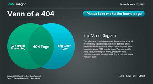
Magnt enables you to create a business card themed web page in minutes. Its clever 404 page demonstrates both a keen sense of wit, and a clear call to action to take you where you need to be.
GitHub
Coding website GitHub is the home of geeks, and what better way to appeal to geeks than a simple Star Wars parody with parallax effect when you move your mouse? GitHub also has a nice 500 page for when the server breaks.
