It’s amazing how often new resources for web designers or web developers appear on the web and it’s a really good thing cause in this way the techniques evolve and so do sites thanks to some people who try to help the community.
Fluid Baseline Grid System
The Fluid Baseline Grid System is an HTML5 & CSS3 development kit that provides a solid foundation to quickly design websites with ease.
The FBG system was built with typographic standards in mind and combines principals of fluid-column layouts, baseline grids and mobile-first responsive design into a resolution independent and device agnostic framework. It is packed with CSS normalization, beautiful typographic standards, corrected bugs, common browser inconsistencies and improved usability. You can finally have your cake and eat it too, all while making awesome websites.
Response JS

Response JS is a lightweight, jQuery plugin, that gives designers/devs tools for producing performance-optimized, mobile-first responsive websites. It provides easy-to-use action hooks for dynamically swapping code blocks based on screen sizes and semantic methods for progressively serving images/media via HTML5 data attributes. Response’s methods are also available as object properties, making them useful tools in OOP-minded custom development.
cssFx

cssFx is a standalone polyfill that inserts the vendor-specific CSS3 properties necessary for old and new browsers. This saves you tons of time, maintenance, and bandwidth
selectivizr
selectivizr is a JavaScript utility that emulates CSS3 pseudo-classes and attribute selectors in Internet Explorer 6-8. Simply include the script in your pages and selectivizr will do the rest.
Frameless grid

Frameless is not a framework. It doesn’t include any code. It’s just an idea for a specific type of adaptive grid. You can use it as a good starting point for a new design, but you’ll still have to do all the hard work of designing and coding yourself.
Animate.css
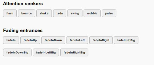
animate.css is a bunch of cool, fun, and cross-browser animations for you to use in your projects. Great for emphasis, home pages, sliders, and general just-add-water-awesomeness.
Fork CMS

Fork CMS is dedicated to creating a user friendly environment to build, monitor and update your website. We take great pride in being the Content Management System of choice for beginners and professionals.
They combine this grand vision with the latest technological innovations to allow developers, front-end developers and designers to build kick-ass websites. This makes Fork CMS next in line for world domination.
Fork CMS is jam-packed with cool apps. It’s comes with the territory of being a kick-ass Content Management System. And just in case you want even more, you can download additional apps to expand your site.
Minible
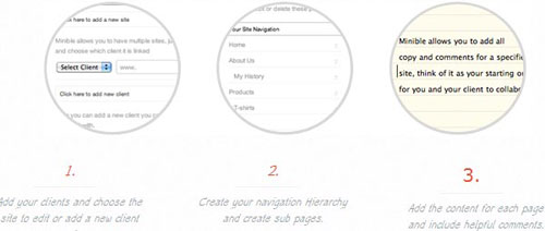
Minible came about when i was tired of having to receive copy for a website in word documents or in badly formatted documents. I wanted one central location where I could see what the client had added and build a site around the content.
FlexSlider

FlexSlider was built to serve up the best responsive jQuery slider around. I had built a few implementations of responsive sliders on different client projects and noticed that there was a glaring hole for plugin support with the concept. I wanted to build a plugin that would serve the newest of beginners, while providing seasoned developers a tool they could use with confidence. What has come forth is this, FlexSlider. I plan to maintain this plugin and provide support to users implementing FlexSlider into their sites. Responsive web design can be tricky, but I hope that FlexSlider serves to uncomplicate the process, just a little bit.
Touchy Boilerplate
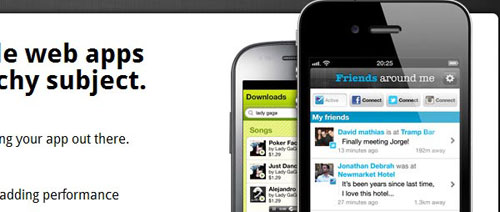
Creating kick ass mobile web apps super fast can be a touchy subject
The feature power behind Touchy™BP. A kickass mobile web app javascript library giving you the best features and tools for easy development and great UX.
Magazine Grid
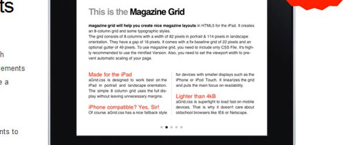
It’s an ultramodern CSS-Framework which comes with common magazine design elements such as pagination, gutters and of course a basic grid.
PhotoSwipe
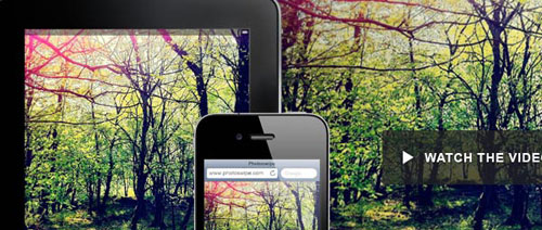
PhotoSwipe is a FREE HTML/CSS/JavaScript based image gallery specifically targeting mobile devices.
Developers and designers requiring an interactive image gallery on their mobile website with the look and feel of a native app.
PhotoSwipe provides your visitors with a familiar and intuitive interface allowing them to interact with images on your mobile website.
Cube
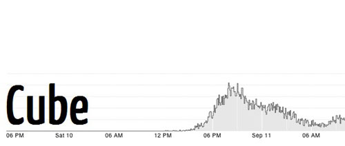
Cube is an open-source system for visualizing time series data, built on MongoDB, Node and D3. If you send Cube timestamped events (with optional structured data), you can easily build realtime visualizations of aggregate metrics for internal dashboards. For example, you might use Cube to monitor traffic to your website, counting the number of requests in 5-minute intervals.
Portamento
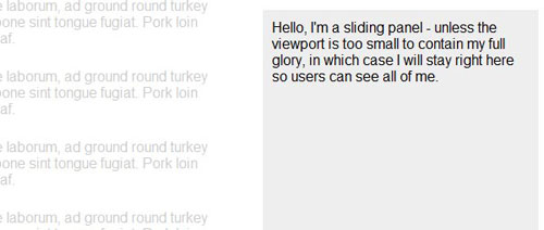
Portamento is a jQuery plugin that makes it simple to add sliding (aka “floating”) panel functionality to your web page. All that’s needed is some simple CSS and one line of JavaScript, and you’re away!
It works fine with floated and absolutely-positioned layouts, in all modern browsers and some not-so-modern ones too.
Portamento also has sensible behaviour if the user’s viewport is too small to display the whole panel, so you don’t need to worry about users not being able to see your important content.
αlphaPun.ch

An image with a transparent background is like a painting on a window: you can see all sorts of exciting things behind it, but you can’t reach through to touch them. αlphaPun.ch changes that!
αlphaPun.ch will trace the opaque part of your PNG or GIF image. It will then punch through the alpha channel (i.e. the transparent bit), so you can click on things behind it.
αlphaPun.ch creates a mask for the opaque part of your pic, along with masks for the clickable content behind it. These masks are placed above the actual image. Clicking a link’s mask will trigger a click on that link.

