E-commerce is rapidly expanding. The evolving digital technology that is helping to simplify daily life is also contributing to the pace of e-commerce design.
Bonobos
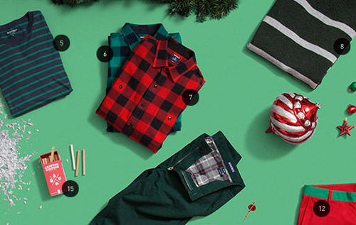
Bonobos’ shopping experience is smooth. Good typography and subtle colors help focus on the products and features, with all distractions fading away as you interact with the site. When a new item is added to the cart, it appears in a sliding sidebar on the right, prompting customers to either keep shopping or check out.
Martina Sperl
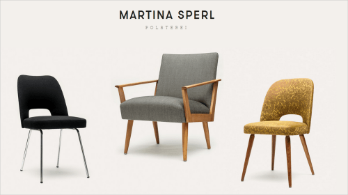
Martina Sperl’s website is a lovely website. The shop features polished photography of her products, with a simple navigation panel fixed on the right side of the page. The hover effect is simple yet bold, showing the item number and price boldly in a large sans-serif typeface. You can, of course, click an image to view details about the product and get a 3-D view of the furniture (just a series of images).
Evyi
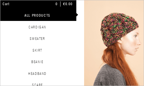
Putting the shopping cart on the left, with the navigation, is a great idea. Because the eye starts from the top left of the page, the shopping cart takes precedence, making it more natural for users to keep track of the items in their cart and the running total.
Banana Cafe
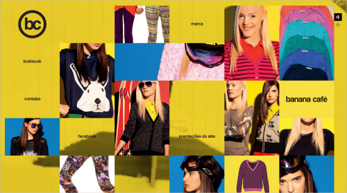
Banana Cafe is crazy. The 3-D hover effects of the site are consistent across the entire shopping experience. The blocks rotate in different directions, creating interesting movement throughout the website. It isn’t your ordinary online shop, but rather a collection of suggestions for your closet.
MadeForFun
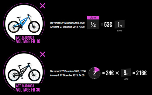
Well, this online shop could be made for fun, but fun was probably not the only reason to set it up. The experience on the site is, however, quite snappy indeed. You can quickly customize each product with features displayed using an accordion pattern.
Indigo
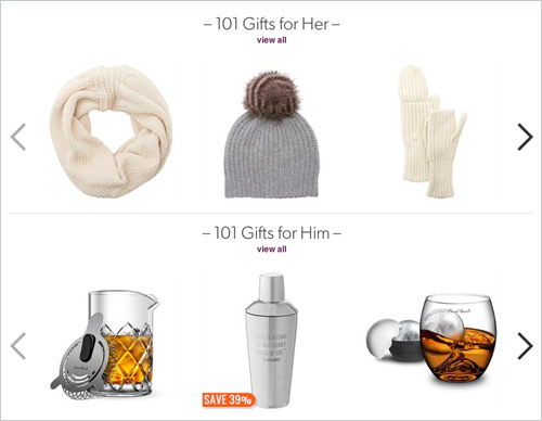
Indigo’s shopping experience isn’t particularly extraordinary, but it’s a great example of how shops with a relatively large inventory can have a quite nice user experience. The number of navigation options on Indigo is quite overwhelming, especially the navigation in the sidebar looks a bit too complex, yet what’s interesting is the bar at the bottom of each product page.
Walmart
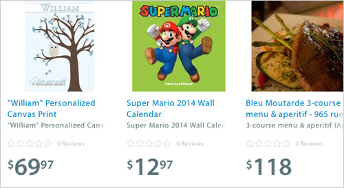
Walmart’s recent responsive redesign must have been quite an undertaking. The main navigation has been hidden behind the “Shop All Departments” button that triggers the off-canvas navigation on the side. The items are well-organized, the interface elements and the typography provide a clutter-free overview.
ecommr
This website catalogs excellent ecommerce user interface designs. If you would like to see various ecommerce interface components, such as designs of product pages and add-to-cart buttons, check out this top-notch gallery. There’s an index for website properties such as “banners” and “navigation” so you can quickly find inspiration for specific sections of your site.
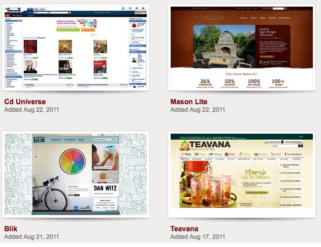
CartFrenzy
CartFrenzy is a website gallery that only features first-class ecommerce web designs. To help visitors navigate and browse through the site, web designs are conveniently categorized into industries like Fashion/Clothing, Office Supplies and Travel. The site is maintained by top web design blogger Steven Snell of Vandelay Design Blog.
Cart Craze
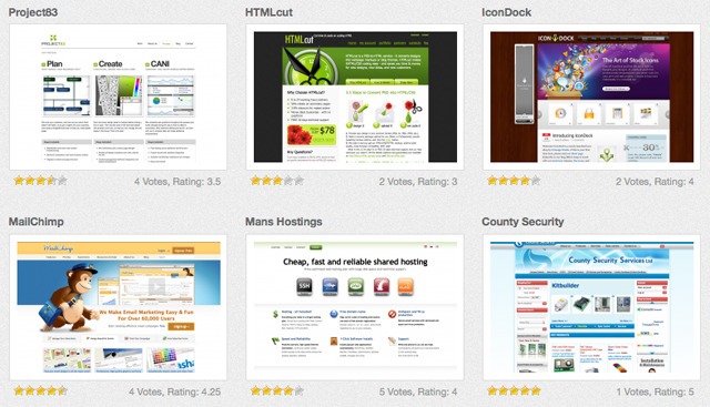
Cart Craze, a web design gallery that’s been in existence for less than a year, is steadily building a big collection of beautiful ecommerce web designs. They regularly update their collection, posting 14 to 23 new designs a month. Look at the site’s top rated ecommerce sites, a gallery view of websites that have garnered the most user votes.
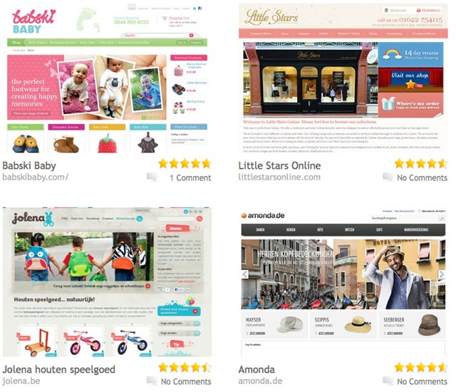
eCommerce Gallery
This site, which has been up since 2008 (a millennium in Internet time), presents top-quality ecommerce web designs to help get your creative juices flowing. The website is managed and owned by James Paden, an ecommerce specialist with more than ten years of web design and development experience.
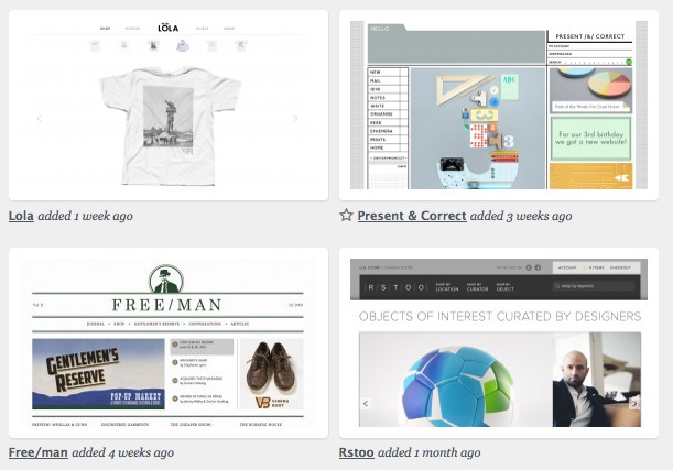
Shop websites (siteInspire)
SiteInspire, a web design gallery site, has a special section that features only beautiful and high-quality online stores. The site is operated by Kulor, a small web design and development consultancy firm located in London.
On the right sidebar, you can select a category (greyscale, organic, etc.), type (corporate site, promotional, etc.), or theme (architecture, education, etc.) to locate ecommerce examples that will be most relevant to you.
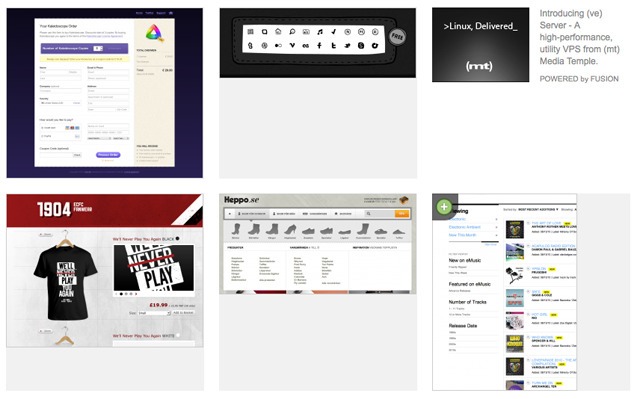
eCommerce Collection (Pattern Tap)
Pattern Tap, an interface design gallery website, has a collection featuring ecommerce-related designs contributed by the site’s users. Inspirational items in the collection include specific ecommerce interface components, such as site navigation and buttons to full screenshots of excellently designed product pages.

