The process of creating a dynamic website takes hard work along with a deeper understanding of design principles. Most of this can be learned from practice and studying what other websites are doing. Animation in web design can be used to enhance almost any page element, and the popularity of jQuery allows anyone to build these effects without much hassle.
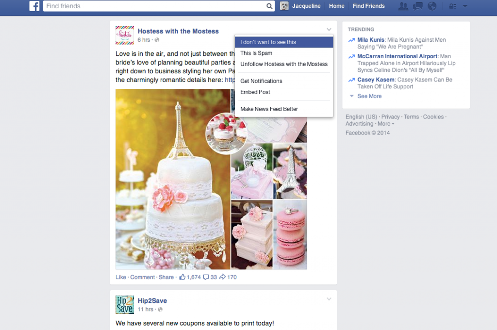
The feed on Facebook is card-based. Each card features content, a way to like, share, and add comments. It also adds in social proof. You can see how many others liked, shared, or commented, which may influence your engagement. Quietly tucked out of the way is a drop menu that gives you the options to hide, unfollow, and report spam.
Google Now
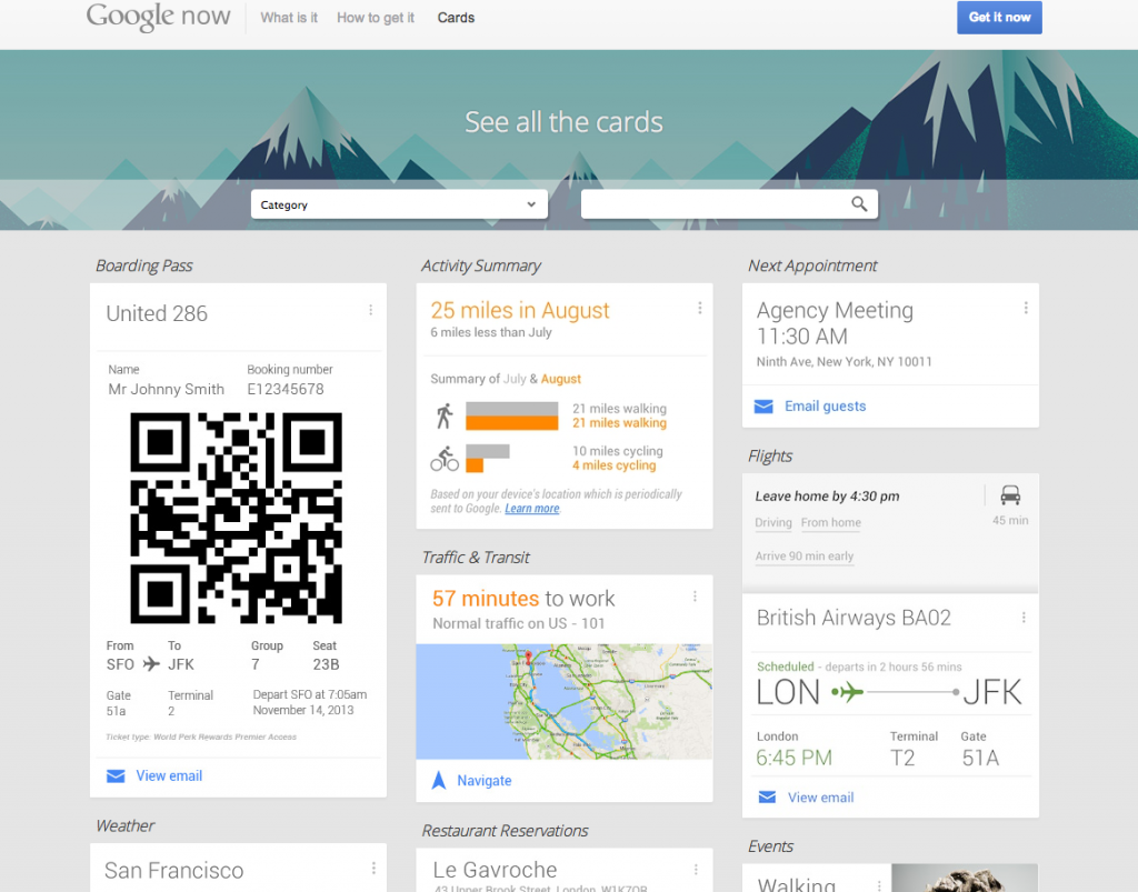
We already know that Google is a champion of card-based design. Many apps in its infrastructure already feature cards, such as Gmail Promotions and Google Glass. Google Now takes it one step further by being completely card-based. This offering is a virtual personal assistant who reminds you of friends’ birthdays, checks local traffic and weather, tells you what to watch on tv.
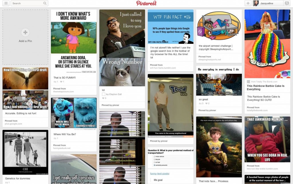
You knew it was coming! Pinterest features one of the most popular card-based designs ever. It’s spurred quite a few imitators. Pinterest is a visual pinboard that allows users to pin, or add, images onto virtual boards. Hovering over a card gives users the option to pin it, send it, like it, or edit it (if it’s already saved to your pin board). Clicking the pin gives you more options, including the ability to visit the website of the image.
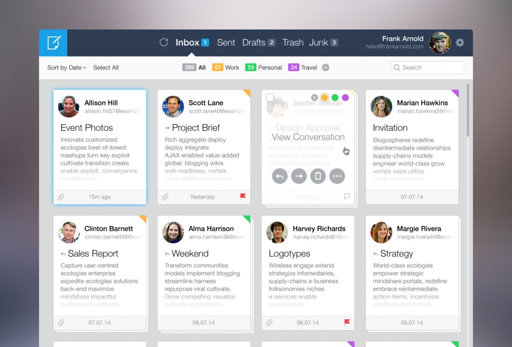
Roman Shkolny’s imagined mail client interface uses cards to visually catalog emails. In this example, emails can be stacked into conversations. Hovers allow color tagging, reply, forward, delete, and more options.
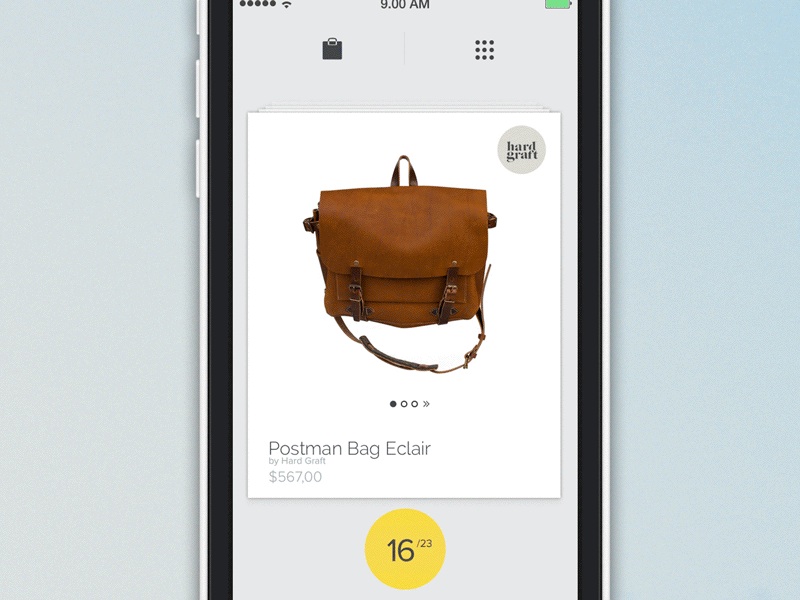
Move Product by Barthelemy Chalvet features highly animated cards that can be selected, deleted, or saved for later viewing. Pop-up cards provide further prompts for the user.
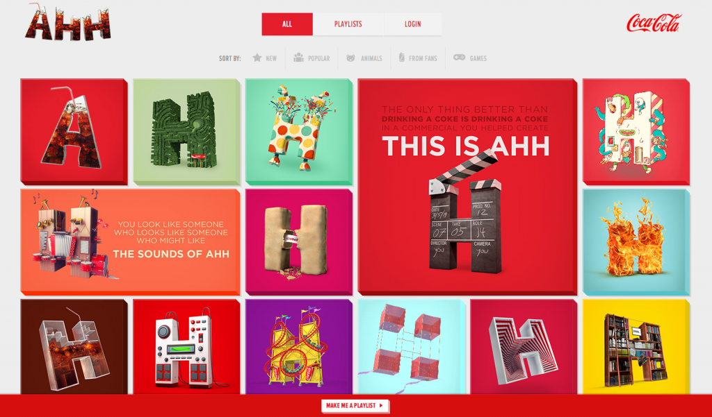
Coke’s Ahh.com campaign features a bevy of card, some rectangular, but most square, some animated but most stationary. As you click each card, it flips over to provide two calls-to-action: add to playlist or play this now.
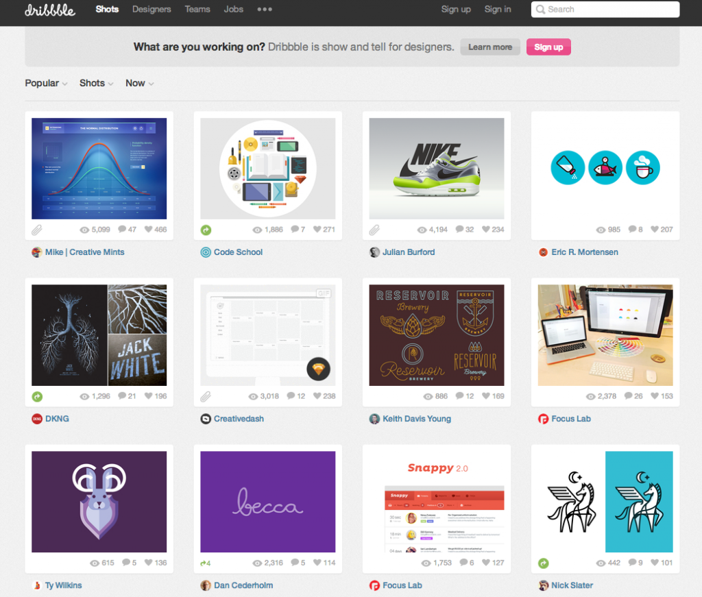
Popular designer hangout, Dribble, features a card-based design. The cards provide insight on how many viewers clicked a card, how many liked it, and how many comments are listed. When users hover over the card, a brief summary of the image is shows, as well as the upload date.
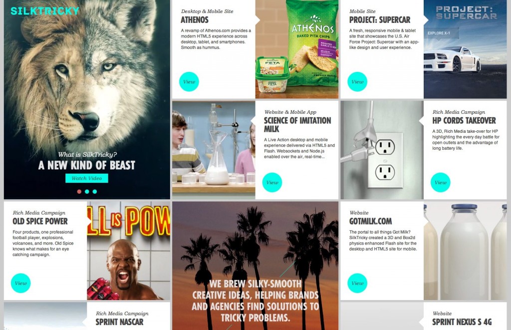
Silktricky is one of my favorite card-based designs because it’s just plain fun. Interacting with the cards and watching them respond to your selections makes the whole design feel intuitive.
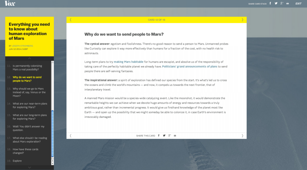
Vox gets into the card game with a what they refer to as card stacks. Akin to slide-shows, card stacks provide a comprehensive amount of information about a particular subject. Each individual card is dedicated to answer one particular aspect of the subject. Cards are shareable and, because of their truncated size, are also easily consumable.
nu box.

