Everything web keeps evolving with time, be it the design part or marketing products. As more and more people participate in this industry to add more value and finesse to its working, new trends and patterns are seen as a part of the evolution process.

December calls for predicting what the new year will bring to us. New trends and new fads are discussed and while the fads do come and go, trends stick on for more than a while. There is so much that the web design industry saw in 2013. With flat designs, progress in the responsive designing, vibrancy in colour, video content; the list is about endless. Let us discuss what 2014 has in store for us and how can you stay well gripped in the business.
Flat Design
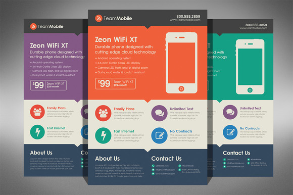
Post Apple’s introduction to flat icons oin their revamped OS, the web world has gone crazy adapting their designs to flat looks and long shadow works on the illustration. For a bigger part of service providers online, you’ll see their work is somewhat becoming predictable and similar because of this trend. Having said that, it does add a sense of fineness to your web campaign and makes sure it is in sync with the latest in the design world. It sure is going to stay for a little more than the other obsessions and you’d see 2014 catch the flat fever more aggressively.
Creative Typography

The most interesting progress in the web design segment has been indicated by the evolution of typography. From very crass fonts a decade back to creatively charactered typefaces in today’s modern websites, most illustrators want to get a grip on becoming type ninjas. The typography in a way adds an emotion to your page. A funny font style ensures your reader would realise the nature of your website as soon as he looks at the font. For the serious and advertorials, there is the ever so booming Helvetica. But besides that, even logo designs have seen pretty typos take over the intricate design because of their clean looks.
Mobile Responsiveness: A necessity
WIth the world trying to access internet through their smartphones, you don’t need to be a rocket scientist to understand the importance of a responsive website. It is an absolute necessity. You cannot do without you. You do not want to end up losing on a major chunk of your business because the whole website you designed fell apart on a different resolution-ed gadget.
Video Introductions for communication
Not very long ago, the website that had a good number of creative pictures to talk to its readers was considered a well thought out website. It does hold true that graphics connect much better with the audience than blocks of written content. But things have taken a turn from there too. You’d see most product descriptions are done on videos and motion graphics for an even stronger connection. You have a minute of your reader’s time and you need to tell them the maximum without losing their attention. Fill in words, motion, characters, quirk and lots of effects. Sounds easy but you really need to wreck your brains for the kind right script. I’d say the videos are really going to take over the internet business in the time to come.
Writer:
Anna John is an experienced website designer and infographic master. She handles all the designing task easily. Apart from these she manage account for an online website similar to www.depositaccounts.com. She is experienced and want to work with brilliant teams.


