It’s no secret we think responsively designed websites rock. For those of you wanting to dig a little deeper, check out our take on why responsive web design is an excellent solution for our websites and how responsive design actually works.
Dadaab Stories
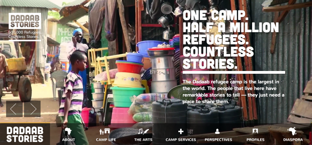
This site is awesome! It’s the kind of responsive innovation that makes you go ‘wow’. The Dadaab Stories website actually transports you to the Dadaab African Village through the use of movie-like headers and wildly attractive design features that seamlessly transform over a variety of mediums. Take a quick scroll through the straightforward screen options and you will see for yourself the impressive attention to detail. Now that is design you can feel good about!
More Hazards
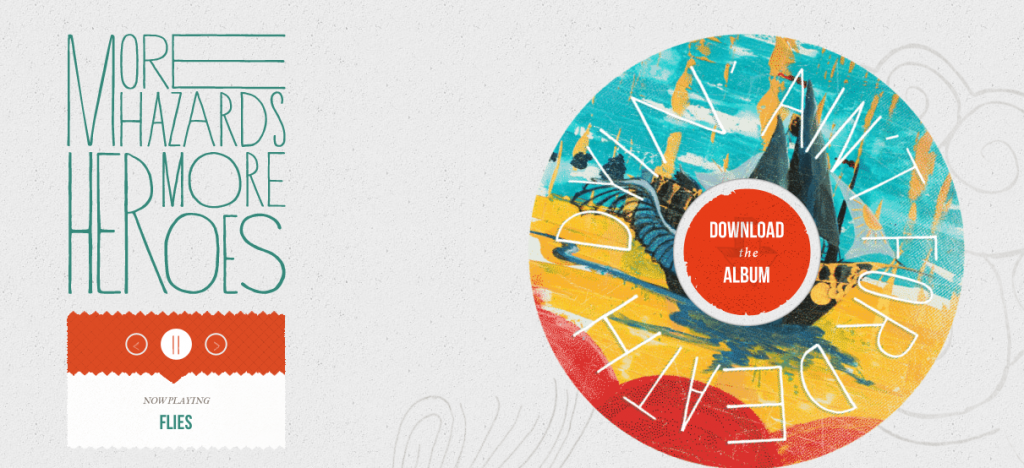
I just love this site. More Hazard’s knows music but they also know website design. The awesome turntable and uncomplicated focus make this site just as much about music as it is about user experience. The page exemplifies the group’s ‘quiet is the new loud’ motto with a creative yet understated design that emphasizes the importance of mobile listening. You should definitely check More Hazard out, if for nothing more then to hear their album-which, by the way, is just as wonderful.
AWWWARDS
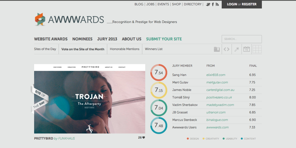
Awwwards.com not only creatively displays and assesses innovative websites but it also boasts one of our top choices in responsive design. This company does a great job of simply and clearly promoting well-made sites without taking their own design too seriously.
The Haberdash Fox
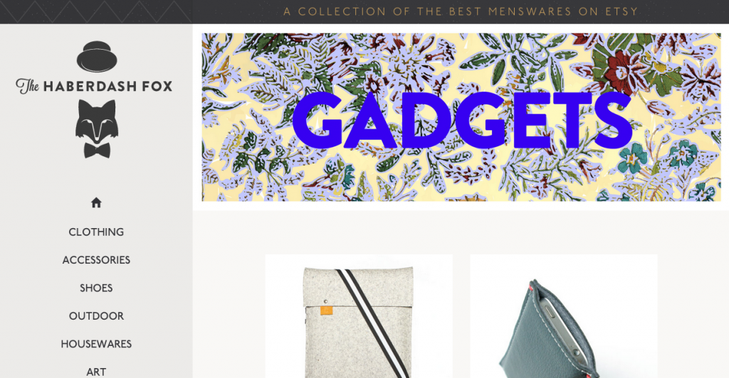
The funky details and crisp construction of The Haberdash Fox website make it nothing short of well dressed. The collection of menswear finds from Etsy is tactfully laid out and the navigation is intuitive. This site no doubt creates a fantastic shopping experience for its of-the-moment consumers.
The Children’s Museum of Pittsburgh
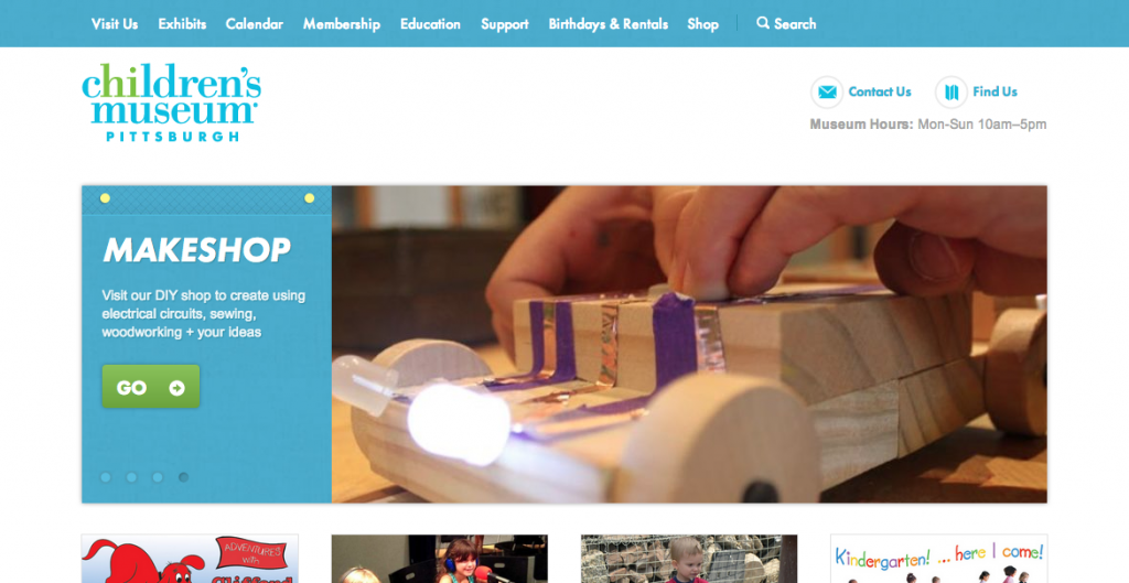
The Children’s Museum in Pittsburgh’s website sports an unfussy design, inviting bright colors and readable, multimedia layouts which are extremely accessible for the parent on the go. With just a touch of whimsy, this website is a great fit for the kid inside all of us.
Contents Magazine
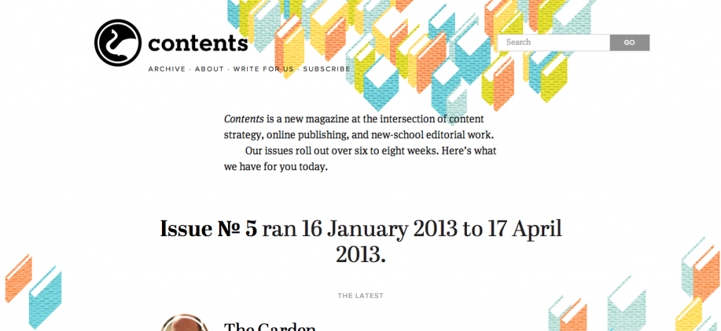
Contents Magazine offers a fantastic example of how responsive design can enhance branding. The logo easily adjusts for any screen and the background imagery is both clear and fresh. Contents Magazine.com is well organized and cleverly designed which makes reading the equally interesting articles easy and inviting.
Sketchin
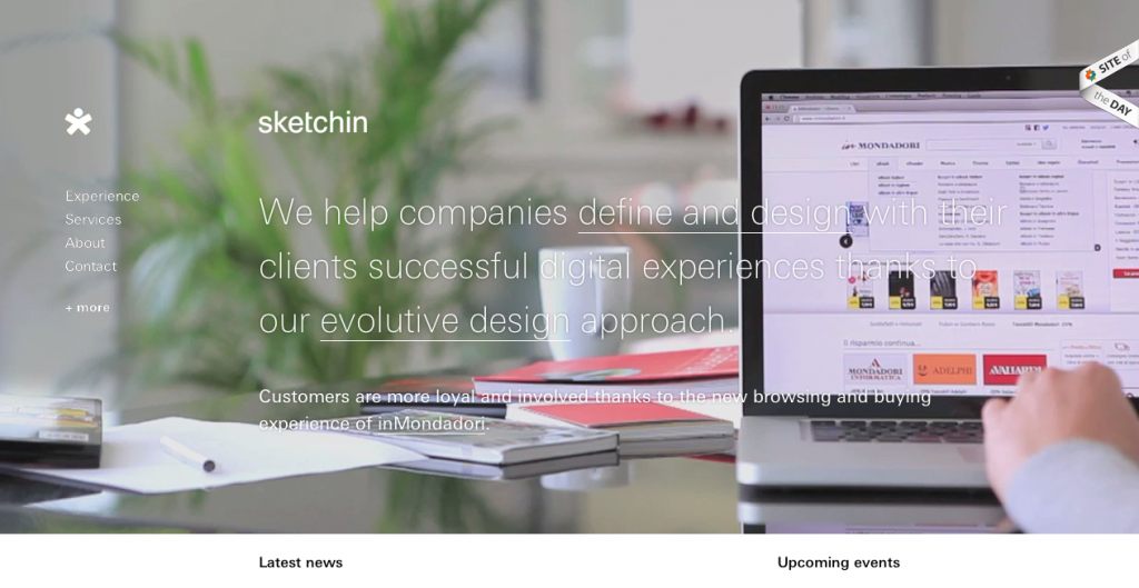
Sketchin, an international user experience design company, has a website that clearly highlights its area of expertise. With changing background reels detailing different client-technology interactions, this website cleverly communicates with its users.
Disney
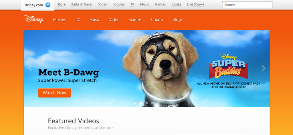
Nothing makes a Disney fan happier then seeing their favorite character on display. Disney’s site does a fantastic job of showcasing the company’s greatest animated stars across all screen mediums. Go ahead and resize your browser to see how seamlessly Simba and Mickey change with you. Simply magic!
The Next Web
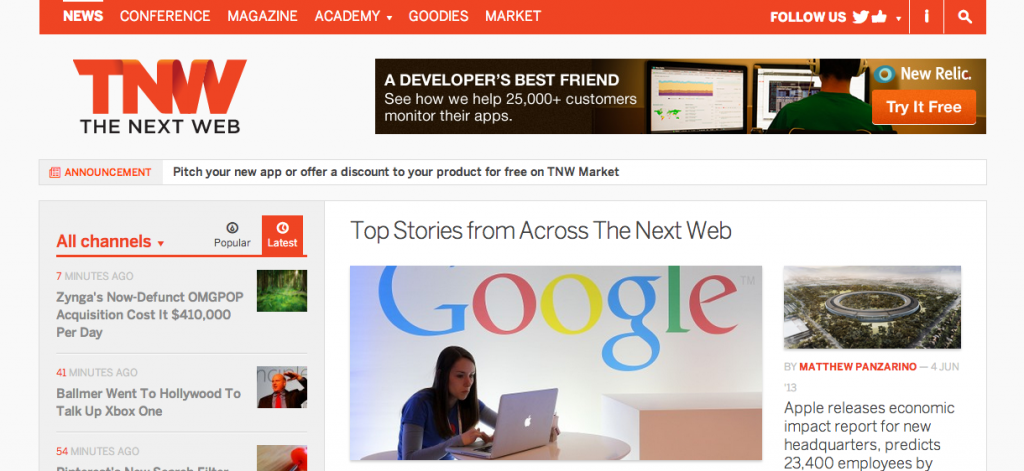
As one of the companies promoting well crafted responsive design, The Next Web does a great job keeping up with the trends. Intuitively designed for multiple mediums, the website is just as easy for me to peruse on my iPhone as it is on my desktop.
These are Things
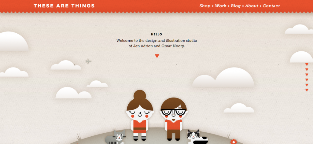
After viewing a ton of responsive websites, These Are Things still remains one of my favorite designs. Created by two artists, this site is nothing short of creative. It has imaginative scrolling features that translate well on any screen. Scrolling through the pages made me feel like I was being taken through a day in the life of the two creators. By paying this page a visit, you will not only get a taste of Jen and Omar’s quirky imagination and lovable admiration for their pets, but you also get to experience the expertly responsive site that left me with a big ol’ smile.
A Book Apart

A Book Apart demonstrates that website navigation can be a breeze regardless of how you access a page. This organization does a stellar job of maintaining an orderly product display system that smartly conforms to different mediums without clutter. With their sharp aesthetic and clear branding, A Book Apart does a standout job displaying their products.
Design Week Portland
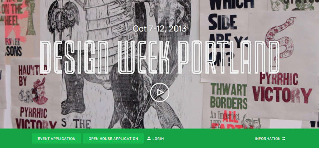
Now this is a group that understands the importance of multimedia. Design Week Portland offers a warm, personal welcome to its website’s visitors with a video appropriate for all viewing mediums. Add that to the page’s clear navigation, fun color scheme, and down to earth messaging and it becomes clear these designers really are experts in their craft.
The Boston Globe
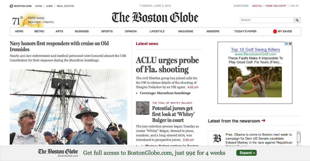
Given the amount of content that passes through the Boston Globe on a daily basis, this website is extremely well organized! One of the pioneers in responsive news media, it continues to provide an outstanding example of how companies can optimize the webpage viewing experience across a large range of visitors. The ease of news access makes paying the extra subscription charge well worth it.
Rally Interactive
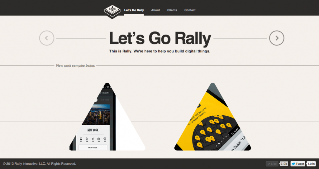
I so appreciate Rally Interactive’s website design. It does an amazing job of giving its visitors a sense of the company’s personality. Their attention to detail is clear and the page’s unexpected gadget-like design features made me feel like I was messing around with an outdoor toolkit from REI. Complete with spinning buttons and whirling images this website was both intriguing and, as their name suggests, highly interactive. Rally interactive is the type of company that successfully embodies the analogy that reaching an audience is like climbing an icy mountain; it takes ingenuity, skill and a bit of intuition.


