lease notice that this article is targeted atnewcomers to the industry rather than seasoned designers and developers. The point of the article is to provide a general guide to building meaningful, future-friendly websites today, including strategies, techniques and tools that most Web designers are used to today
01. This Is Your Kingdom
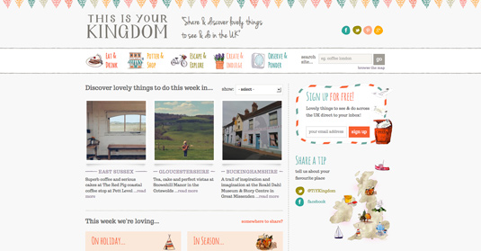
This is Your Kingdom is a site that brings together style and substance to help visitors find activities in their local area. Simple in its concept, the site is much more complex when we start to consider all of its inner workings and potential.
02. Travel Portland
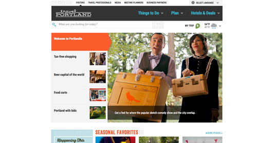
Travel Portland aims to inspire people to visit Portland in Oregon, US, and to help them plan their trip with tools and content highlighting the unique opportunities in the city. Clean design is on every page of its site with images telling of the Portland experience, from waterfalls to food trucks.
03. Worry Free Labs
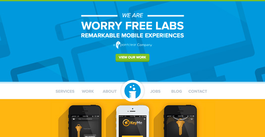
Worry Free Labs is a web agency based in New York that markets itself for its expertise in building remarkable mobile experiences. Where better to show off its skills than on its own site?
04. I Shot Him
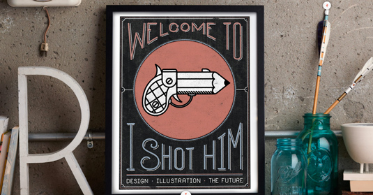
Intriguingly named San Francisco-based agency I Shot Him doesn’t take itself too seriously. “We are a studio that learns as we go. When we first started learning how to develop sites, our resources all pointed to WordPress as the quickest and most useful route,” explains co-founder Michael Jeter.
05. Great Lengths Hair

Great Lengths Hair is a fully responsive website for a hair extensions fashion brand that was built by Turn Key, which is based in Leeds. “We used various JavaScript techniques and frameworks to achieve the responsive and infinite loading techniques,” says development director Andrew Markham-Davies.
06. Toronto Standard
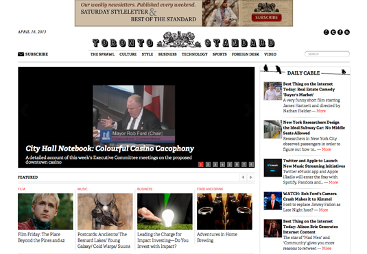
Digital creative agency Playground was behind the design of this redesign for the Toronto Standard. Creative director at Playground Ryan Bannon explains, “The client was an investor who had purchased the rights to an old Toronto news brand and wanted to reinvent it as a purely digital, fresh voice in the Toronto editorial scene. That was about it; purely digital, fresh voiced editorial.
07. Harvey Nichols
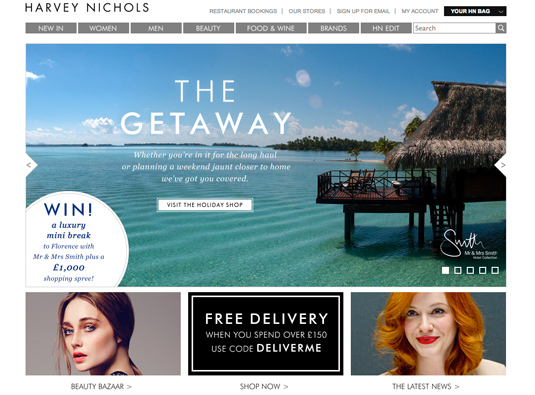
This site for international luxury fashion destination Harvey Nichols was created by digital agency Pod1. Fadi Shuman, co-founder of Pod1 explains, “The brief was an exciting ecommerce proposition to deliver the luxury shopping proposition, to be flexible in its design for campaign imagery and themes.
08. Captain Creative
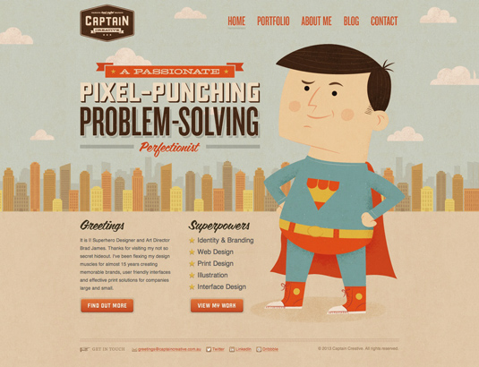
A true superhero of the web world has finally revealed himself. And he has a website! Brad James is a self-described “mild mannered designer and art director” based over in New South Wales, Australia. Although he works for agency, iQmultimedia, James has set up as his own online identity named Captain Creative.
09. Little
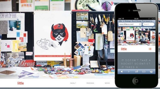
Little has provided strategic design thinking and execution to meet external and internal business challenges for Fortune 500 companies, nonprofits and others for over 30 years. “With a significant portion of web traffic moving towards tablet and mobile, it was imperative that we addressed the browsing experience needs of our users,” designer Michael Arney tells us. “I was confident that as long as we were using a responsive framework like Bootstrap and an easy-to-use CMS like WordPress we’d be setting ourselves up for long-term success.”
10. Poster Roast
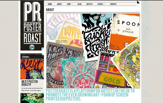
Poster Roast is a platform for UK artists to promote their screen-printed gig posters. The site first came about whenTelegramme was commissioned by Alex Curtis and Chris White. Director of Telegramme Studio Robert Evans explains, “I met them last year at various gigs and exhibitions they were putting on. We got chatting about the emerging gig poster scene in the UK, and the idea arose of giving all the artists an easy way to get people to see and buy their work.”
11. Viewport Industries
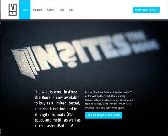
Viewport Industries makes digital and analogue products for web professionals. Founded by Elliot Jay Stocks and Keir Whitaker in 2011, the company chose WordPress as its CMS. “I’ve used WordPress for years and have developed a way of working that means it’s easy to get up and running with a new theme,” explains Whitaker. “Adding a page, new post or custom post type is straightforward and allows flexibility.”
12. Tornobambino
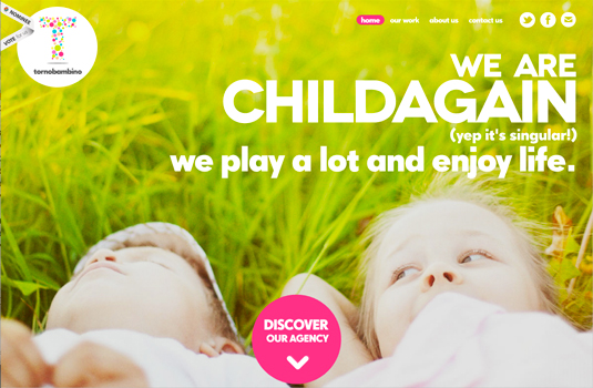
Tornobambino is a small Italian agency comprising designer Fedrica Cau and developer Pasquale de Luna. For their cool and colourful site, WordPress was the obvious choice, Cau reveals. “We think WordPress is the best option for small websites that need to be modified and tweaked often,” she explains.
13. E&E
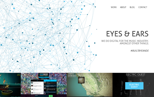
The E&E agency mostly works in the music industry, but has been known to flex its considerable talents in other areas of the digital realm. When it came to crafting its award-winning site, WordPress ticked all the boxes.
14. Jess Marks Photography
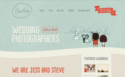
Brisbane-based wedding photographers, Jess Marks and Steve Bliesne’s online home is a fun, whimsical website bristling with personality. When it came to revamping the site, Bliesner says that they, “actually moved from ExpressionEngine to WordPress. We searched for a long time to find the right design house to do this project. We settled on Simple as Milk, and WordPress is what they worked with, so we transitioned.
15. Work by Simon
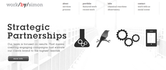
Work by Simon is the design studio site of Simon Carr and Elijah Wasserman. The website serves as their online portfolio and blog.


