It seems that most of the E-commerce websites that we see over the internet don’t worry much about their design. It seems that they overlook the fact that a website is their new visiting card, the perceived image of their company. It is also the first and in most cases the only mean through which they can communicate with their customers and as Megan Whitman of Hewlett-Packard puts it “Communication is at heart of e-commerce”.
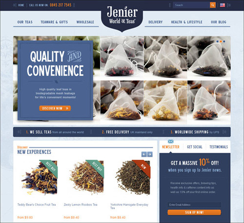
Jenier Word Of Teas
This website design has been chosen to demonstrate to you how many ways of contact the Tea Shop provides: phone number, contact form and mailing address. The phone number is placed on the most easy-to-find places: in the website header and footer. The customers will definitely trust the site and are more likely to do business with it.
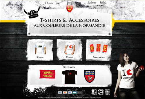
Normanniae
This online shop attracts with its unusual background color, attractive images, yet providing user-friendly navigation as well as a simple checkout process.
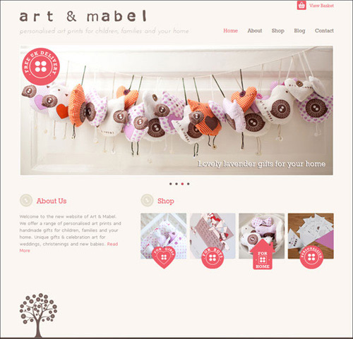
Art & Mabel
The website belongs to Art and Mabel, a shop which offers personalized gifts for children. The home page is clean and stylish, without being overloaded with distracting elements, yet informative enough. Due to the easy-to-use website navigation, the whole order process is simple and transparent.
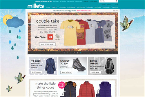
Millets
Here is another eCommerce website with an interesting background. Simple user-friendly navigation, well thought-out layout, high quality images, a variety of customer service options and payment options – everything makes this online shop stand out among others.
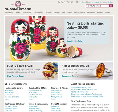
The Russian Store
The Russian Store design looks really simple, yet informative. The unobtrusive color scheme combined with the striking images will definitely create a good impression on each customer.
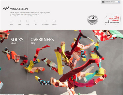
MINGA BERLIN
Here is one of the most laconic eCommerce website designs which leaves and impression with the simplest navigation and high quality product images. Minimalist design is always a win.
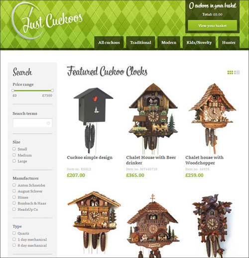
Just Cuckoos
This eCommerce design is created in a minimalist style and meets the most significant requirements: extensive product filter, huge and detailed product images, various means of contact, namely phone number, e-mail address, mailing address, and contact form, etc. The green used is an accent color which has a strong emotional correspondence with safety.
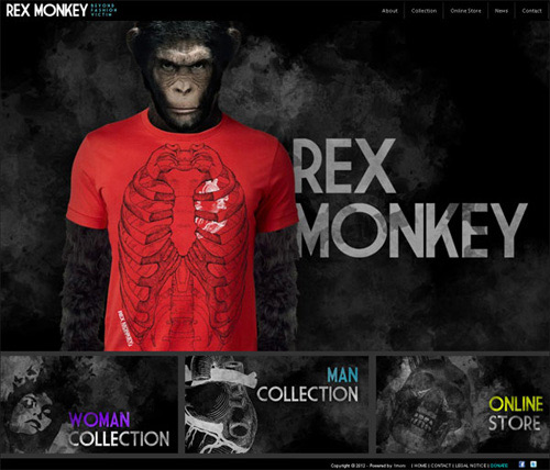
Rex Monkey
Here is one of the most creative and striking eCommerce websites! And though the website home page doesn’t look like a store at all, it still provides user-friendly navigation, a contact section, really HUGE product images, descriptive product information, a simple checkout process and much more to provide customers with a rich shopping experience.
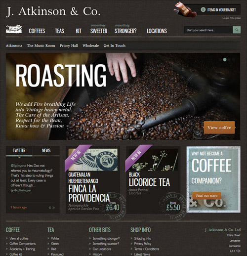
The Coffee Hopper
This online store, selling coffee and tea, impresses with its flawless and well thought out design. The color scheme is perfectly balanced.
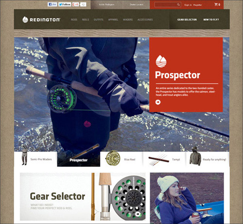
Redington
This online store sells fishing equipment and apparel. It’s really obvious that its owner thought through his categories and navigation elements very carefully: it is easy to move around the site, browse different categories and get to the shopping cart.
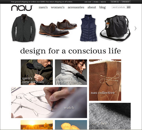
Nau
This eCommerce design presents a creative way of website navigation done in the form of a collage, which makes it really easy to find the needed product. The website looks trustworthy, as it provides a great variety of customer care services and contact options: phone number, mailing address, e-mail, and even live chat. The product images are also huge and attractive.
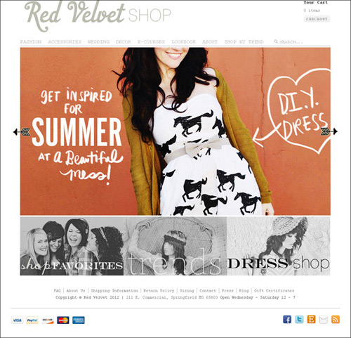
Red Velvet Shop
Cool typography together with the muted color scheme and bright images add a little touch of style to this eCommerce design. Everything is neat and clear.
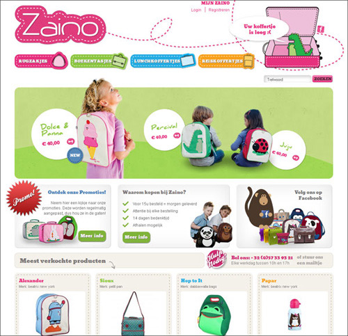
Zaino
Everything is perfect about this website: catchy images, informative and detailed product description pages, convenient product filters that make product searching fast and easy. The hot pink and green go well together, and the use of stitching and bright colours creates a pleasant and funny atmosphere.
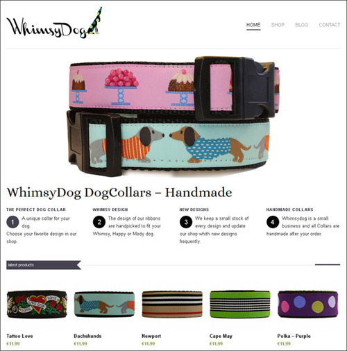
WhimsyDog
The minimalist website design of this Custom Dog Collar Shop speaks for itself. The Home page slideshow, featuring high-quality, striking images, catches a user’s attention within the first few seconds. The product description page provides an opportunity for customers to leave reviews on different products.
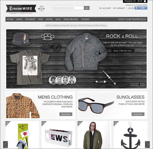
TensionWIRE
This online shop is characterized by a muted color scheme, eye-catching image slideshow, big product images, and descriptive product pages. The design is worth your attention.




You really should check out amber necklaces because their design is pretty nice.
Look for amber jewelry , you can find even more interesting templates for websites developers.