The use of textures can dramatically improve your print design work. You can (if used sensibly) add more depth to your work, whether your work be business cards, advertisements or posters. The results of using texture in your print design projects can be completely different every time, depending on various factors such as what textures you use, how many textures you use, and how you apply them to your work.
Chuck Tingley
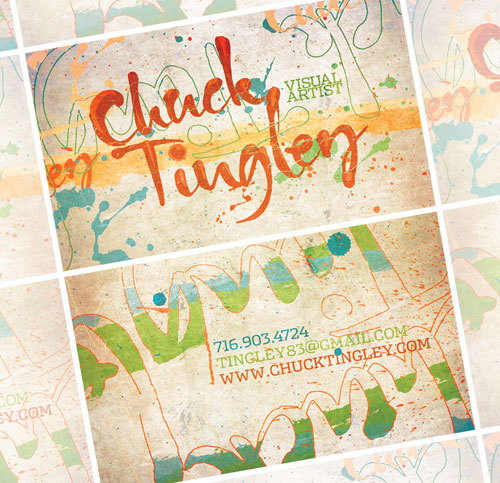
The use of texture in this card is incredible. A little bit of grunge mixed with paint and splatter marks is (usually) never a bad thing, and the composition of this card shows how to do it perfectly.
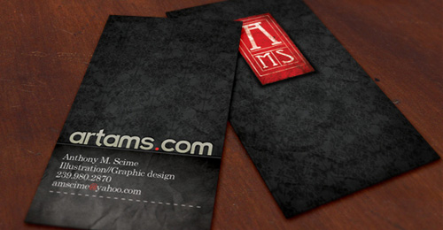
Artams
Redbox Media
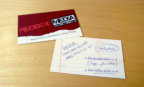
Redbox Media use a subtle grunge texture in the red of their business card to make it just that little more appealing. The digital texture of the lined paper and coffee stains, combined with the ‘hand-drawn’ style typography make this card very unique.
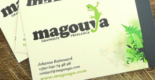
Magouya
Marko Manojlovic
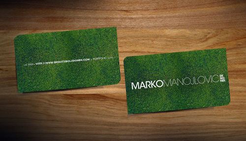
Well, it’s quite obvious what the texture is used for in Marko Manojlovic’s card. Although very simple, it’s interesting and definitely appeals more than a standard plain card!
Matus Macej
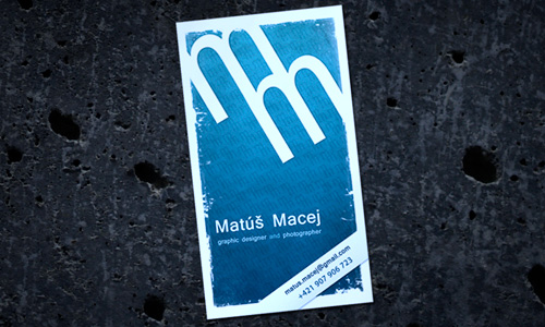
Colokial
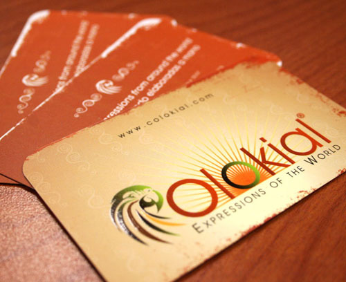
Colokial use texture in their business card to give it a worn-out and stained “tropical” look. It works very well with the color scheme of the logo and that little touch of Spot UV makes it so unique!
SeedVibe
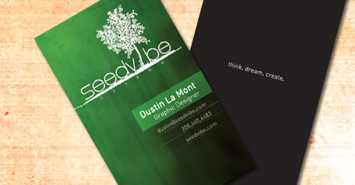
Hypno Liberate
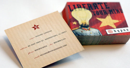
The texture used in Hypno Liberate’s card adds a lovely vintage look to the design, matching the corporate brand of the company well.
DigitalMedia
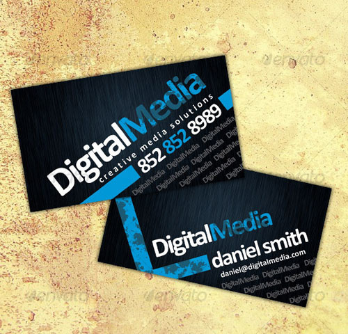
Textures in Printed Advertisements
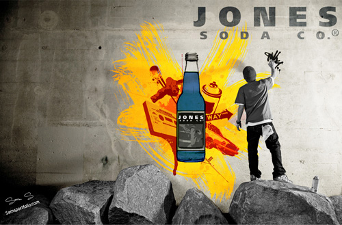
In my opinion, textures are used to their greatest advantage in print advertisements such as billboard posters and postcards. Taking a look at the selection of superb designs below; you can clearly see the huge difference adding a little bit of texture can make.
Jones Soda Ad
Got 2 Be
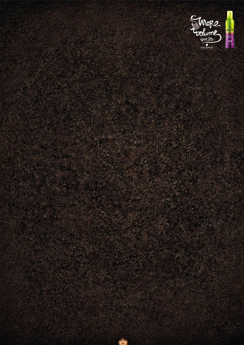
This fantastic advertisement for a hair product is incredibly clever and is made up (almost) entirely of hair texture. The addition of someones face in the bottom center of the poster makes it a little comical, too.
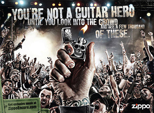
Zippo Hero
Smoke Shave
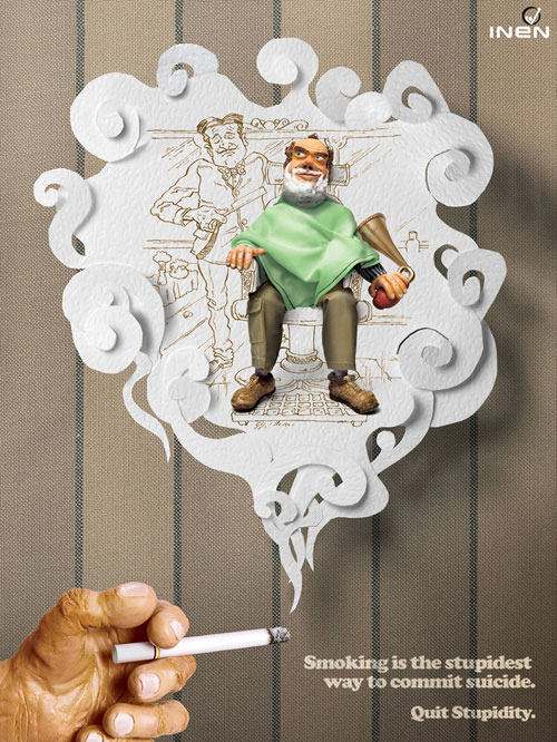
This great poster to encourage people to stop smoking has a great three-dimensional look to it which was created using textures. In fact, without the textures in this poster, there’d be nothing left!


