With web users bombarded with so much information, web designers are constantly exploring new ways to deliver content. One-page websites are now being widely adopted with some of the biggest brands in the world using them to provide users with a fast, clean and simple experience that is simultaneously effective and beautiful.
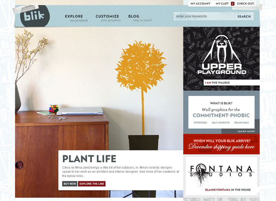
Blik
Blik manufactures whimsical removable graphics to spice up the walls of your home. Even though the “About” info gets a bit lost in the large product preview in the center, getting an idea of what Blik is all about doesn’t take longer than a couple of seconds. .
Fred Perry
Fred Perry’s e-commerce store has a contemporary and elegant look, conveying key features of the brand very well. The stylish grayscale color scheme, along with sparse text in Helvetica font, make an impact. The design naturally combines Flash and JavaScript. 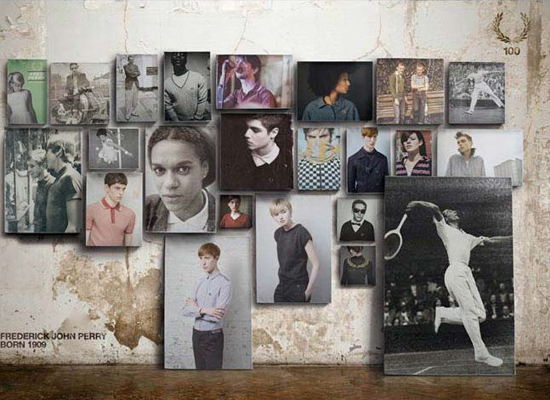
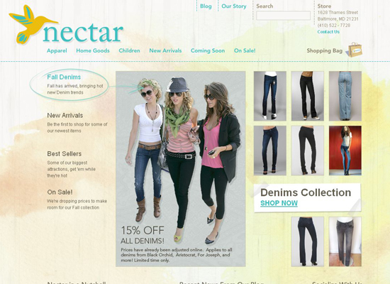
Nectar
The website for clothing and accessories boutique Nectar was designed bySunrise Design studio. The website’s structure allows you to browse goods and make purchases with ease. A muted palette and slipshod watercolor strokes in the background give the layout a positive feel.
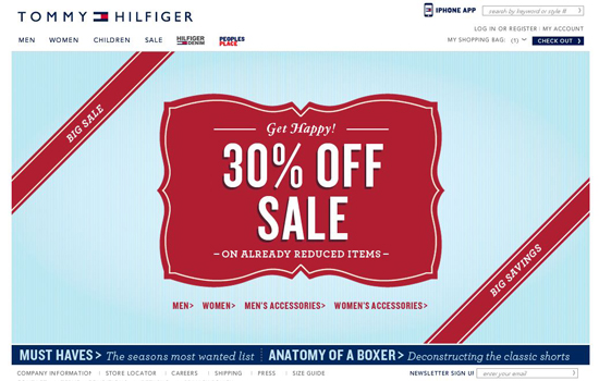
Tommy Hilfiger
Another giant brand: Tommy Hilfiger. This design relies on simplicity, a comfortable shopping experience and its corporate identity.
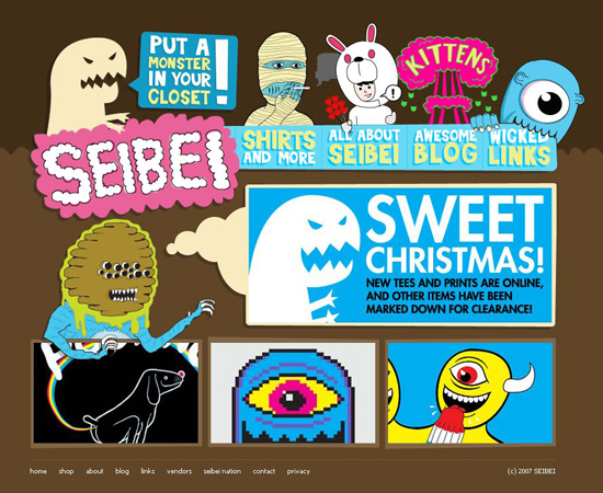
Seibei
Now, that’s a design you will not forget! The site has a very simple, even minimal navigation combined with a striking “cartoonish” design. Product pages are clean and straightforward. Nice and unique design solution.
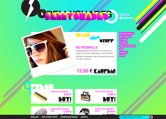
Bellyshades
The design of German club-wear and accessories store Bellyshades stands out for sure. The vibrant acid colors, insane typography and animals that stand in for shopping carts will leave you anything but cold.
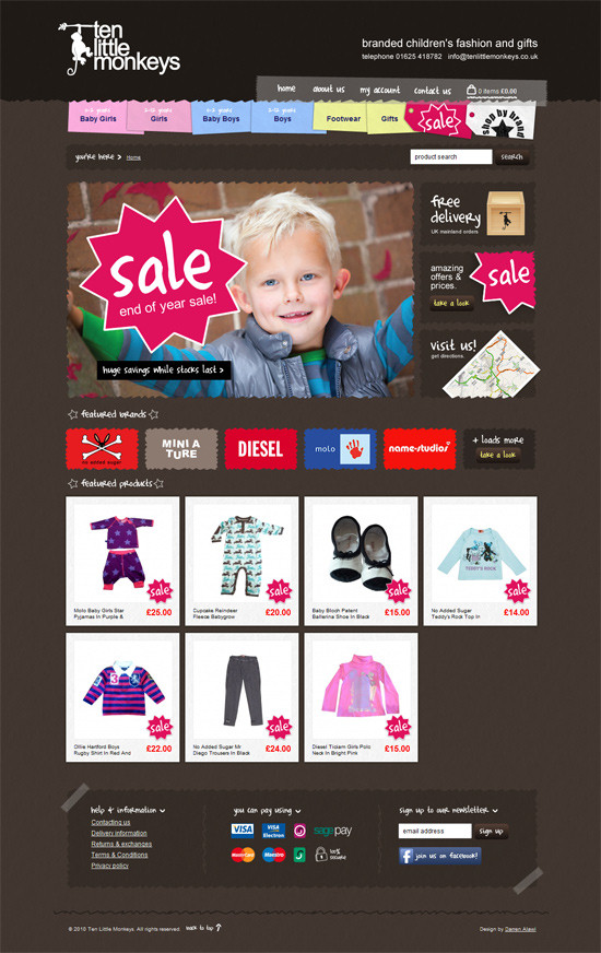
Ten Little Monkeys
This design has a very strong visual appeal; vibrant colors work well on the dark background, the navigation is colorful yet intuitive (notice how the section for girls and boys are distinguished).
DogCollars.ca
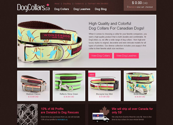
Here’s another beautiful e-commerce website: DogCollars.ca. It’s a simple HTML website with a neat grid-based layout, a warm chocolate color and big high-quality thumbnails. The design is minimalist but not plain, and it delivers a satisfying shopping experience.
’47
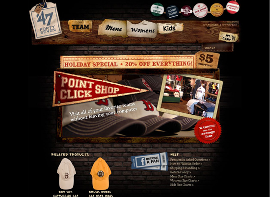
Premium sports apparel brand ’47 has an interesting history: “This is a classic story. It’s the American dream come to life…” Thus, the company emphasizes the individuality of its brand in its store design and associates that brand with a community.
Storyville Coffee Company
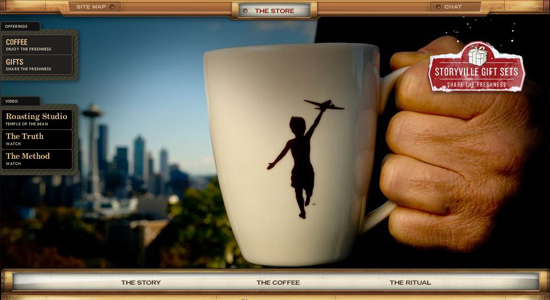
Creating an e-commerce Flash platform, let alone a good one, is challenging. In addition to the Converse store profiled above, our showcase includes another fully Flash-based online store: Storyville Coffee Company.
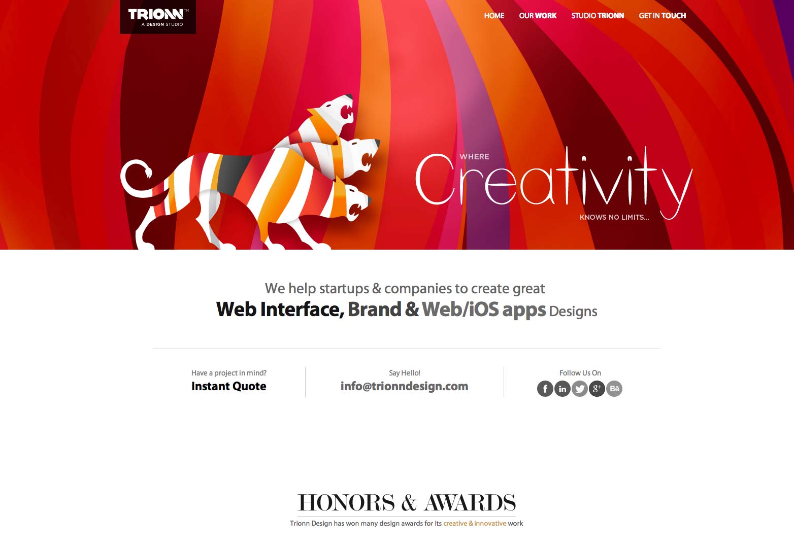
Having won several awards, Trionn Design’s one-page HTML5 website uses parallax scrolling to make it easier for users to navigate through the site. This responsive design uses attractive images to keep users engaged, and also incorporates some great CSS effects.
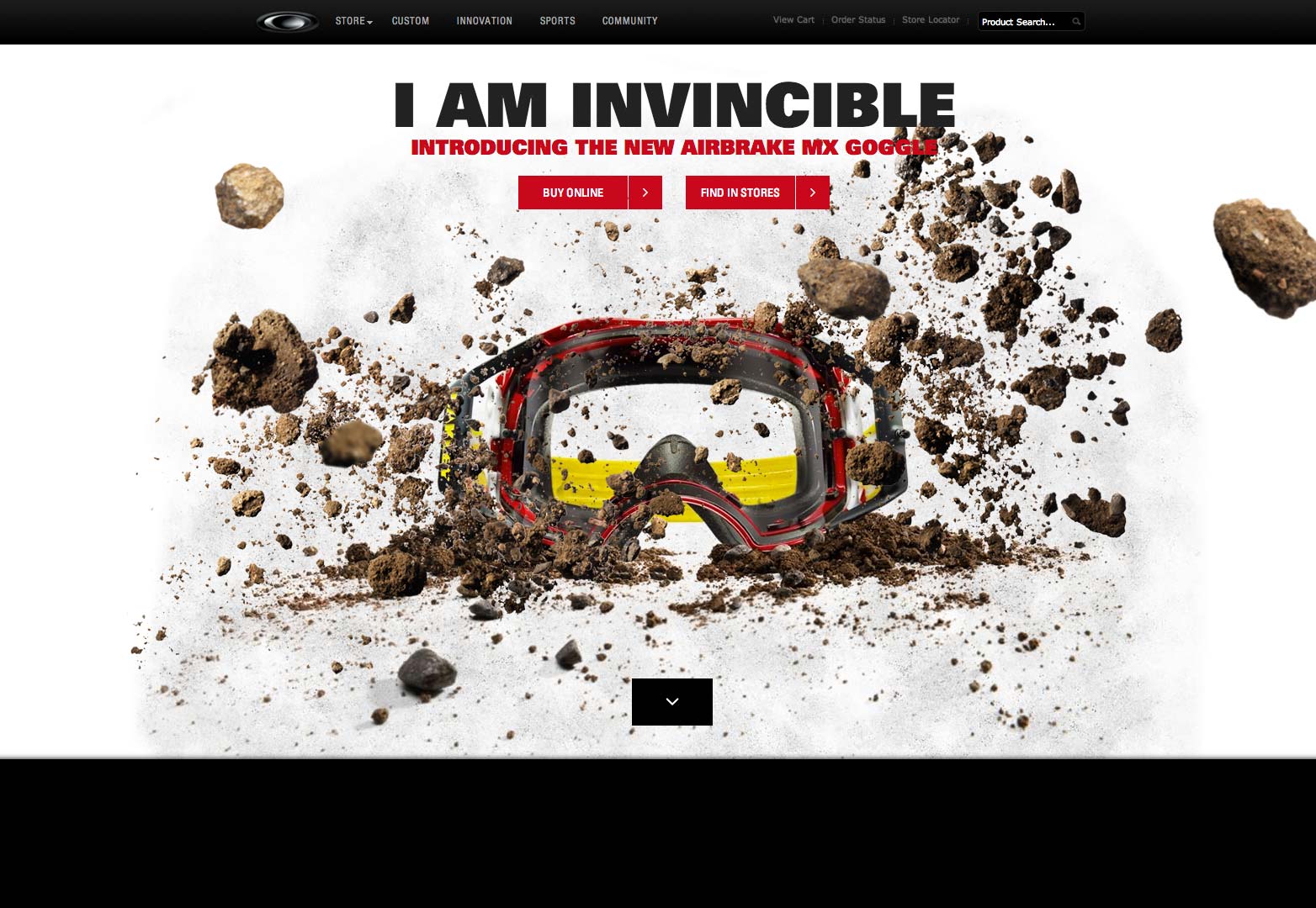
Oakley have created this entertaining and eye catching site, combining parallax scrolling and amazing photography to showcase the new Airbrake MX goggles in a unique way.
Not only is this site stunning but it also provides useful information on your ’5 a day’, encouraging visitors to eat more fruit. The site makes use of clever parallax scrolling for a bright, almost video-like feel.

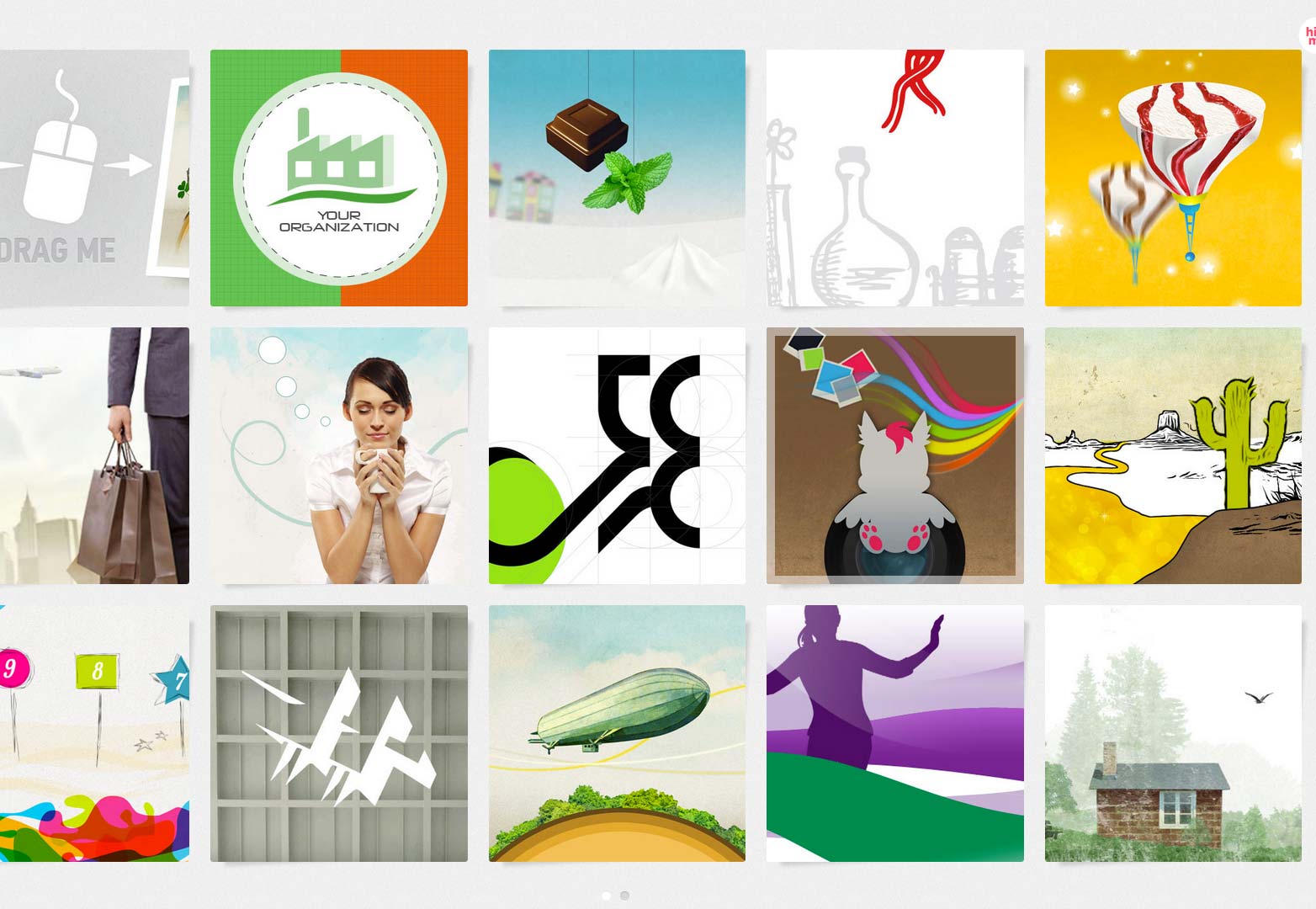
Graphic designer Laura Baffari has created a stunning interactive portfolio that uses horizontal scroll and touch swipe for smartphones and tablets. When entering the site you’ll see tiles displaying her work which can be scrolled through in any direction.
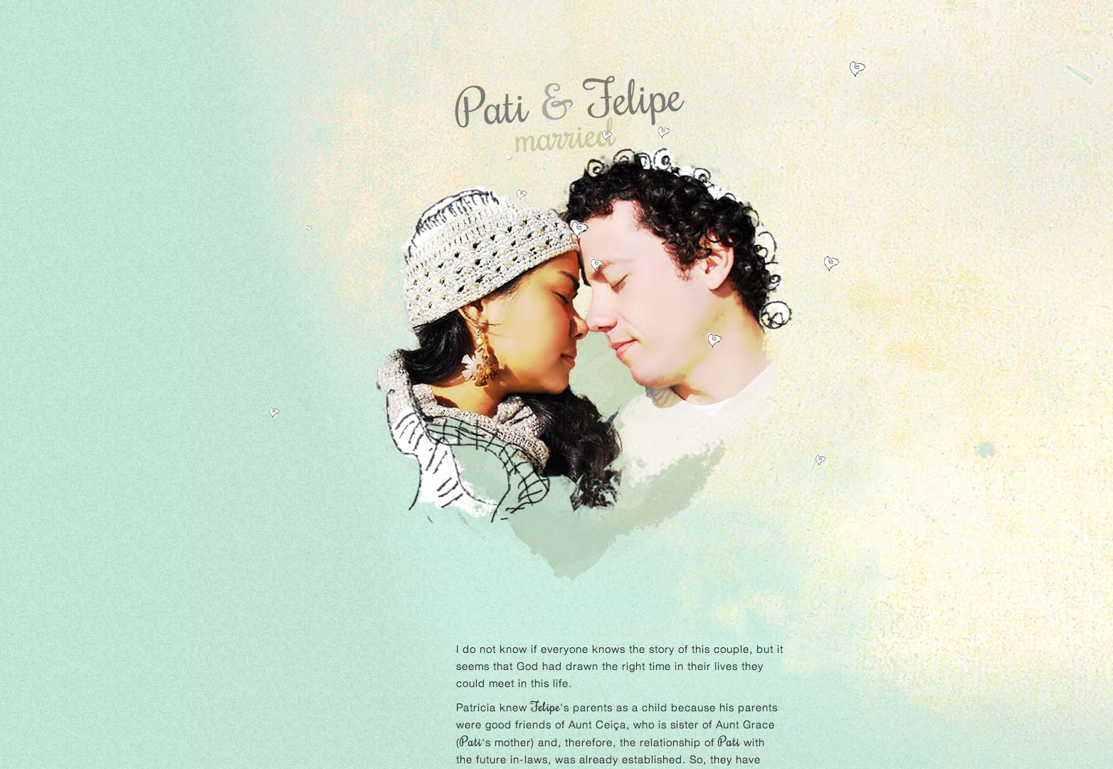
This one’s for all the romantics out there. This has to be the most unique way to confirm your attendance to a wedding. A beautiful story of a couple who met many years ago, this site uses parallax scrolling with some great animation and inventive typography.
