I have to tell you that I discovered my first CSS framework more than a year ago and I was fascinated at least. Hours of writing the same dull code and then solving the same silly bugs have been lost before it and I was almost mad about it but in the same time happy that I’ve at least found the bloody thing.
Blueprint
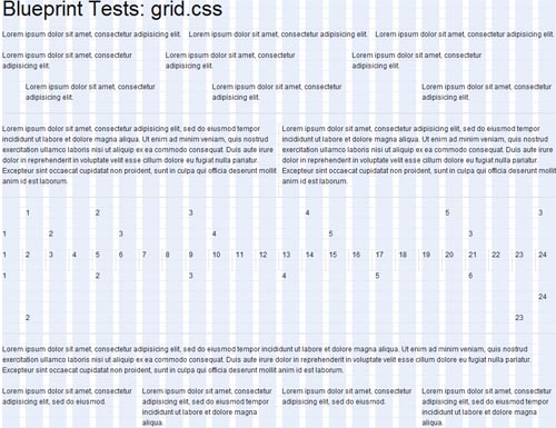
Blueprint is a CSS framework, which aims to cut down on your development time. It gives you a solid foundation to build your project on top of, with an easy-to-use grid, sensible typography, useful plugins, and even a stylesheet for printing.
What does Blueprint have to offer?
- A CSS reset that eliminates the discrepancies across browsers.
- A solid grid that can support the most complex of layouts.
- Typography based on expert principles that predate the web.
- Form styles for great looking user interfaces.
- Print styles for making any webpage ready for paper.
- Plugins for buttons, tabs and sprites.
- Tools, editors, and templates for every step in your workflow.
960 Grid System
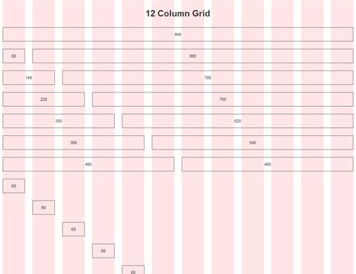
The 960 Grid System is an effort to streamline web development workflow by providing commonly used dimensions, based on a width of 960 pixels. There are two variants: 12 and 16 columns, which can be used separately or in tandem
The 12-column grid is divided into portions that are 60 pixels wide. The 16-column grid consists of 40 pixel increments. Each column has 10 pixels of margin on the left and right, which create 20 pixel wide gutters between columns
The premise of the system is ideally suited to rapid prototyping, but it would work equally well when integrated into a production environment. There are printable sketch sheets, design layouts, and a CSS file that have identical measurements.
YAML
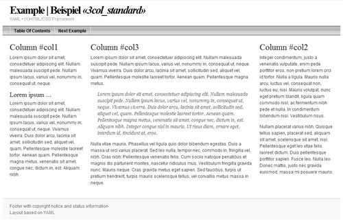
“Yet Another Multicolumn Layout” (YAML) is an (X)HTML/CSS framework for creating modern and flexible floated layouts. The structure is extremely versatile in its programming and absolutely accessible for end users.
The YAML framework is an open source project by Dirk Jesse and has been continuously enhanced since its first release in October 2005.
- Focussed on web standards and accessibility
- Slim framework core with numerous extensions
- Robust, flexible layout concept (columns & grids)
- Design patterns for typography, forms, mircoformats, rtl support ect.
- Complete multilingual documentation
YUI 2
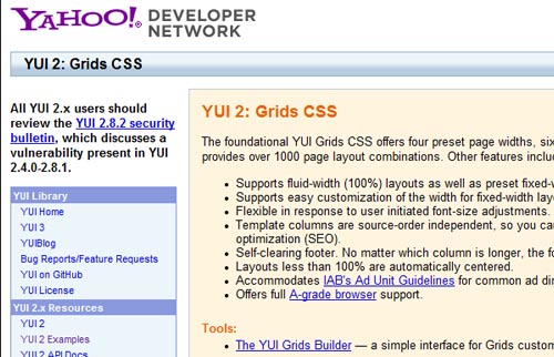
The foundational YUI Grids CSS offers four preset page widths, six preset templates, and the ability to stack and nest subdivided regions of two, three, or four columns. The 4kb file provides over 1000 page layout combinations. Other features include:
- Supports fluid-width (100%) layouts as well as preset fixed-width layouts at 750px, 950px, and 974px, and the ability to easily customize to any number.
- Supports easy customization of the width for fixed-width layouts.
- Flexible in response to user initiated font-size adjustments.
- Template columns are source-order independent, so you can put your most important content first in the markup layer for improved accessibility and search engine optimization (SEO).
- Self-clearing footer. No matter which column is longer, the footer stays at the bottom.
- Layouts less than 100% are automatically centered.
- Accommodates IAB’s Ad Unit Guidelines for common ad dimensions.
- Offers full A-grade browser support.
BlueTrip
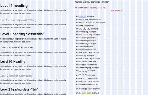
A full featured and beautiful CSS framework which originally combined the best of Blueprint, Tripoli (hence the name), Hartija, 960.gs, and Elements, but has now found a life of its own.
BlueTrip gives you a sensible set of styles and a common way to build a website so that you can skip past the grunt work and get right to designing.
Download the package, include the images and stylesheets in your site structure, and get going!
Features:
- 24-column grid
- Sensible typography styles
- Clean form styles
- A print stylesheet
- An empty starter stylesheet
- Sexy buttons
- Status message styles
Elements
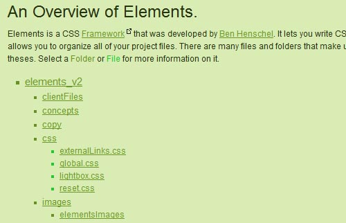
Elements is a down to earth CSS framework. It was built to help designers write CSS faster and more efficient. Elements goes beyond being just a framework, it’s its own project workflow.It has everything you need to complete your project, which makes you and your clients happy. Read the Overview for more information.
Some of the awesome features:
- Easy to use
- Lightweight
- Collection of preset classes
- Lightbox included
- An awesome mass reset
- Adds style and usablity to external links with icons
- Can be easily uploaded to your website hosting server
- Free of course
52framework
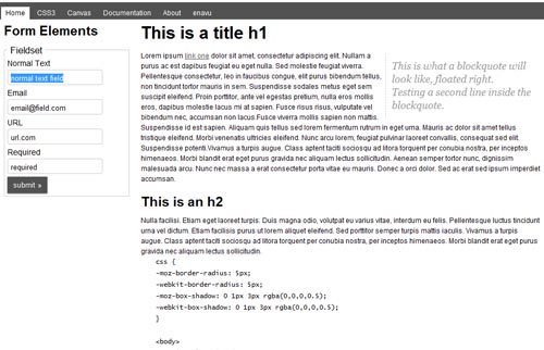
With HTML5 support coming so fast, with the tiniest of hacks we are able to use it today in virtually al browsers. Using HTML5 makes for much cleaner mark up. This framework fully uses all the great advantages of HTML5.
CSS3 is one of the coolest thing in the web designer world and has been a long time coming. With CSS3 you can save time designing and slicing fancy layouts. CSS3 has features like text/box shadow, rounded corners,and animations. These just a few of the many CSS3 features has to offer you
Brief Feature List:
- rounded corners
- text-shadow
- box-shadow
- html5 markup
- grid system
- css reset
- and much more
elastiCSS
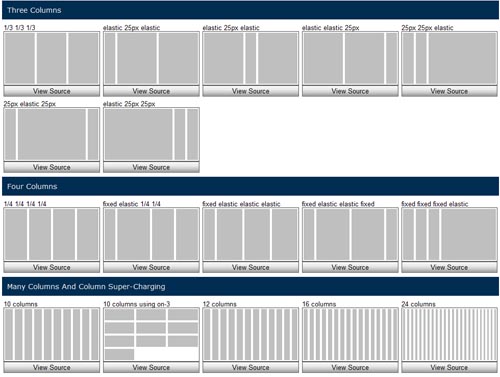
A simple css framework to layout web-based interfaces, based on the printed layout techniques of 4 columns but with capabilities to unlimited column combinations. and capacity to make elastic, fixed and liquid layout easily.
All frameworks are the consequence of repeated patterns, they help developers get faster, repeatable and predictable results. CSS frameworks are no different. By using them you can predict the results you will obtain, and you don’t have to write over and over the same classes or CSS rules to accomplish certain results.
Boilerplate
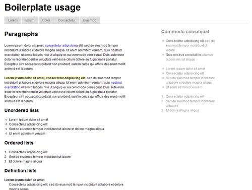
Boilerplate: noun standardized pieces of text for use as clauses in contracts or as part of a computer program.
As one of the original authors of Blueprint CSS I’ve decided to re-factor my ideas into a stripped down framework which provides the bare essentials to begin any project. This framework will be lite and strive not to suggest un-semantic naming conventions. You’re the designer and your craft is important.
Typogridphy
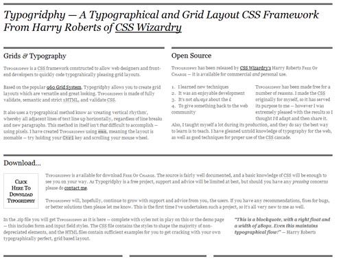
Typogridphy is a CSS framework constructed to allow web designers and front-end developers to quickly code typograhically pleasing grid layouts.
Based on the popular 960 Grid System, Typogridphy allows you to create grid layouts which are versatile and great looking. Typogridphy is made of fully validate, semantic and strict xHTML, and validate CSS.
It also uses a typographical method know as ‘creating vertical rhythm’, whereby all adjacent lines of text line up horizontally, regardless of line breaks and new paragraphs. This method in itself isn’t that difficult to accomplish — using pixels. I have created Typogridphy using ems, meaning the layout is zoomable — try holding your Ctrl key and scrolling your mouse wheel.
Emastic
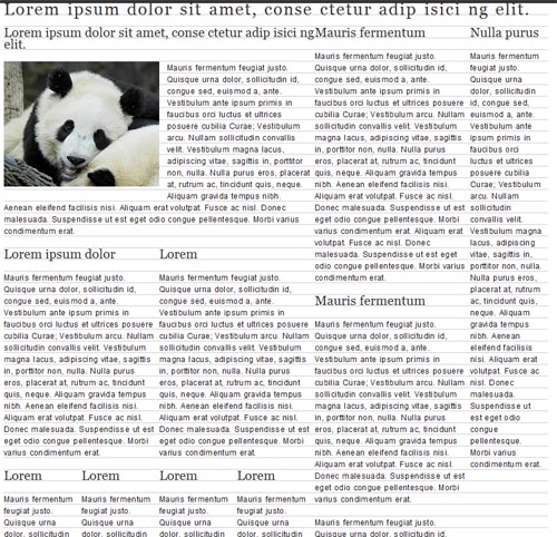
Emastic is a CSS Framework, it’s continuing mission: to explore a strange new world, to seek out new life and new web spaces, to boldly go where no CSS Framework has gone before.
Why should you use emastic?
It’s:
- Lightweight (compressed weight less then 4kb)
- Personalized width of the page in (em,px,%)
- Use of fixed and fluid columns in the grid.
- Elastic Layout with “em”s
- Baseline Grid Typography
Malo
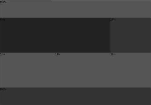
Malo is ultra small css library for building web sites. It is meant to be structural base for small or medium web sites. Malo derives from it’s bigger brother Emastic CSS Framework.
Why should you use Malo?
Because it’s:
- Ultra small (compressed is 0,25 kb or 8 lines of CSS! )
- Personalized width of the page in (%, px, em)
- Super flexible.
- Easy to use.
- How Malo works?
The Golden Grid
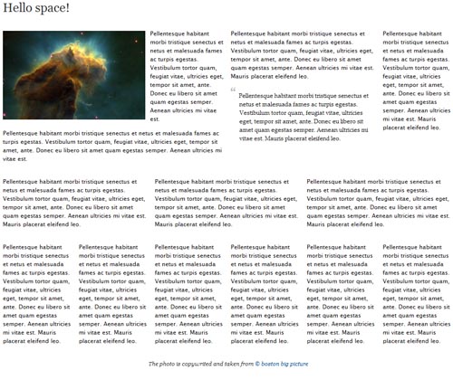
The Golden Grid is a web grid system. It ‘s a product of the search for the perfect modern grid system. It ‘s meant to be a CSS tool for grid based web sites.
Main features:
- 970px main width
- 6/12 grid system
- Super lightweight((compressed weight less then 1kb)
- Easy to learn.
1kb grid
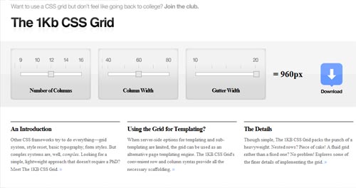
Other CSS frameworks try to do everything—grid system, style reset, basic typography, form styles. But complex systems are, well, complex. Looking for a simple, lightweight approach that doesn’t require a PhD? Meet The 1KB CSS Grid
When server-side options for templating and sub-templating are limited, the grid can be used as an alternative page templating engine. The 1KB CSS Grid’s convenient row and column syntax provide all the necessary scaffolding
Though simple, The 1KB CSS Grid packs the punch of a heavyweight. Nested rows? Piece of cake! A fluid grid rather than a fixed one? No problem! Explores some of the finer details of implementing the grid
Tripoli
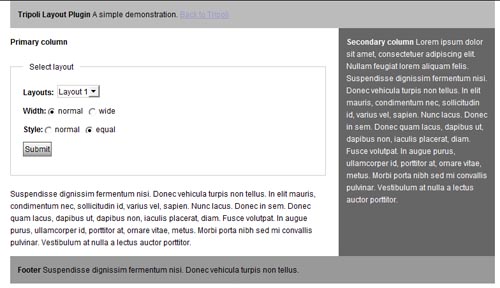
Tripoli is a generic CSS standard for HTML rendering. By resetting and rebuilding browser standards, Tripoli forms a stable, cross-browser rendering foundation for your web projects.
Tripoli completly resets all default browser standards and rebuilds them quietly with modern web development in mind.

