 Regardless of the fact that both HTML5 and CSS3 have made significant steps toward improving the existing web standards, web designers and developers still rely on old and proven techniques for moving content on screen or aligning it the way they want. With the introduction of Flexbox, these problems have been addresses and a new way to build and design websites has been introduced. Let us take a look at the reasons why we would like to use Flexbox in our projects.
Quick and Easy Creation of Repeatable Elements
Flexbox allows for fast creation of repeatable design patters. When one couples this with the use of the nth child selector, the benefits are easy to notice. Without the Flexbox grid the development time for such patterns substantially increases and is counterproductive to their relative simplicity. The ordering of elements is also less painful with the introduction of the “order” property. With only one or two lines of code, a developer can change the display order of elements on different screen sizes quickly, freeing time for more important tasks and removing problems such as possible cross browser issues and complex bugs.
Center Various Elements With Ease
Centering content with CSS has already been a problem for layouts. There is a staggering number of blogs and posts on the web on how to do this in different ways. Flexbox changes this “game” by introducing the align-items and justify-content properties. All you need is to apply the following styles to a parent div element:
display: flex;
justify-content: center;
align-items: center;
flex-wrap: wrap;
That is all it takes! Regardless of how many extra child elements we add, they will align correctly, the way we want them to. This holds true for both horizontal and vertical alignment, removing the necessity to introduce old CCS hacks and tricks. This is a very potent and powerful tool for web developers when they need to display dynamic data from an external source of information on the web.
It is the Grid Design’s Future
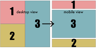
Although using Flexbox for two page elements might not demonstrate how useful it is in practice, once you start nesting more of them, its power starts to shine. Combining Flexbox with media queries allows for addressing different layouts on different screen sizes, to highlight and reorder elements easily. Even Bootstrap has utilized its power in its latest fourth version by introducing Flexbox in its own grid.
Great Support
As more than 97% of the people on the web use browsers that support Flexbox, it is safer and preferable to use it instead of other modern grids such as the CSS Grid, which isn’t as well supported presently. This is its main strength when compared with other CSS properties.
Do you already use Flexbox? If not, give it a try. Its main purpose is to simplify complexity and make your job of creating web layouts easier. It has a bright future and removes the need to concentrate extra efforts on changing and centering DOM elements with extra CSS lines or employing JS and jQuery. An important point to consider!


