Are you a web designer looking for the right place to get your creative juices flowing? Look no further — the following list is the perfect remedy for someone stuck-in-a-rut, bored of seeing the same designs over and over. Here are the most inspired, curated, and constantly updated websites around to help your creativity:
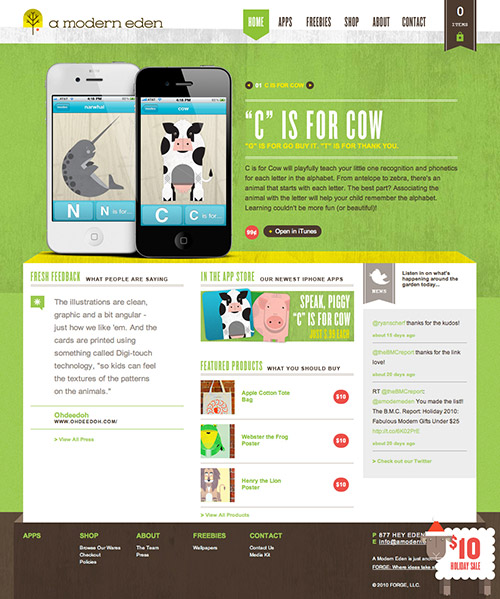
A Modern Eden
A Modern Eden sells posters and iPhone applications. The design also features a large horizontal slideshow area on which all illustrations have a nice shadow to make them look a bit more realistic. The fonts used are chosen carefully and used consistenly throughout the design.
Sky’s Guide Service
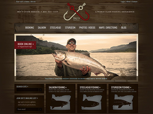
Sky’s Guide is a wonderful example of what a service website can look like with a quality set of textures and images. The choice of colors for design elements and body copy nicely complements the theme of the website and logo of the company (dark red and light brown).
Patrik Ervell
Patrik Ervell demonstrates innovation at its finest. Category pages present a Flash video of the clothes being modelled on an actual male model, giving the customer a sense for how the clothing would actually look on them. The website also gracefully degrades to static images for browsers without Flash support.

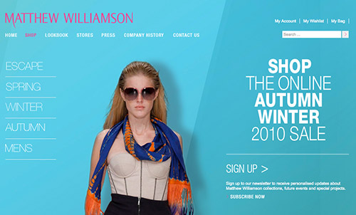
Matthew Williamson
Designer fashion outlet Matthew Williamson demonstrates good use of fonts, contrast and high-quality images. The product pages allow users to zoom in and out to take a closer look at the shop items. Also, the product page provides a size guide, a delivery guide, a return guide for customers as well as comprehensive product details.
Paul Smith
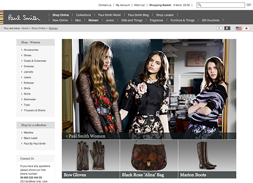
The Paul Smith website has an elegant design that emphasizes the quality of the brand. There is something quite appealing about the simple navigation at the top, especially the logo and colored horizontal stripes.
Chicago L-Shirts
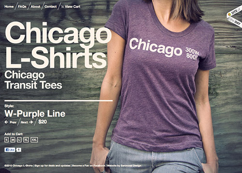
Chicago L-Shirts is big and bold on Helvetica and the dark processed vintage illustrations. The website is unique and hits you straight away with the featured product on sale, which fills the entire background.
Norton’s “Enjoy Your Privacy” site gives users the feel of how their private data can be easily accessed if they don’t protect themselves properly. The site is both innovative and informative, earning the creators recognition from the Awwwards jury and online users alike. Norton knows that their audience cared about privacy and security, which is why this website is so powerful.

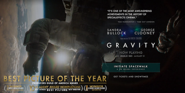
A top box-office hit in 2013, the movie Gravity also an equally exceptional website. The site let visitors partake in a unique spacewalk experience (one that must’ve taken a heckuva lot of man hours for the designers behind this beauty). What better way to market a movie than make you feel like you’re a part of it?
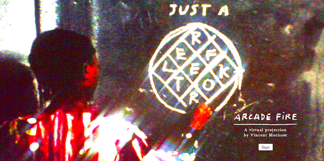
For Arcade Fire’s latest album release, the marketing machine was in full force — and included this intriguing website. The site allows you to control the focus and lighting of the video while listening to a Arcade Fire track, making for a terrific UX for passionate fans. Kudos to the alt-rockers for the experimental design — it’s honestly kind of trippy.
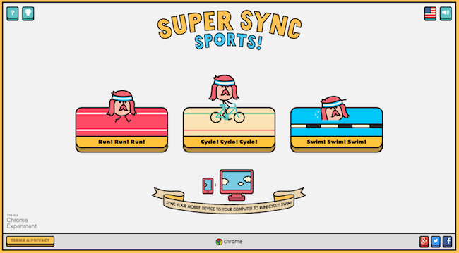
Google Creative Labs had a hand in creating this fun site. Super Sync Sports features three interactive games that users can control with their mobile device. Connect your phone and then you’re ready to run, cycle, or swim. We love the cross-device use and we weren’t alone — this YouTube clip of the game has 1.8 million views and counting.
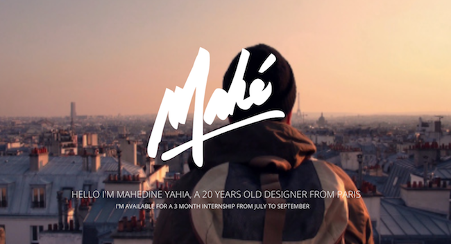
Who says marketers can’t take design cues from personal websites? Case in point: This crazy-good site for Parisian designer Mahedine Yahia just blows me away. This site acts as a resume and portfolio for Yahia, who most likely will never be out of work again given the site’s flawless design work and concerted focus on great imagery.
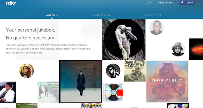
Back to some business-based sites. Here’s one from the popular music tool Rdio: Its distinct and engaging homepage makes it easy for users to check out their favorite artists and share their playlists with friends through social media — two crucial components of getting this website to grow. Because the site easy to use and share, Rdio will retain the visitors it gets and get those visitors to bring in new ones — a superb growth strategy.
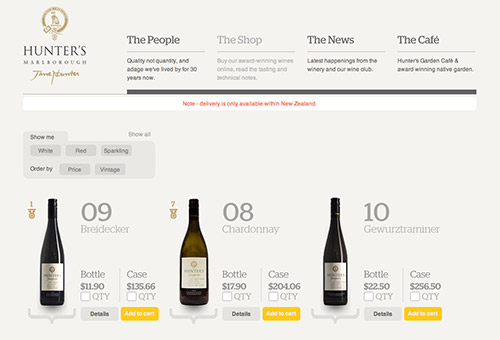
Hunter’s Wines
Hunter’s Wines is an online wine store. The front page introduces some dynamics in its grid by placing text blocks next to each other in a somewhat chaotic manner. Notice how well the design separates sections of the pages by using yellow color in the background of the wine bottles.
Sassy Duck
Sassy Duck is a young fashion-forward handbag brand that creates luscious accessories for the modern woman. This website literally elicits a hunger for those female accessories. Again, large product photography is striking on the website, trying to evoke an emotional response from the site’s visitors. It’s interesting that the overview pages do not contain prices — they are displayed only once the visitor hovers over the product image.

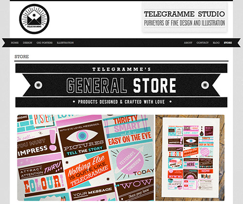
Telegramme Studio
Probably the most eye-catching detail in Telegramme Studio’s design is vivid, high-resolution product typograrphy displayed in the horizontal slideshow in the upper area of the front page.
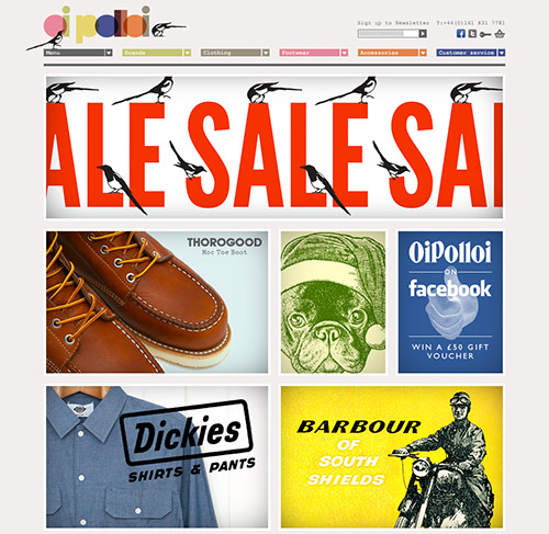
Oi Polloi
Oi Polloi is small retail store based in the Northern Quarter, Manchester, UK. This website design is (again) in retro style, supported by the typewriter-style typograph and old print-style textures. They capture the Oi Polloi brand well.
